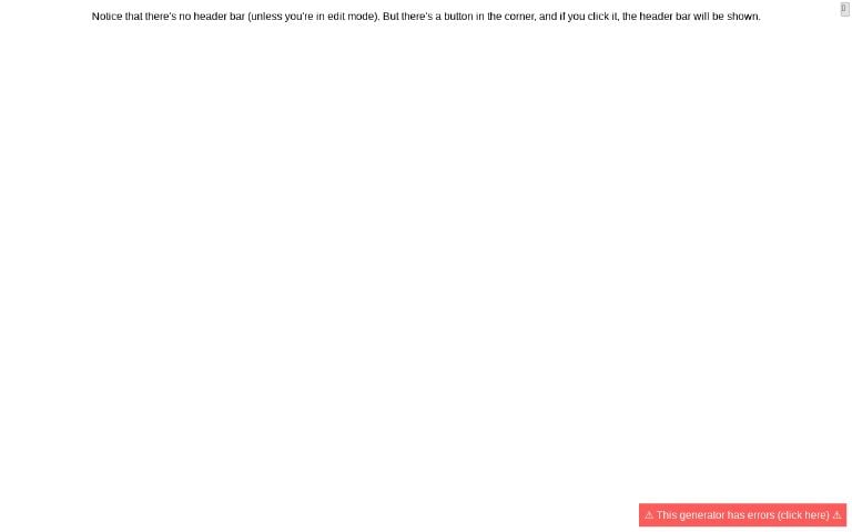
By “hide” I mean it shows a button in the top-right, which when clicked, shows the full header bar.
Examples:
Please let me know if you run into any issues or have feedback 🙏
Edit: Also, for people who know some JavaScript, you can use the public generator list API to get generators with specific tags like this:
let data = await fetch(`https://perchance.org/api/getGeneratorList?tags=foo`).then(r => r.json()); // returns generators tagged 'foo'
let data = await fetch(`https://perchance.org/api/getGeneratorList?tags=foo,bar`).then(r => r.json()); // foo AND bar


Cool!
Um, hao return to minimized with just an icon after having touched it and expanded the bar? Also: hao choose minimized icon?
i hope foobar’s a cool generator
Fair point! Just added an ‘x’ button to close re-hide it.
I did think about this, but I think (for now at least) I’ll hold off on this. My thinking here is that ideally it would be something distinctive and consistent across generators so it’s easy to find. A big part of how a lot of people got introduced to perchance was being curious about what that “edit” button means. They click it, and then everything is a blur for two weeks and suddenly they know how to code (a bit). I’ll keep the headers on my generators for this reason, but I think in that particular respect (i.e. helping newbies get introduced to the platform) it should still be fine to use minimal header mode, so long as there’s a distinctive icon that people notice a few times across separate perchance visits before finally getting curious enough to click it.