
- cross-posted to:
- cross-posted to:
cross-posted from: https://lemmy.world/post/19456945
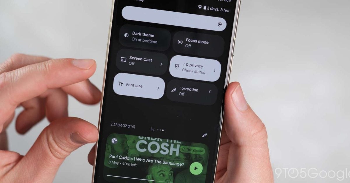
Google is working on a redesign of Quick Settings that might launch with Android 16.
cross-posted from: https://lemmy.world/post/19456945
Google is working on a redesign of Quick Settings that might launch with Android 16.
Wow, first time I feel strongly about a quick settings update. It looks awful, taking the worst parts of the Android 12+ redesign and combining them with the worst ideas from the older design, like unlabeled icons.
It looks like there are unlabeled icons in the expanded state? Wtf? If I’m expanding the quick settings, that means I’m fishing for the less used settings, so there’s no way I’m going to remember that for example the weird circle with a small segment cut out means “Data saver”. It will just be a mystery icon that does some mystery action - that has nothing to do in a modern OS.
It looks like this design is heavily sacrificing usability for people who don’t spend hours every day mucking around with quick settings in order to please some hypothetical user who feels more slowed down by swiping over one or two screens than by having to find the one setting they currently need in a big matrix of poorly designed icons.
Edit: also it looks like the home screen is visible under the quick settings - I’m not a big fan of that, I really like the current design where the notifications are pretty much their own separate screen without distracting app content, but that’s just my subjective taste. Unlabeled icons are objectively bad.