
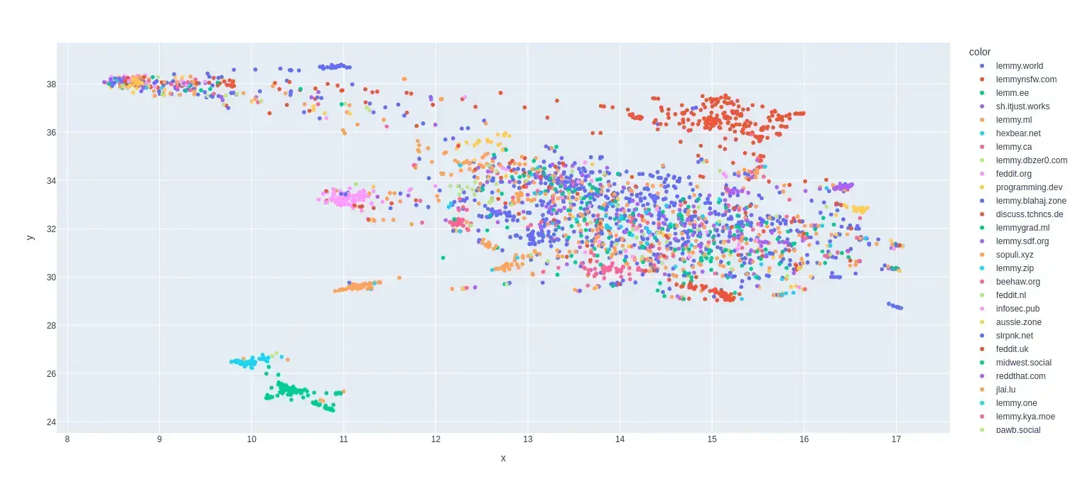
This is my first try at creating a map of lemmy. I based it on the overlap of commentors that visited certain communities.
I only used communities that were on the top 35 active instances for the past month and limited the comments to go back to a maximum of August 1 2024 (sometimes shorter if I got an invalid response.)
I scaled it so it was based on percentage of comments made by a commentor in that community.
Here is the code for the crawler and data that was used to make the map:
So more dots means more activity total for that communities users on any community in the top 35?
Wouldn’t a bar graph be sufficient?
For example most of the red dots to the top right are nsfw communities and it was able to clump like that because the people that comment in those communities tend to comment in the other nsfw communities as well.
edit: left -> right
Anti Commercial-AI license (CC BY-NC-SA 4.0)
Ah cool, self segregating proximity map. The format makes more sense with this explanation, thank you.
I didn’t measure activity for this map. Each dot represents a community. I only used the communities that were on the top 35 instances (except lemmings.world which it couldn’t grab any comments for.)
Anti Commercial-AI license (CC BY-NC-SA 4.0)
So number of dots is number of communities, but the data relies on comments to those communities to appear in the set?
Yeah pretty much. I wanted to see communities that had similar people that commented because I thought that would be a good way to see if there were similar kinds of discussions were happening in those communities.
Anti Commercial-AI license (CC BY-NC-SA 4.0)