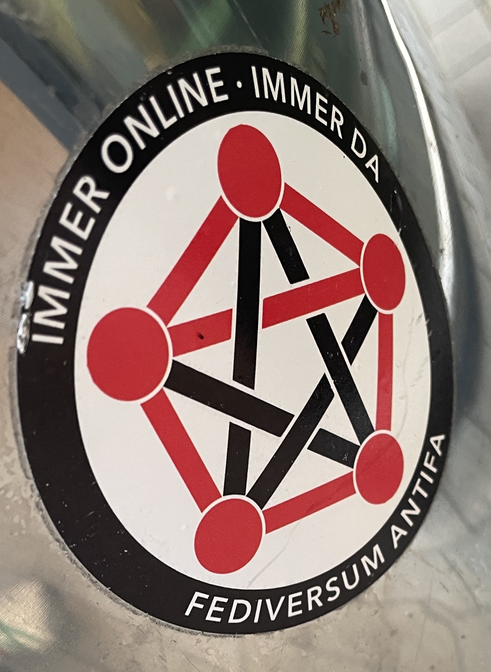
@[email protected] to Fediverse [email protected]English • 5 months ago"Always online – always here: Fediverse Antifa"files.catbox.moeimagemessage-square20fedilinkarrow-up1190arrow-down112file-text
arrow-up1178arrow-down1image"Always online – always here: Fediverse Antifa"files.catbox.moe@[email protected] to Fediverse [email protected]English • 5 months agomessage-square20fedilinkfile-text
minus-squareflamingos-cantMlinkfedilinkEnglish21•5 months agoBut wouldn’t three of the lines need to be red for that? Something like this:
minus-square@[email protected]linkfedilinkEnglish11•5 months agoyeah i like that a lot more, kinda want to make the dots black though, feels like that contrast makes it a bit easier to see the A and generally looks better.
minus-square_NoName_linkfedilinkEnglish4•5 months agoNot sure how but you made an abstract logo look like a leatherdaddy. Excellent work.
minus-square@[email protected]linkfedilinkEnglish6•5 months agohm, yeah i don’t see it, perhaps you think more about leatherdaddies than most people?
minus-squareᴇᴍᴘᴇʀᴏʀ 帝MlinkfedilinkEnglish3•5 months agoThe A may be more obvious if the outer ring was also black.
minus-square@[email protected]linkfedilinkEnglish3•5 months agoyeah i considered that but then the whole thing is basically all black, and the original anarchist symbol has a red outer circle.

But wouldn’t three of the lines need to be red for that? Something like this:
yeah i like that a lot more, kinda want to make the dots black though, feels like that contrast makes it a bit easier to see the A and generally looks better.
Not sure how but you made an abstract logo look like a leatherdaddy. Excellent work.
hm, yeah i don’t see it, perhaps you think more about leatherdaddies than most people?
The A may be more obvious if the outer ring was also black.
yeah i considered that but then the whole thing is basically all black, and the original anarchist symbol has a red outer circle.