
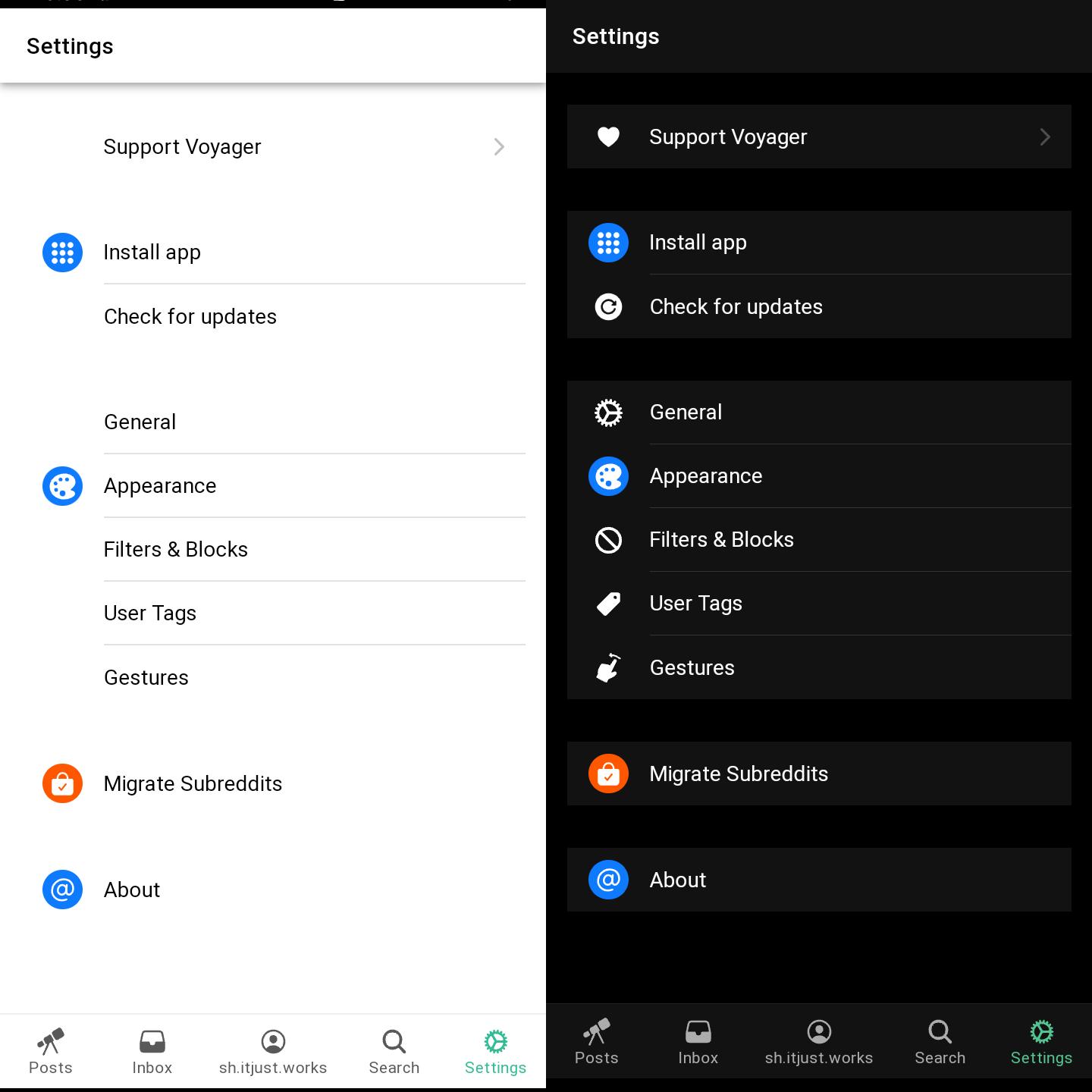
Well, I hope the icons are recolored to work both on light and dark themes.
I’m using the web app and this is applies to both Apple and Android designs
Well, I hope the icons are recolored to work both on light and dark themes.
I’m using the web app and this is applies to both Apple and Android designs
Yeah I’m sorry I’m not buying the argument “staring at a light bulb hours a day is better, because occasionally some asshole will flash one in your face against your will anyway”.
If I didn’t use dark mode in bed as one example, I would be exposed to light 10 times brighter and it would fuck with my circadian rhythm hard. But because I use dark mode, I’m able to fall asleep easily after using my phone.
I’m talking about eye strain and light mode, shockingly, isn’t a light bulb unless you have your brightness on max all the time.
Any cool light can disrupt your circadian rhythm. While dark mode is definetly helpful on that aspect, sepia tone is also as helpful if you don’t prefer dark mode.
Light mode with brightness all the way down or otherwise is horrible on my eyes. Decades of experience tell me that
And yes I already know about the color temperature aspect and have adjusted accordingly. It’s definitely the more important issue how much light you’re getting though. Dark mode on full brightness is probably similar to light mode on 10% brightness