There’s KDE software (might be a Linux-wide thing, idk) that changed it to a down arrow pointing to a rectangle. I don’t like it. I really don’t fucking like it.
I wouldn’t peg that as the save. It looks like a download button. I get it within the context of skumorphism, but that down arrow icon already pretty universally means download.
I don’t think it’s “ugly”, but the first time I used that editor (with the new icons, that is–it used to have the traditional icons) I was like “Where’s the damn Save button?” I had to hover over them to get the tooltips so I could tell. The Open button is just as bad–it looks like it would be Print!

There’s KDE software (might be a Linux-wide thing, idk) that changed it to a down arrow pointing to a rectangle. I don’t like it. I really don’t fucking like it.
Me neither, it looks like it should mean “download”.
Those icons probably come from the default breeze dataset
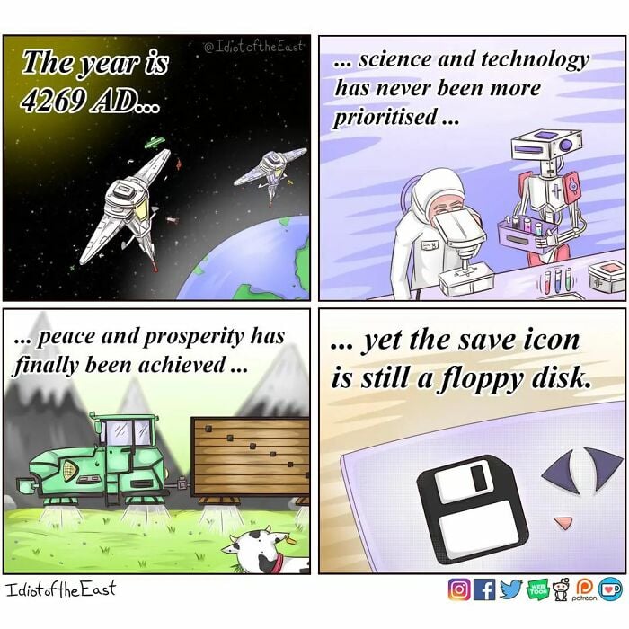
It’s still floppy disk here
ThatsANoformeDawg.jpg
That’s not true, this is the current version on Arch and it’s a floppy.
Huh, interesting. It’s probably my icon theme, then. I’ll check when I get a chance.
Got me real curious. What app? Care to share a screenshot?
Here are the icons in the default text editor in Mint Cinnamon. Save is the third from the left (the first 2 are New and Open).
I wouldn’t peg that as the save. It looks like a download button. I get it within the context of skumorphism, but that down arrow icon already pretty universally means download.
That’s ugly af, and first time I’ve seen it.
I don’t think it’s “ugly”, but the first time I used that editor (with the new icons, that is–it used to have the traditional icons) I was like “Where’s the damn Save button?” I had to hover over them to get the tooltips so I could tell. The Open button is just as bad–it looks like it would be Print!
It may not be aesthetically displeasing, but functionally so.
That screenshot looks disgusting. Unsharp font, irritating icons, weird fontset. Is that GNOME and/or Ubuntu? Terrible.
My Fedora KDE native applications do. But downloaded software still uses the floppy icon if those developers want to.