I don’t like the interrobang. It looks too crowded, and the sharp angle created between the question mark and the exclamation mark looks out of place in among latin alphabet letters.
It looks like a cross between double-typed characters from an old-school typewriter, and an optical illusion where the seemingly straight lines of the exclamation cast squiggly shadows.
Either way, IMO it’s quite busy and visually unappealing. Gove me a good ol’ !? any day of the week.
Plus, depending on context !? and ?! could mean two entirely different things; to me, the former is a sign of incredulity “What the fuck!?” - while the latter is a yelled question “Can you hear me?!”

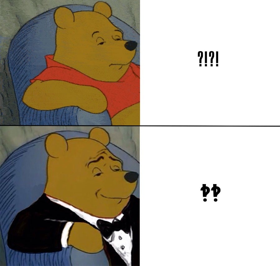
I don’t like the interrobang. It looks too crowded, and the sharp angle created between the question mark and the exclamation mark looks out of place in among latin alphabet letters.
Really‽
It looks like a cross between double-typed characters from an old-school typewriter, and an optical illusion where the seemingly straight lines of the exclamation cast squiggly shadows.
Either way, IMO it’s quite busy and visually unappealing. Gove me a good ol’ !? any day of the week.
Plus, depending on context !? and ?! could mean two entirely different things; to me, the former is a sign of incredulity “What the fuck!?” - while the latter is a yelled question “Can you hear me?!”
100% agree. We should have taken an opportunity to create a new symbol for question/exclamation rather than combine two together.
Interrobang looks awful written down.