@BallShapedMan to Art Share🎨English • 5 days agoCan I paint Samuel L. Jackson pt11?imagemessage-square8arrow-up163arrow-down14file-text
arrow-up159arrow-down1imageCan I paint Samuel L. Jackson pt11?@BallShapedMan to Art Share🎨English • 5 days agomessage-square8file-text
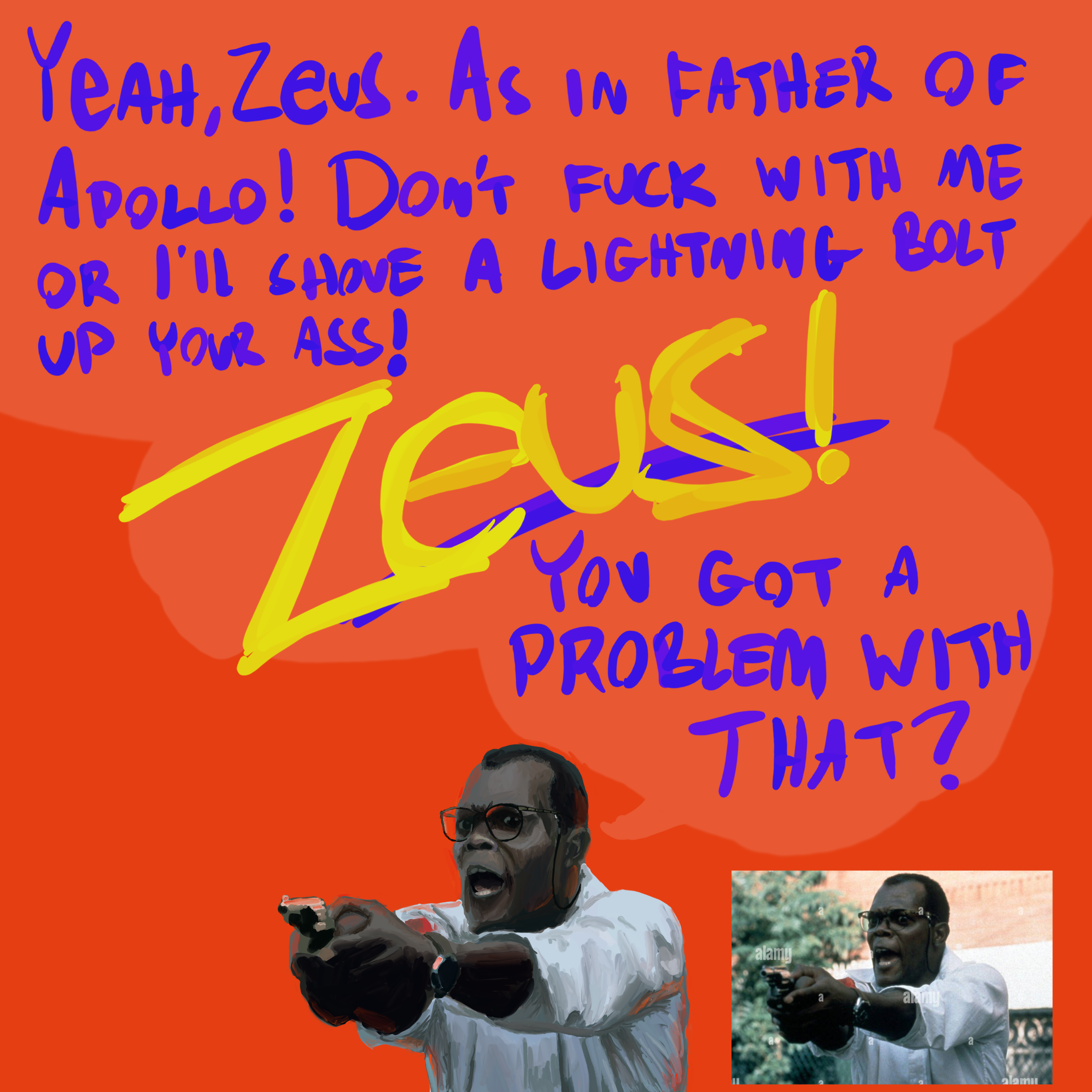
minus-square@[email protected]linkfedilinkEnglish2•edit-25 days agoThis art looks fucking fantastic. The only criticism I can provide is the lettering, especially the letter S in “shove” looking like a letter C
minus-square@BallShapedManOPlinkEnglish1•5 days agoOh yeah, I should have written more slowly clearly. Thank you!
minus-square@[email protected]linkfedilinkEnglish3•5 days agoNope. You can write rapidly and maintain your lettering style because it’s unique to you, just ensure to redo the ones that are not legible
minus-square@BallShapedManOPlinkEnglish1•5 days agoFair enough. I didn’t even see it until you pointed it out. So maybe go slowly there next time 😆


Die Hard 3 was great!
Just rewatched it, classic!
This art looks fucking fantastic. The only criticism I can provide is the lettering, especially the letter S in “shove” looking like a letter C
Oh yeah, I should have written more slowly clearly.
Thank you!
Nope. You can write rapidly and maintain your lettering style because it’s unique to you, just ensure to redo the ones that are not legible
Fair enough. I didn’t even see it until you pointed it out. So maybe go slowly there next time 😆