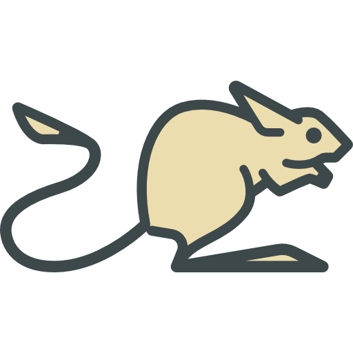
Hey guys! So, following up my previous post about the Jerboa icon, I’ve made new logo as well. I think I will continue working on it, but for the meantime, that’s how it looks.

I modified existing lemmy logo, couldn’t get longer ears though, wouldn’t look right or it would resemble rabbit too much. Added a little tail as well because Jerboas have a really long one, and it looks cute. Main inspiration was Apollo icon, it looks really neat. I think I would like to improve upon the background and maybe change color palette to be more bright, but I want to hear what you think.


Looks great, I quite like it. But about the background, keep in mind that dynamic icons are now a thing - and the current logo supports it. So the background color won’t necessarily be chosen by you, but by the Monet subsystem based on the user’s wallpaper.
I will keep that in mind, thanks!