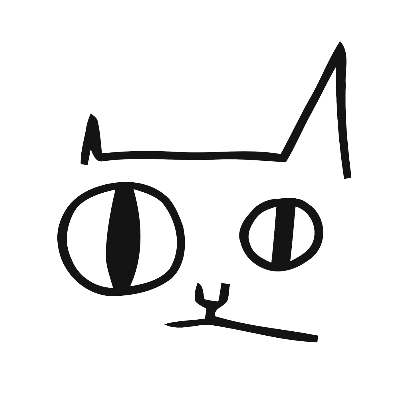
Hey guys! So, following up my previous post about the Jerboa icon, I’ve made new logo as well. I think I will continue working on it, but for the meantime, that’s how it looks.

I modified existing lemmy logo, couldn’t get longer ears though, wouldn’t look right or it would resemble rabbit too much. Added a little tail as well because Jerboas have a really long one, and it looks cute. Main inspiration was Apollo icon, it looks really neat. I think I would like to improve upon the background and maybe change color palette to be more bright, but I want to hear what you think.
The tail looks like the reddit logo antenna. Maybe make the head smaller and the tail longer in a shape of a j?
Agreed, that was my first thought as well. If I saw this with no context I’d assume it was a 3rd party reddit app, and if I looked further and saw it was for Lemmy I’d assume it’s trying to be a reddit rip-off.
Will give it a thought, thanks!
Also the floof at the end of a jerboa’s tail is long rather than round. I donno why that detail is bothering me. Otherwise I love this logo!
Yeah, the little circle at the end makes it look like an antenna. It’s kind of cheeky to make a reference to Reddit, but IMHO it’s not necessary, especially on the long run.
Check out these Jerboa tail drawings for inspiration.
Or consider to leave out the tail completely. You know, K.I.S.S. style. 😉
Looks great, I quite like it. But about the background, keep in mind that dynamic icons are now a thing - and the current logo supports it. So the background color won’t necessarily be chosen by you, but by the Monet subsystem based on the user’s wallpaper.
I will keep that in mind, thanks!
I also have version with light blue logo, but I found out that the white logo is much more readable.

You are right, the white logo is better.
This is awesome!
I also like it over the current icon, nice job
I like it as well. When does the update drop? Lol.
It’s very cute and simple! 👍
I actually really like that background color and think you should keep it
Incredible work!
Looks really good, well done.
i really like it!