Why? How was that supposed to help? It’s just exactly the same but more cluttered and confusing. Just worse.
I’ve spent way more time trying to figure out why there are random, meaningless icons of a video game character in the speech bubbles than it took me to read the comic in the first place.
EDIT I just noticed her forehead turned blue in one of the panels too, wtf, was this intentional?? This is fascinating
helps folks that are hard of seeing contextualize parts. Visual aids sort of speak.
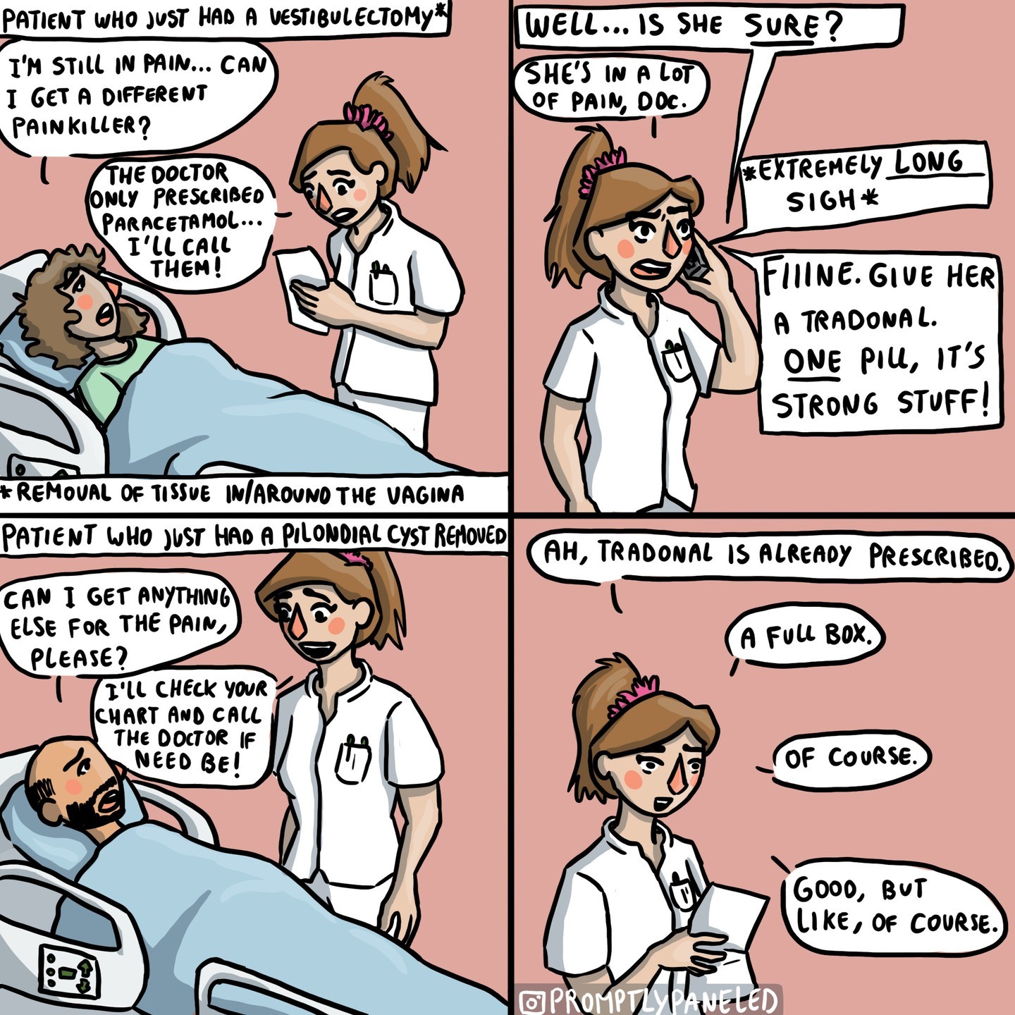
Notice I colored the important parts of the Doctor’s hypocritical prescriptions.
I don’t disagree. Had to consult a praxis chat, and they were able to inform me my edit makes the comic less monochromacally, protanomaly, and tritanomaly legible.
Someone can if they want, make it more monochromacally legible, while highlighting the key words using a different font. Currently busy.


Why? How was that supposed to help? It’s just exactly the same but more cluttered and confusing. Just worse.
I’ve spent way more time trying to figure out why there are random, meaningless icons of a video game character in the speech bubbles than it took me to read the comic in the first place.
EDIT I just noticed her forehead turned blue in one of the panels too, wtf, was this intentional?? This is fascinating
Oh what you didn’t like the 👄 emoji inserted into the comic?
Surely that adds context
What about the shrug emoji?
helps folks that are hard of seeing contextualize parts. Visual aids sort of speak.
Notice I colored the important parts of the Doctor’s hypocritical prescriptions.
The color makes the text harder to read, imo
I don’t disagree. Had to consult a praxis chat, and they were able to inform me my edit makes the comic less monochromacally, protanomaly, and tritanomaly legible.
Someone can if they want, make it more monochromacally legible, while highlighting the key words using a different font.
Currently busy.