
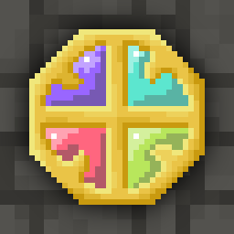
The colors and shading on the new runestones make them difficult to differentiate visually, especially with low screen brightness or night mode. I often play on low brightness at bedtime and it’s really hard to see. There needs to be more contrast between the color on the stone and the stone itself.
Stylistic comment: the new sprites for runestones and seeds look like eggs. Too perfectly round in their shape
Question to Evan: what’s your preferred way to provide beta feedback? This is my first time getting involved in beta even though I’ve been playing for 10+ years
some criticism isnt as constructive as you might think.
Evan listens to the community
Remember the upcoming talent “recall glyph”
Remember how this was pointed out as needlessly confusing, using a word that was already used for another very specific game mechanic?
Remember that in those discussions, it was pointed out that another perfectly good word was already in use for one of the items this talent affected?
Remember when people began to casually use the term “recall rune” or even just “RR” because that was obviously, OBVIOUSLY the most logical and simple choice to name the still-in-development talent?
But of course, it was not Evan’s original idea, and thus it was completely unacceptable! Recall Inscription it is!
It’s an observed pattern.
recall inscription is a fine name, why you being weird bro?
Excuse me? What is wrong with you
Was I not supposed to provide support for my own position?
I didnt do anything to you but you are obviously ready to lash out.
I don’t have to take this from someone like you
Very cute.
Are you done with your tantrum now?
Oh trust me, j know people like you, i know im now on your crosshairs and you will bully me any chance you get.
But I hope you know you are human garbage for it
My dude… I have no idea what to say. You feel personally attacked by someone giving an opinion about somebody else entirely.
That’s completely nuts. Do some soul searching.