

- cross-posted to:
- [email protected]
- cross-posted to:
- [email protected]
Reddit refugee here.
I have really started to like Lemmy and love the fact that it’s free and open source, but I wasn’t feeling so home with the UI, so I found nice looking style from https://userstyles.world/style/10345/lemmy-world but I personally prefer dark theme so I adjusted some colours and made the radiuses and margins bigger. I thought that maybe someone will find this useful and hence I decided to post it here. I am not a professional programmer, just a guy who likes to tinker with computers so this style may not be perfect. Critique, feedback and suggestions are welcome.

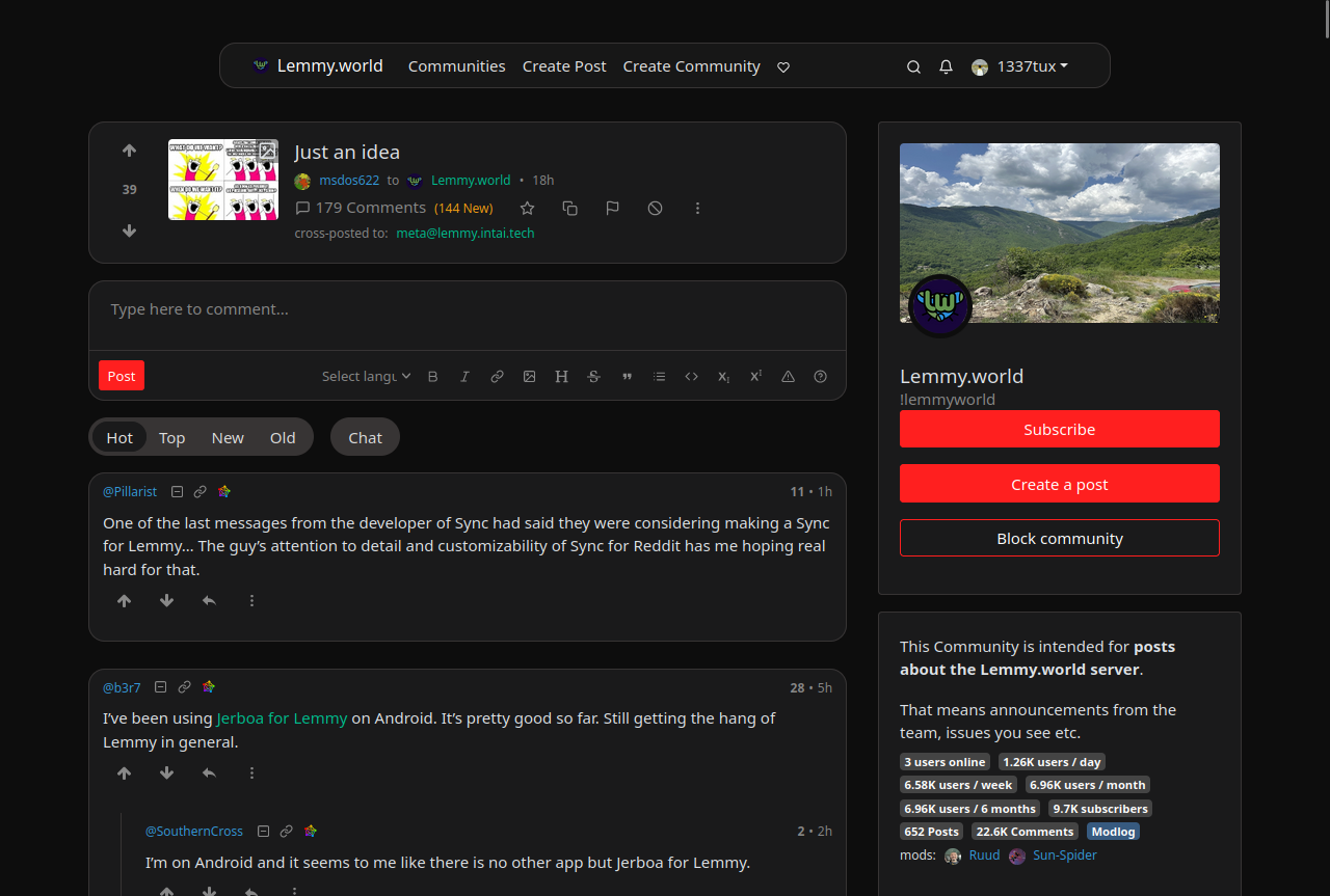
Edit: The colors are from reddit and if you want the colors to look more like the original lemmy, change the bg primary and default to hex #303030 and #222222. I really like this color scheme too
--bg-primary: #303030;
--bg-default: #222222;
Edit2: I have now made some small adjustments using the feedback and suggestion I got from you. I’m really grateful for the feedback :)
I also have now two styles, which have slightly different color scheme https://userstyles.world/user/VILPAUTOEE
Keep the feedback coming ;D Thx
I like the way threaded comments are colored in the default scheme. Makes it very easy to see which subcomment belongs to which parent.
With a bunch of vertical lines, I quickly lose track.
But I very much appreciate all the crafting and tinkering going on! It’s nice to see things grow.
Tracing those lines was almost a wasted effort for some more complex threads lol. Start going cross eyed. I like the colors much more.