- cross-posted to:
- lemmyapps
- cross-posted to:
- lemmyapps
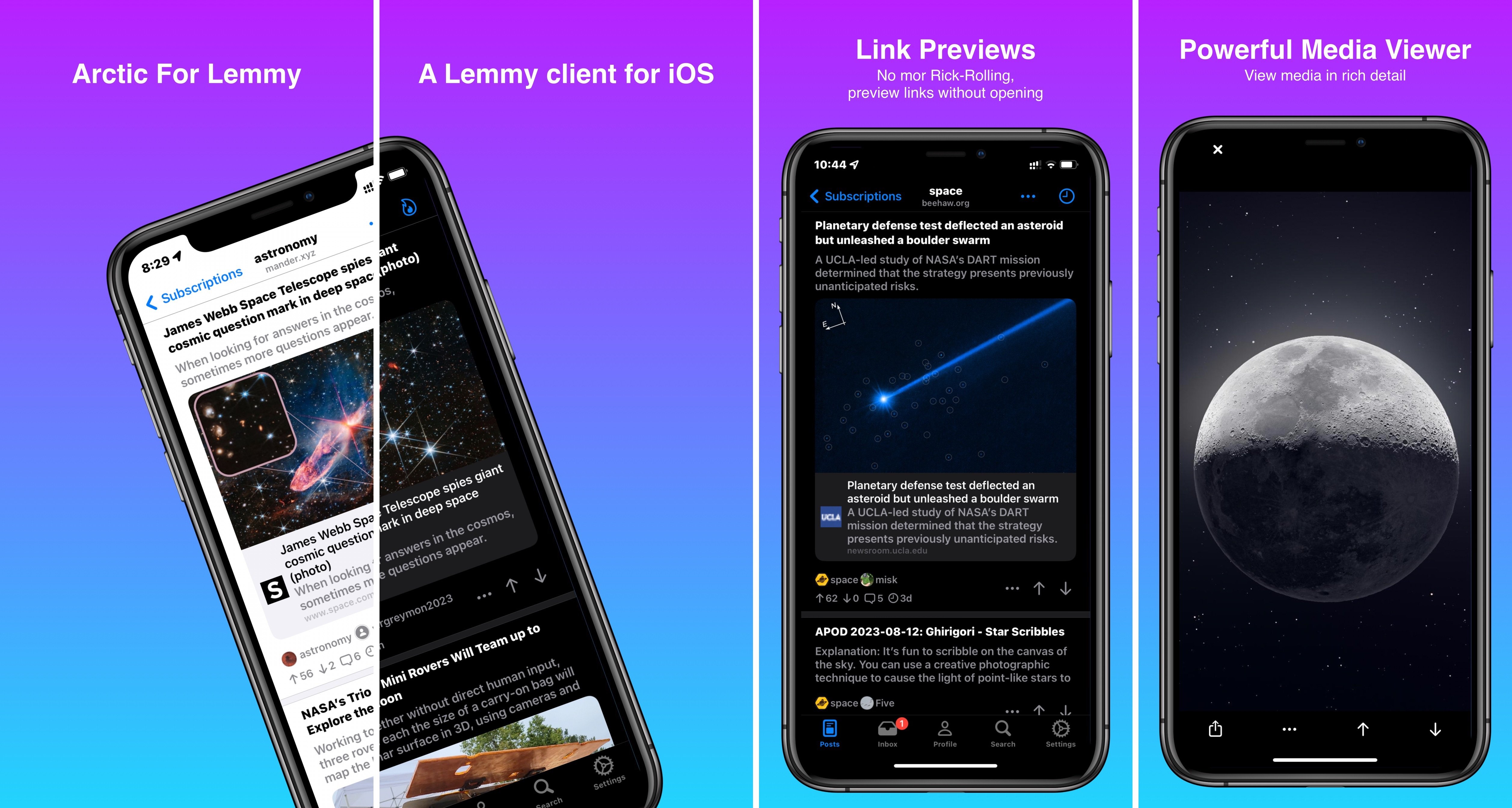
After a few delays, Arctic is has finally been submitted to TestFlight and got the green light. For those of you who don’t know what Arctic is, it’s a Lemmy client for iOS 15+ built in pure Swift.
Arctic began as just a little side project for me. As an avid Apollo user I was missing a feature rich and familiar client for IOS. So I started working on Arctic. My primary goal with the project has been creating a native UI appearance, and content presentation, focusing on putting the important content directly in the feed without feeling cluttered. I’m finally at a point where I feel Arctic is stable enough, and houses enough features to go forward with beta testing.
I’m currently testing out Reimplementing the UI in SwiftUI as it allows for quicker iteration, and less boilerplate code. Though I’m not sure about performance yet. SwiftUI seems to be lacking in certain areas such as prefetching APIs for heavy feeds etc. you can find an experimental post feed in settings that uses SwiftUI.
As of right now, I have not set up an issue tracker for Arctic. The reason for this is that I don’t know for sure if I will be Open Sourcing the project yet. I’d like to keep the issues/project in the same repository, and I’m unable to have a private repo with public issues. I’ll be deciding what route I would like to take over the next week or so.
While on the subject of open source, I’d like to mention that Arctic does not collect any information from users devices. The only user specific information that is stored is the Lemmy account JWT Auth token for communication with the Lemmy api. Absolutely no personal information is collected, or leaves your device. Currently I have no plans to implement any analytics in Arctic, and if I ever do, it will be on an opt-in basis, and be completely anonymous only tracking information relevant to Arctic support.
Development
I feel the need to point out that I work a full time job, and am often busy outside of working. With that said Arctic development may be a bit slow compared to some of the other projects out there. I do however plan to release at leas one update every week for now. I will try to push out more frequently as my time permits, even if that means smaller hot-fix type releases. I do plan to support Arctic long term, as I’m already quite invested in the project and have really enjoyed working on it.
Anyways, please don’t hesitate to reach out and ask questions, or offer feedback/suggestions . I’m quite busy most days, but I will do my best to respond as soon as possible.
Almost forgot the most important part, here is the link to Arctic TestFlight
Current Features
- Submitting / Editing Posts
- Submitting / Editing Comments
- Voting on Posts / Comments
- Blocking Communities / Users / Instances
- Subscribing to Communities
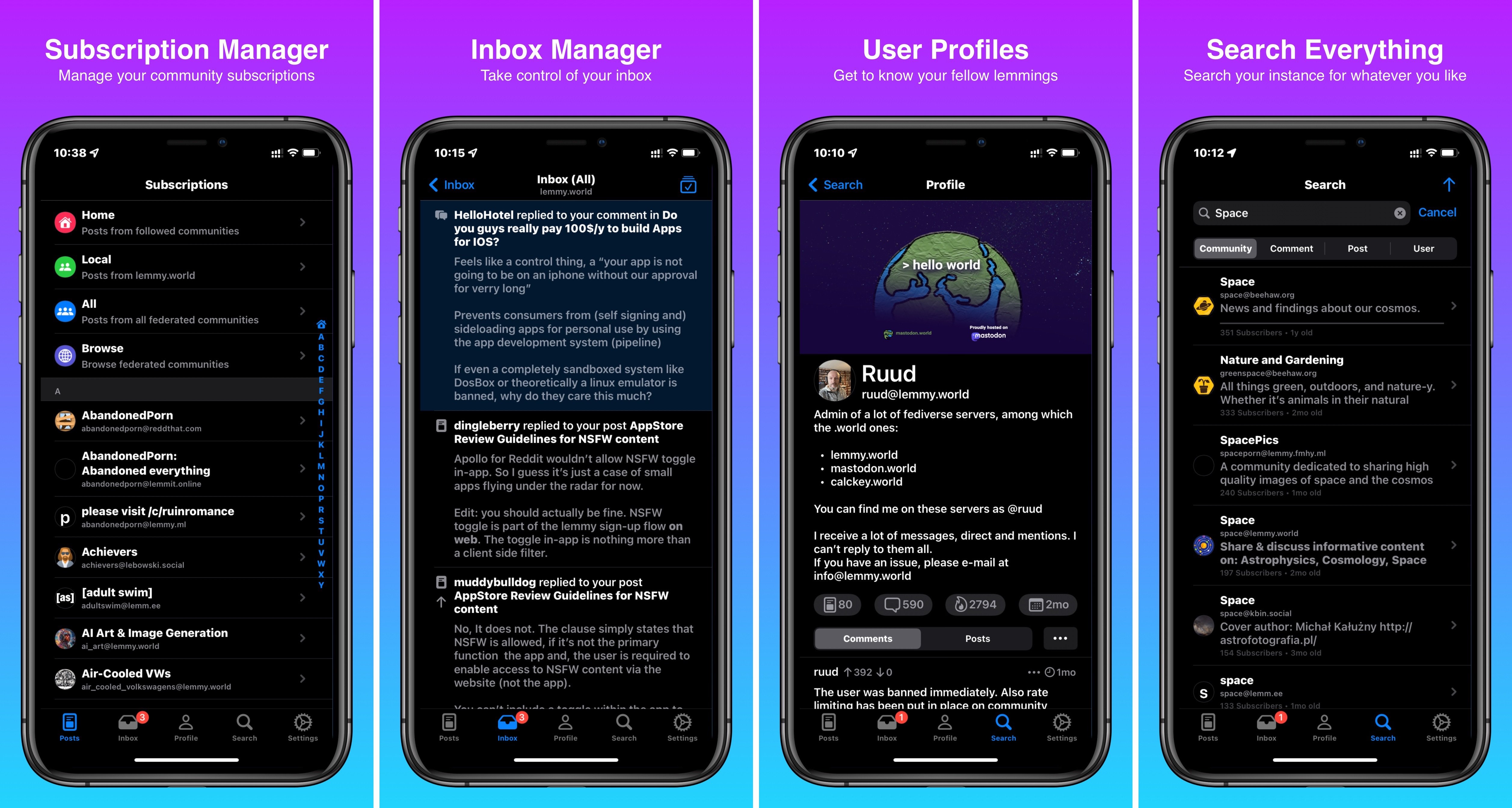
- Search (URLs, communities, comments, posts, users)
- Rich link previews
- Uploading images
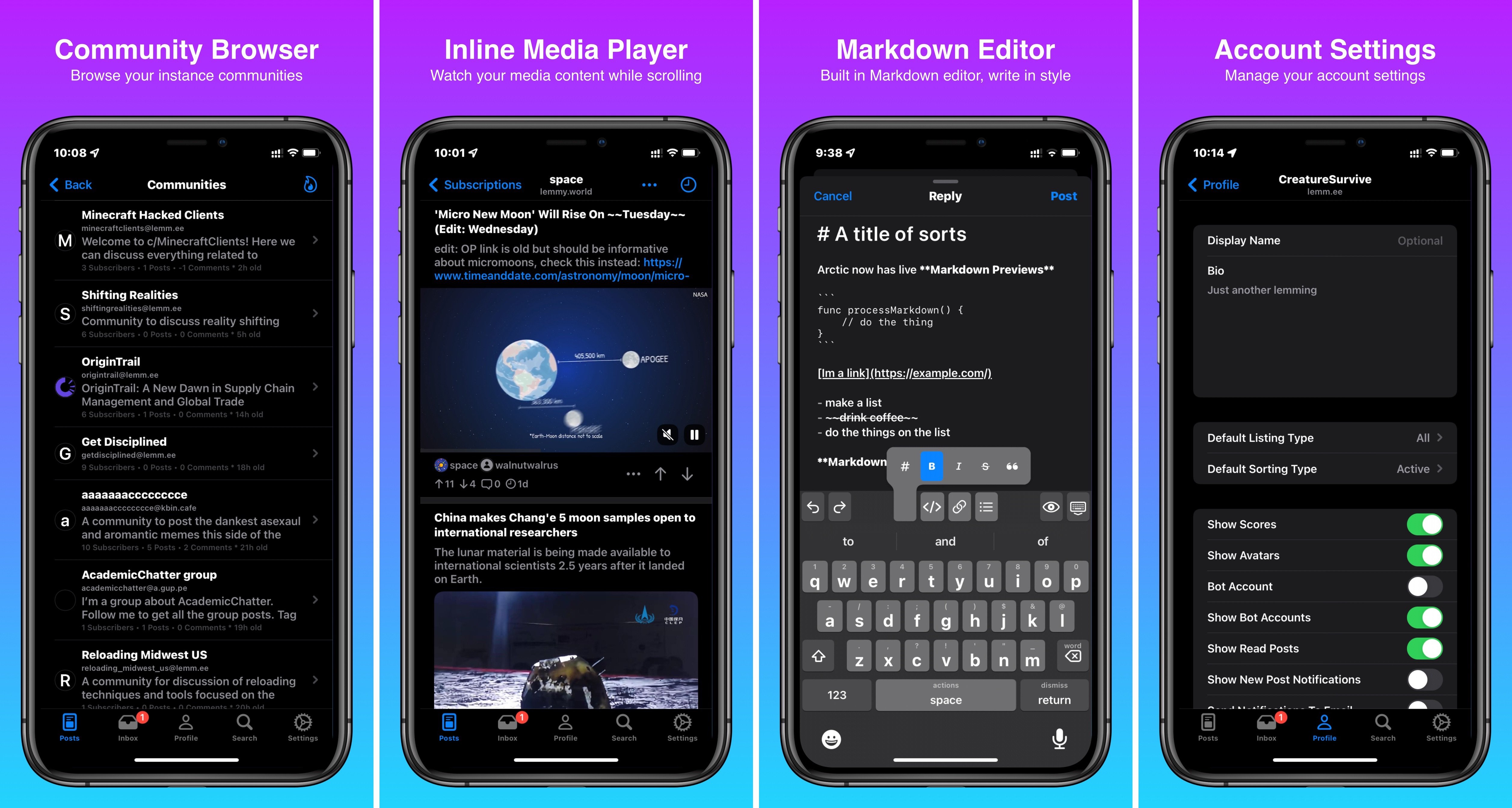
- Rich Markdown Editor
- Community browser
- Basic guest (anonymous) mode
- Multiple accounts, and quick switcher
- Integrated Media Viewer
- Upload manager manage previous media uploads)
- In-line YouTube videos (experimental, this seems to have broken with recent changes to the YouTube api)
Known Issues:
- Some in-line links do not recognize taps, I’m looking into overhauling the Markdown rendering and may be switching to swift UI for this, as it is better suited for that task instead of UIKit
- State Sync, The UI does not update in all cases to reflect changes such as voting on a post, and then viewing it in the post feed
- Some media fails to load and is unhandled by the UI
- Scrolling performance needs improvement
- Long usernames/community names can overlap action buttons
- Fast scrolling can result in user/community icons showing in the wrong cell
- Videos do not display in image gallery previews
- YouTube videos fail to load at times
- No spoiler support at the moment
- No in-line images Yet
- Private Messages are not currently supported, they will be coming soon
Previews


Awesome! Looking forward to testing them out! Will definitely submit bug reports and provide feedback as needed. Thanks for the awesome app!
Side note: any plans to add a view new comments tab (like in the web UI). When watching some of the less active communities, it’s sometimes really nice to just see the last few comments of the day and just filter through them that way.
That’s great, I could really use some feedback on the mod tools. I’ve never been a moderator of anything big enough to have a workflow setup. So any input as to how you’d like to access and use these tools would be great.
My work schedule was just changed yesterday, so it may be Wednesday before I wrap up this next release, but I’ll do my best to have it out before then.
A comments feed is a great idea! I’ve noticed the feature in the web UI, but I never actually used it. That should be a relatively easy feature to implement. I’ll see about adding this in the next release. This current release has already taken longer that I had planned, and I’d like to get it out as soon as possible.
I’m thinking I will add this to the home feed similar to the web UI so you can swap between comments or posts.
Random question. Do you by chance know what the chat feature is in the comment section of posts? I just noticed it the other day, and was not exactly sure what it did. I noticed it changed the sorting of comments, but it doesn’t appear to be a sort option.
[edit] never mind, I checked the source, and I see that the chat feature disables hierarchical comments, so the sorting options are absolute.
Awesome, would be happy to provide feedback. Might also be worth your time to set up a test community somewhere and just use that to make some test posts / comments and see how the mod tools work around them. Would be awesome if I could customize swipe actions and put mod tools on them. Since your swipes in this app open a drawer, you could probably put more than 2 actions per side and just make it so the outermost one is always the action for a long swipe. You would one-up the web interface if I could moderate comments from the comments list (discussed earlier) without having to click into a post and find the comment. Even better if I can do it from the search results (which the web UI also doesn’t allow).
Lastly, mods can see deleted posts so it would be awesome if you had an icon that said “removed by mod” or “removed by admin” that I could see so I can know I should just ignore it. Right now if I tap on a deleted post, I get an error when the app tries to mark it as read on the server.
Great! I did actually set up a test community so I could verify that all the mod tools are working. I wouldn’t want to release them without some internal testing. So everything should be working as intended when the update comes out. I think the real feedback I’ll need is more around the workflow.
Currently I have it setup so you can only access mod tools when browsing one of your communities or posts in your community. This is simply due to the fact that moderator lists are not provided with the api results of feed requests. However, there is no reason I couldn’t cache a list of modded communities when launching the app. So I could definitely make these available in the main feed, and search results.
As for swipe actions, personally I’m not a huge fan of the drawer style, I just haven’t had the opportunity to implement custom swipe actions just yet, though with your comment, I may get community feedback before I decide to change them. I definitely intend on adding the ability to customize swipe actions in the future. Currently the mod tools are accessible on any post/comment through the long-press/… action menu.
When it comes to deleted posts/comments, Lemmy really does not provide any information on these, just a simple Boolean indicating it was deleted/removed but no way to find if it was the user/ a mod/ or an admin who deleted it. I’ll have to double check this, perhaps I overlooked something. So for now I simply state removed by creator. I was however unaware that mods could see deleted/removed content, so I’ll have to test this further. As for the error, I’ll add some checks where applicable to properly indicate the content was deleted.
That’s good to hear, I’m not a huge fan of the drawer style either haha! It would probably make it easier to implement having more the two options per direction than swiping… though an app with a short medium and long swipe option would certainly be a good idea. I guess you could always have a toggle switch that would enable different modes: drawer style, 3 option swiping and then config options for each to assign actions.
I think the only thing the web UI differentiates if if something was deleted by a mod/admin and if it was removed by the content creator. It’d probably be tough to find out if it were a mod vs an admin removal as the only place I’m aware of that information is in the modlog.