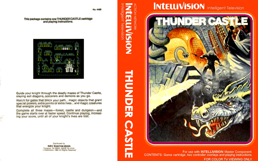
I really liked this cover for Thunder Castle. Never even heard of the game but this is the type of fantasy art I crave. Gameplay doesnt look too bad either!

I really liked this cover for Thunder Castle. Never even heard of the game but this is the type of fantasy art I crave. Gameplay doesnt look too bad either!

I was thinking the same thing, how annoying
There was room for a row at the bottom too that wouldn’t block the middle area view, I don’t know css extremely well but I figured they could put that row horizontal down there without much hassle and give a better view. Of course then you don’t get reminded to click on a social link, ugh.