I am a enjoyer of art but no critic. I very much like this style and I think you are well in your way. For me I actually preferred the image more when it was darker. I liked that the vibrancy was toned down and made me want to look closer and see the brush work and made me want to sit and stare and think. Great first outing.
On one hand it’s an amazing piece in both the dark and the light versions, on the other the bottom right side sort of loses something in the darker version. I feel like the minor difference adds something, even if it doesn’t draw the eye as much as the top half.
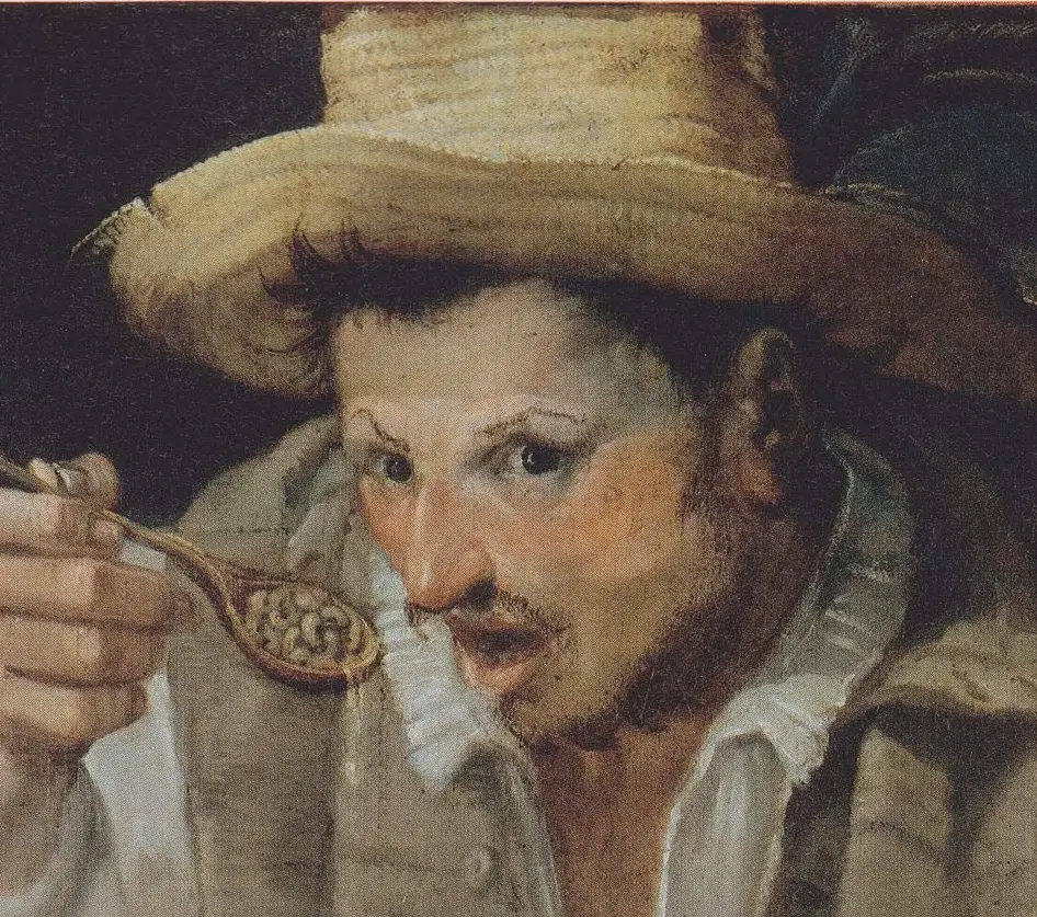
That image got really dark when I uploaded it, here’s a screenshot of it for better colors
I am a enjoyer of art but no critic. I very much like this style and I think you are well in your way. For me I actually preferred the image more when it was darker. I liked that the vibrancy was toned down and made me want to look closer and see the brush work and made me want to sit and stare and think. Great first outing.
On one hand it’s an amazing piece in both the dark and the light versions, on the other the bottom right side sort of loses something in the darker version. I feel like the minor difference adds something, even if it doesn’t draw the eye as much as the top half.
Hahaha I made my post before I saw this.
Looks much better