Here are some proposed graphics.

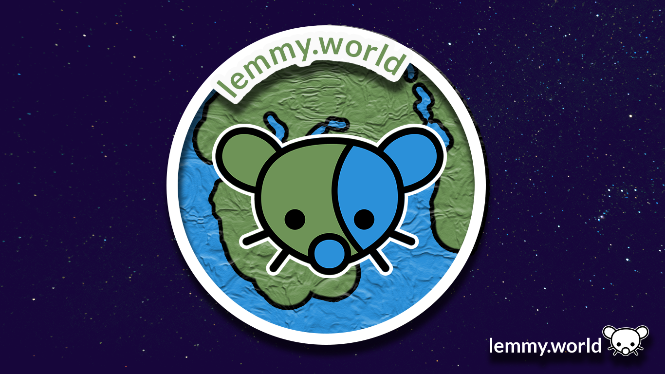



EDIT: I’ve now made a repository on GitHub, so that you can download the graphics and use them for your communities and projects. There’s even an Etsy store selling stickers now.
Here are some proposed graphics.


EDIT: I’ve now made a repository on GitHub, so that you can download the graphics and use them for your communities and projects. There’s even an Etsy store selling stickers now.
I like #1 and #2 for the banner but the globe should be different colors than the mouse. It makes them too hard to distinguish and the image looks cluttered
Maybe like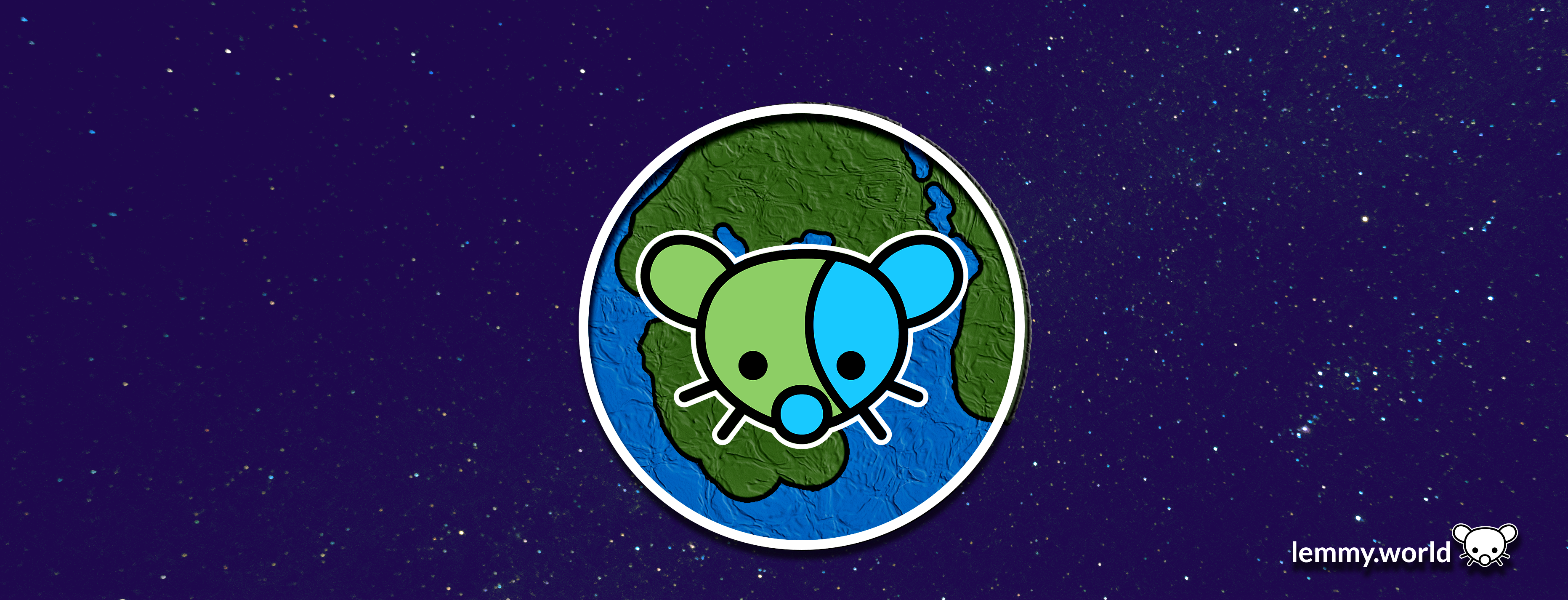
Edit: actually would be nice with a shadow on the mouse too, like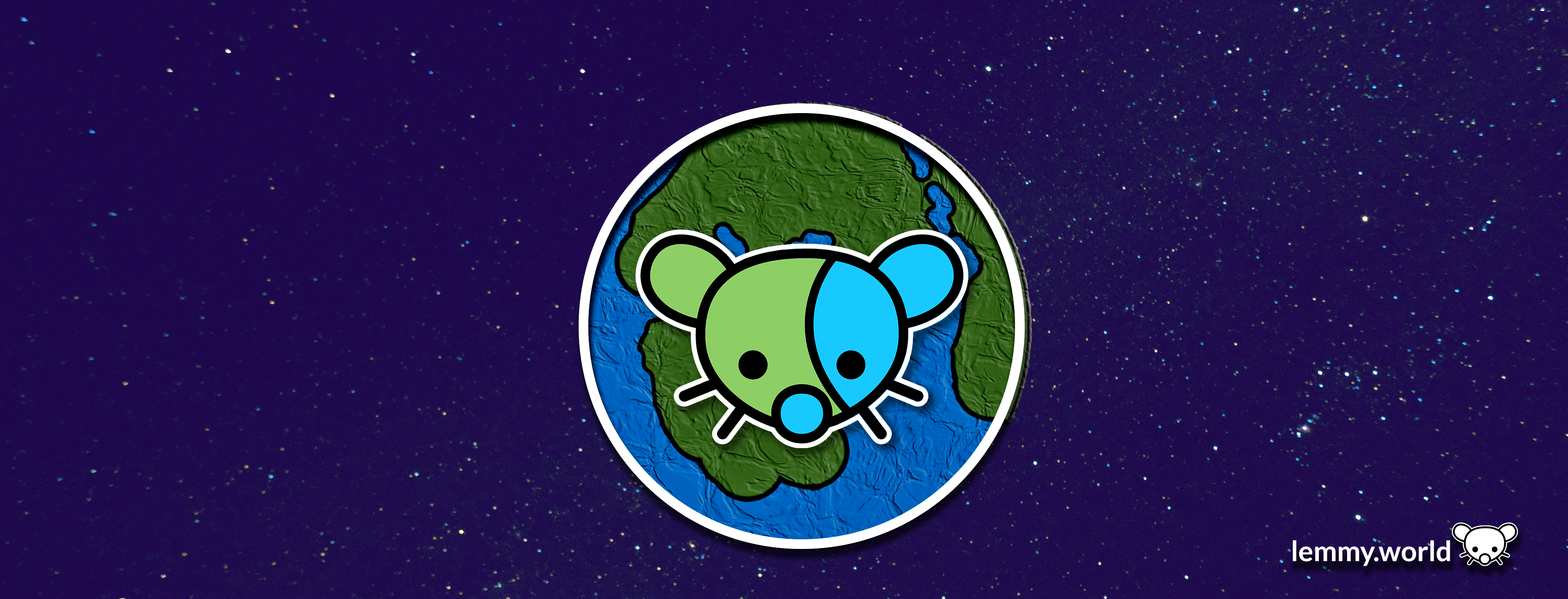
Yes, that looks great! Having slightly different colours makes a big difference