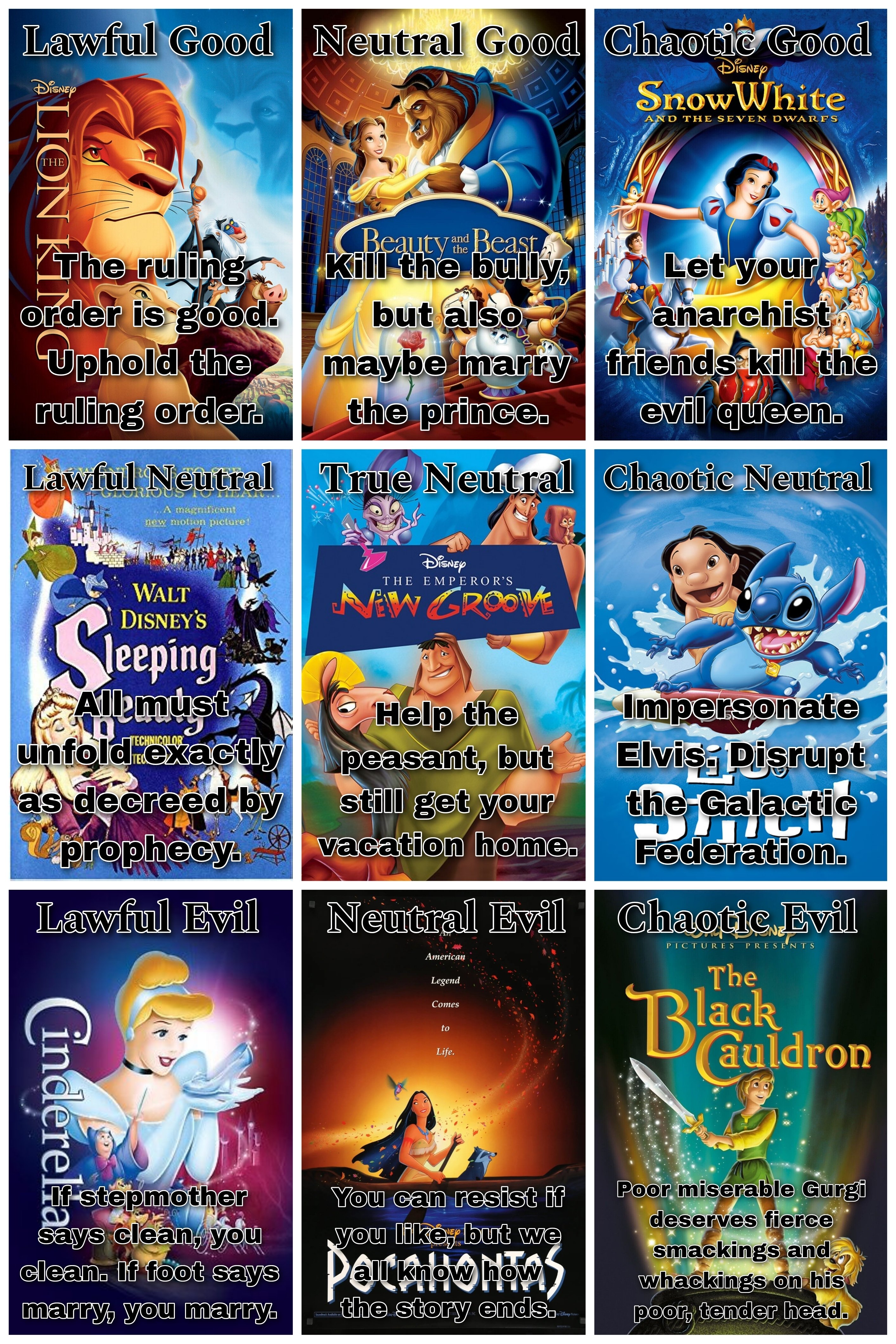
@GraniteM to Dungeons and Dragons - Memes and Comics • 1 year agoIf Disney Movies were on the alignment chartimagemessage-square25arrow-up1164arrow-down116file-text
arrow-up1148arrow-down1imageIf Disney Movies were on the alignment chart@GraniteM to Dungeons and Dragons - Memes and Comics • 1 year agomessage-square25file-text
minus-square@Axiochuslink30•1 year agoJesus that font color makes it super tough to read, at least on mobile.
minus-squarekamihekulinkfedilink6•1 year agoThe idea is solid (black with white stroke), but yeah, maybe the stroke could be thicker.
minus-square@Viking_Hippielink2•1 year ago black with white stroke I wouldn’t say I had a STROKE exactly, but yeah I’m melanin-challenged and had some difficulty reading it 😛
minus-square@GraniteMOPlink2•1 year agoYeah, I wasn’t super happy with that myself, but I didn’t want to mess with the movie posters too much more. I tried adding a drop shadow, but maybe that could have been darker.
Jesus that font color makes it super tough to read, at least on mobile.
The idea is solid (black with white stroke), but yeah, maybe the stroke could be thicker.
I wouldn’t say I had a STROKE exactly, but yeah I’m melanin-challenged and had some difficulty reading it 😛
Yeah, I wasn’t super happy with that myself, but I didn’t want to mess with the movie posters too much more. I tried adding a drop shadow, but maybe that could have been darker.
In the end we got to read it, no worries ☺️ good meme