Key points
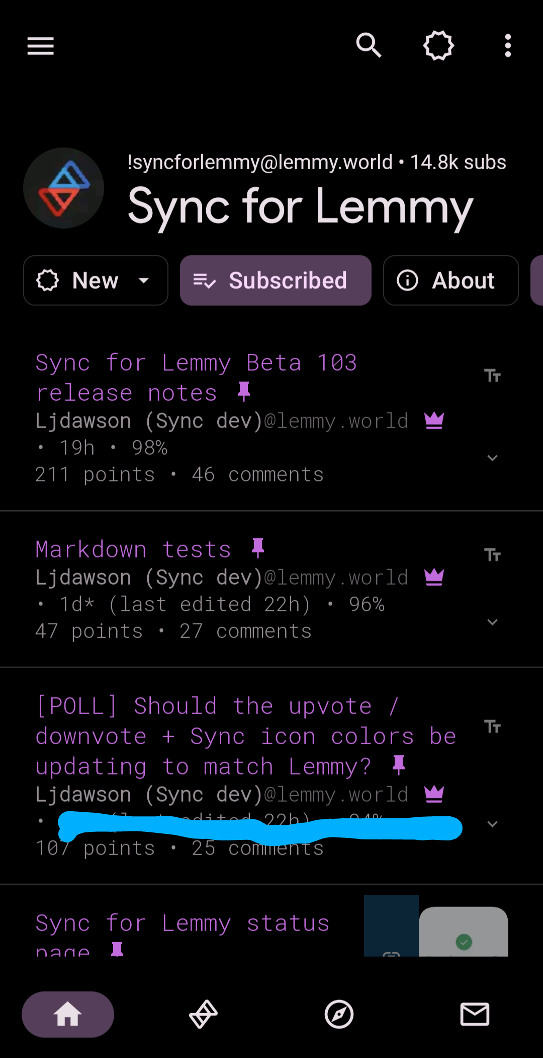
- Updated the Sync logo to match the Lemmy voting colors
- Updated editing posts to match the submit post screen including editing titles etc
New
- Added the option to customize the voting colors
- Added controversial sort to user profiles and searches
Github issues closed
- RedGifs unable to load #474
- Unable to edit post tile when editing post #471
- When editing a Post, it’s not giving an option to edit the Post Title #298
- Post Editing doesn’t let you change anything except text #297
- Can’t edit posts for community I mod #456
- Sync crashes when viewing this posts comments #464
- Network Error notification spam #453
- Clicking the “Instances” button returns the error “Could not load communities.” #469
- Random NSFW Button Loading Perpetually #467


Oh, you must have missed the whole conversation here: https://lemmy.world/post/12922184
There was a whole thing about it. This is how Lemmy itself does it, so Sync changed to match.
Edit to add:
Oh that’s weird (that Lemmy is reversed I mean). I guess I can just customize them back so no big deal. I kept getting confused thinking I accidentally downvoted stuff.
That’s fair, and why there’s the option included to change the colors back 😁
Took me a min to get used to, since I don’t really use the web ui much, but I like the colors and it makes more sense to me to follow the colors that actually match the rest of this platform instead of that other one.
I agree that consistency is good, so the change is probably for the better. For me though, the old way makes more sense when considering the nature of the platform: orange for “hot” and blue for “cold”. Plays better into the sorting algorithm of the frontpage for me.