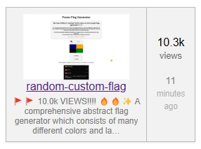
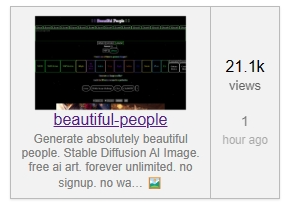
So as the Dev say that enough details and specific keywords on descriptions could help generators easier to find as people type many different keywords related to the generator, but descriptions like that doesn’t look so pretty when the generator is shown in the generators page, as it is trimmed midway.


Now, since I prioritize my generators to look cool in generators with a fairly short description in the card while also being easily discoverable with a lot of keywords, what if we could set both the description that appears in generators (and make it short) and the description that appears when the generator is shared outside or appears in search results (and make it long and descriptive)?


totally agree. I had thought an alternative suggestion is to have the description length on the generators page match google’s 160ish. But really BluePower’s suggestion is, I believe, the ideal, since words used for SEO are not necessarily how I or others want our generators to be seen by real people. I would have a much prettier description if it didn’t hurt SEO.
adding a @[email protected] because this is a good suggestion. tho @[email protected] Comments seem higher priority because they are slightly broken for many people across Perchance right now (details in the comments post).
Great suggestion! While we are at it , I’d like some $meta options for the “perchance screenshot” of the generator.
For me specifically , either;
to include a $meta image link to use as the “perchance screenshot” , or
to include a $meta setting for how far down to scroll before taking the “screenshot” of the generator