
https://gitlab.com/sxwpb/minimal-tux-icons
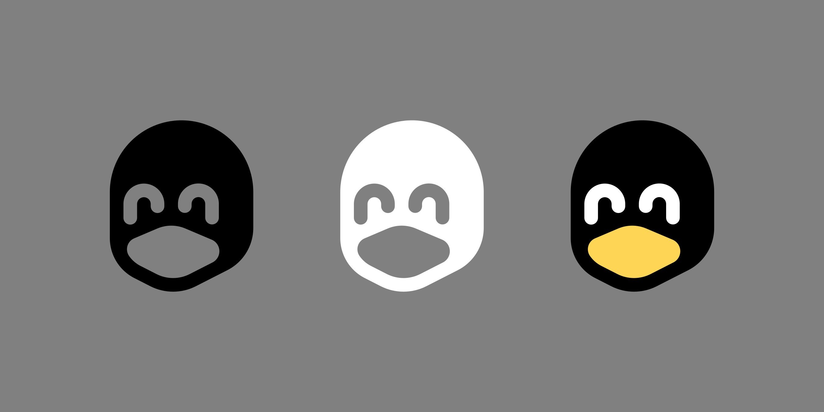
These are only meant to help for cases where the full tux is too detailed to display, see examples in the linked README. But the shape also works well for single fill cases, like in the keychain example. I wouldn’t want these to be used when the full tux could be displayed in all its glory instead.
One issue I have is I do not know how to license these properly, I wouldn’t want them to show up in a trademarked logo or anything, but I would still want them to be freely usable as tux icons anywhere. What do you think?
I have chosen the CC BY-SA 4.0 license, thank you for helping me!
I think these either need the beak to be a bit irregularly shaped or needs a black line inside the beak to make it more clear this isn’t just a big hole in the face but an actual bird beak.
But other than that its great! And that’s of course just my personal opinion, you do you!
I personally think it looks fine, seems to look like a happy penguin to me
the middle one llok like a robber mask
i did go overkill with the simplification, so its easy to see other things. but at small sizes i feel it works better.

deleted by creator
I need the colored one as a sticker to cover that weird square thingy on my super keys.
Ooh now I need that too.
Why can’t those scummy forum scraper bots work in my favor?Imma try and make a 3d print out for my laptop to replace the keycap
Obigatory

OP should make an extended forehead alt icon pack in this image’s honor
OMAHA
Why is the white one happiest? Shit, am I a racist?
The black one has open o_o eyes but the white one has closed _ eyes
I can’t find it, but I have seen a video where a designer talked about how you can’t just invert your monochromatic logo to make it white-on-black. There’s an effect that will make several aspects of the logo feel very differently, even though it’s just inverted.
they won’t stop me… (e: /s)
You will live in fear that one day when you come home, you’ll find him sitting in your chair, patiently waiting for his revenge.
xD
Yeah, there must be something subjective going on because they all look the same to me. They all look like closed happy eyes to me.
I think you’re absolutely right… perhaps something with the effect of lighter compared to the rest = open vs darker compared to the rest = closed.
I think it’s also magnified by the fact that we’re comparing to the full color one on the right which has the lighter color for (in my perception) open eyes.
Yeah I think the black part tricks your brain into thinking “those are pupils”, and the eyes go from smiley shut ones to normal open ones.
Yeah exactly.
Creative Commons is exactly the tool you need for licensing; they even have a “build-your-own” customized license tool. The tool will generate an icon, text, and a link to easily understandable legalese for your license.
CC is like GPL (but more flexible) for art, and it’s an awesome service.
thank you, the build-your-own thing is great, i have chosen the CC BY-SA 4.0.
I’m no expert, but would CC BY-SA do the trick?
Those look nice!
Have you considered a Creative Commons license, maybe with the BY-SA (Attribution-ShareAlike) terms?
thank you for pointing me to this, i have choosen this license and added it.
thank you also @[email protected]
This logo feels unbalanced, I don’t have enough experience to say what is wrong, but it feels wrong.
Thanks for sharing. Maybe I will fork it and make it better.
Two issues I notice:
The beak looks like a wide open mouth. It does not look like a beak.
The middle icon colour scheme makes it look like it has a different expression to the other icons, like one of those squinting/extremely pleased anime faces. The expressions should match regardless of colour scheme.
I agree. Its cute but i think it lacks essential details. The monochrome versions don’t look penguin enough.
Yeah, the colored version is pretty good but the monochrome needs something to make the beak a beak.
Oh dude this is really awesome. Fresh.
thankyou! btw, since you’re a billion dollar corp can you send me a check? cheers
LoL I’m not. Just an early Lemmy user with weird taste
aw ok… you never know ig heh
Why is the white one wobbling?!?
Maybe you should go lay down
What?
I don’t know why but like I swear it looks like the white one wobbles when on my phone screen.
I notice the same effect.
One of you show me your phone, I don’t see it.
📱
No such effect for me. Some cheap Samsung AMOLED here.
I LOVE these! Great work!
I love Pingu.
I love Tux and these icons!
I now I also know how it’s skull looks like :P
Honestly I hope any of these variations replace the old logo. Looks great OP! Thanks for sharing
hell no, full tux is the best, these are just simplified icons. but thanks for the compliment!!
No problem stranger 👈😎 lmao
The middle one reminds me of Elan from The Order of the Stick


