For what i heard, a lot of people on the Linux community use Krita for image manipulation, even though, it’s intended for digital painting, and GIMP is the one intended for image manipulation, because people don’t like the GIMP’s UI.
My issue is, i never understood why they don’t like the GIMP’s UI, since i never have issues with it,(Although it’s probably because i’m used to the UI) so i need to adress this problem and ask you What does the GIMP UI has that you don’t like or hate so much and why you like Krita’s UI over GIMP’s?
Before you event comment your answer i need to ask you to do the following:
-
Address each specific issue along with an concise and direct explanation of why you don’t like it
-
Answers such as “I just don’t like it”, “I don’t like where it’s placed” or anything alike doesn’t count as “Concise and Direct”, we are adults, not 4 year old children.
-
If you can provide a suggestion of how GIMP’s UI can be improved, it would help a lot, and maybe this issue can be solved.
-
If someone else commented something you were about to comment, upvote them, this way we can address the most common issues effectively.
-
I need you to watch the screenshots of both UI’s, because something that most people don’t know, it’s how similar Krita and GIMP’s UIs are.
Krita’s UI

GIMP’s UI
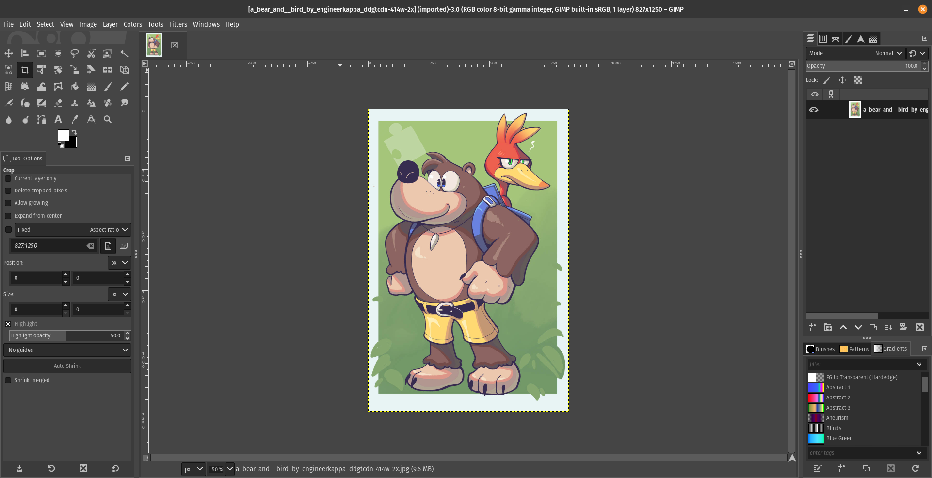
(Credits to a friend of mine for lettig me use the screenshots.)
My ideas on how GIMP can improve it’s UI
-
Adding the option of the new UI selected by default, but with the possibility to switch to the new UI.
-
Possibly addding “work spaces” like Krita would help too, along with the possibility of exporting and importing them, this way people can have custom arrangements of the UI according to the kind of work they will do.
Thanks for reading and hopefully we can address this issue effectively.
Now admittedly I’m not someone who often uses drawing programs, but my biggest issue in GIMP is that I never seem to be able to find what I’m looking for.
In the two images you posted you can actually see an example of such a case. In Krita all the tools (or whatever you’d call them) in the bar on the left are ordered in a logical way, and separate types of tools are also visually separated by separator lines. The bar with tools is also only 2 icons wide, which makes scanning for the right tool a bit easier, since you can mostly just scan along the vertical axis. In GIMP it’s just a pile of low contrast icons in seemingly random order. Unless you’ve used it enough to know the order, you’re gonna have to do a lot more searching. And searching will be way harder since you’ll have to search horizontally and vertically.
It’s like reading a website where the text is taking the whole with of the screen and without paragraphs (GIMP) vs reading a website where the line length is constrained, the text is horizontally centered, and there are proper paragraphs.
I feel like this example reflects my personal experience with both. I’ve used quite a few different types of image editing programs, and with most of them I can fairly easily find the stuff I need. Using GIMP however, I used to be quite lost. Nowadays it’s gotten better because the windows are not all floating around and I’ve used it more. But still, I only found Krita after using a fair bit of GIMP, and yet I felt instantly more at home because the UI was easier to navigate.
Edit: That being said, GIMP is a very cool program. I don’t want to hate on it too much. It’s helped me countless times. The UI has already improved a lot since the floaty window days, and I hope that continues.
For me all the things you said about GIMP, but my biggest issue is how layers work in it. It is totally unintuitive to me. Last week I tried to edit some simple image in GIMP, basically pasting some small objects and touching them up. I couldn’t get it to work properly, and would probably have redone it in Photoshop if it was to be used by more than three people for a short period.
Changing icons to color helps me find which ones I’m looking for. Seems weird it defaults to it looking like they’re greyed out because they won’t work on the current selection.
Dude, you can put the tools on the same way as Krita, just look at this
you can
That’s the key. can. It needs to not suck by default. If people have to tweak the program to be usable first then nobody’s going to want to use your program.
The deal is, it’s not mine, it’s a Libre Software, so it belongs to everyone, not just me.
That’s cool. I’m not going to fix software I don’t like.
no one asked you to?
Can, but not by default. The default setup is what leaves an impression on most users. Most users opening GIMP for the first time expect to be able to find stuff that they need, not have to first spend a lot of time getting familiar with all of its options. It shouldn’t be needed to first spend time opening all the sane default windows and re-aliging stuff every time you boot it for the first time. At least, that shouldn’t be the case of GIMP wants to be as popular with non-technical users like Krita is.
Also, the tool bar still doesn’t have the nice separations between tool functions, and it still feel a bit more chaotic. Not sure of it’s the icons or the order.
I hate it when people are SO quick to judge and so superficial
You call it “quick to judge and superficial”, but imo that’s the wrong attitude. Every tool we use as humans should be designed to be as intuitive as possible. It makes it easiest for people to learn how to use a new tool. That doesn’t mean that a tool cannot be complex or customizable, but the default experience should make it easy for new users to quickly achieve something. Once they grow accustomed to the tool they can tailor it their own way.
No tool has to do this, but if it wants to be widely used then this is kinda necessary.
There’s a reason why there are whole fields of study into human media interaction, and why software companies hire UI designers. Everything that doesn’t have to be explained in words and text because it is intuitive saves mental overhead for the user and makes the application more accessible.
It’s not what the buttons look like, it’s what they do. In Krita, making an ellipse involves clicking the ellipse button and dragging it somewhere. You now have an ellipse, and you hold shift if you want to make it a circle instead.
In GIMP there is no direct ellipse tool, there’s only an ellipse select tool, likewise you hold shift to make it a circle. Then you use a menu item to select the border of your selection, getting a popup to let you determine how much pixels you want. And then, you use the fill tool or fill menu item to fill it. That’s a surprising amount of clicks to accomplish what’s most likely the single most common task for anyone opening a screenshot in an image editor. I’m not aware of any easier/faster method to do it. Feels like it should exist, but this is also what you get if you search for how to draw a circle in GIMP, so if it exists everyone’s missing it.
GIMP’s method gives you more power, but you rarely ever need that power. But when you do, Krita also has ellipse select, border select and various fill tools that can be strung together in the same way.
Small comment on that: after I discovered greenshot on windows, I have never needed to open the screenshot again to edit it, because it already does all these simple tasks right after taking a screenshot.
Hm, yeah, i never used the Elipse tool, i guess yeah, that should give the advance settings as an option, but going simple should be first, wish we could reach out the devs, but it’s not an easy task. :/
I’m just looking through this entire thread, and call me crazy, OP, but you seem angry not more people are using GIMP. You’re quite aggressive about it, attempting to shut down legitimate UI and UX concerns at every corner, and it is genuinely fatiguing to see.
Just saying, using Krita for Image Manipulation it’s like using a Driller to cut wood, that’s the wrong tool for the job.
If it works for them, then it’s not the wrong tool for the job.
No, that’s like cutting wood with a kitchen knife
In your opinion, sure.
Bruh, Even the Krita devs themselves say that Krita is made for Digital Painting
I don’t care.
UI is dated, for one.
range inputs can’t be scrolled, dragged around the screen, and are absurdly small on high DPI screens.
There’s a load of UX issues, such as how pasting content will create a new layer that is for some reason more limited than a typical layer.
Feature discoverability is poor. Most features are buried in years-old dropdown tabs that aren’t kept up to date with UI/UX expectations.
Some features are incredibly obtuse in how they explain themselves: selecting a brush dynamic selects stuff from a massive scrolling list with nothing but a title to explain what they do.
UI is inconsistent. Some elements are clearly older than others even after ““recent”” (years-old) updates.
There’s way more, btw. But honestly if this years-long push to get GIMP to GTK 3 has told me anything, it’s that the project should’ve canned the update years ago and written an entirely new app from scratch, dropping the technical debt, the archaic choice of language and UI toolkit, and they still would’ve come out with a new version faster than they have now.
How would writing an entire program be faster than upgrading an already fully functioning one ? I don’t see the logic ?
Because the underlying dependencies of GIMP changed a lot, especially between GTK2 and GTK3. It pulls resources from writing code to figuring out how to migrate code to a new version, usually as changes in the toolkit mean you may have to rewrite stuff anyway, which can mean more bugs or regressions in functionality which must be addressed.
Writing from scratch, you can write code that immediately fulfills the spec you’re working to (They could’ve even skipped straight to GTK4!) and used the old code as a reference of what’s needed for users whilst throwing out anything and everything else that isn’t strictly necessary.
It allows you to throw out old features and code that you had to work with in the past, but may not actually be used by anyone. If it WAS needed, it can be added later.
Most importantly, there’s little to no expectation that the new app will supersede the old one immediately, whereas during a toolkit migration you need to keep everything working for every release you do.
It’s like how building a new house can be faster than renovating an old historically-protected building to the same regulatory standard. There’s red tape, you have to work around old masonry and brickwork, you have to avoid damaging the building and keep its appearance the same. A new house may be different in looks and miss the old charm or familiarity, but it’ll be built faster, cheaper, and for the same price have more features to the old building.
I see ! couldn’t development be done in a separate branch with no expectation of an immediate release ?
Probably in a similar way to how USA and Canada are stuck with a two party government system and any attempts to remedy that haven’t been working out, but maybe if the country collapses under its own stupidity and the ultra wealthy run off with all the resources then the remaining people can struggle to survive with nothing left and die then… Oh wait…
You seem to have a pretty big monitor. Try it on a 13” laptop and you’ll see why it’s harder to use.
You can press the TAB button to temporarily hide all menus. It helps when working on small screens.
Which isn’t as easy as having the tools right there.
You can click the tool, configure it, then hit tab to work on the image. Then tab again to click on the new tool, tab, work on the image. It’s a nice and simple workflow. I don’t know what to tell you, it’s not rocket surgery. I mean, you’re the one trying to do image work on a tiny ass screen. I’m giving you a neat trick that worked perfectly for me. Sorry it is not good enough for you, I guess.
I hear you. And I use that for many situations. All I’m saying is most complaints likely come from users with small screens and the fact that the default tool setup is so large makes it hard.
I can never put my finger on why I don’t stick with GIMP. I install it on every machine I own, and occasionally use it to open a file and export to another file format.
From time to time, I tell myself I will finally sit down and just only use GIMP. Finally learn the tool. Envitably I find myself googling to find every tool, and then I will come across something simple, like making a red rectangle, and I end up having to google how to do it, and then get frustrated that I can’t just draw a box and quit.
There are probably legit reasons for the decisions, but if it kills my workflow, I can’t afford to use it.
Doesn’t mean Krita will do the job for you either.
That’s correct. But I don’t remember if I said it would or not.
The Krita devs themselves said it, it is intended for Digital Painting
I’m confused. My post is about my experience with GIMP. What does Krita have to do with what I posted?
As others have mentioned, it’s simple things takes alot time finding/figuring out.
I use GIMP within Ubuntu MATE few times a week to edit pictures. Simple edits nothing major.
One of the thing I need regularly is to highlight certain part of the picture.
Now in Microsoft Paint I can draw a rectangle, choose its border thickness, and color in 2 seconds.
I have learned how to do the same in GIMP few times but it took alot of time and I still forgets after few weeks.
So now I just reboot the PC and log into Windows or use Windows virtual machine and draw rectangle in 2 seconds in Microsoft Paint.
Mine is extremely simple use case, so I can only guess how difficult or how time consuming it would be for actual professional to create artistic work in GIMP vs Photoshop (or in similar commercial software).
Just my 2 cents.
I hope you’re joking about rebooting to Windows for paint 😁
But just in case, and for the benefit of others: KolourPaint
It’s basically KDE Paint, and works great as a simple image editor
Yeah i agree, it’s even available as Flatpak which makes it even better.
This sounds a lot like how people would use windows paint for simple things over photoshop. Many folks just want a simplified tool. I was estatic to find out firefox now gives simple pdf editing capabilities instead of me importing it into libre office draw.
I guess i am so used to the layout i barely have a problem, but finding things in GIMP, isn’t it the same as Photoshop? I mean, maybe not for Krita, but in GIMP you can change the settings so the tools are all visible instead of being on little boxes.
Im not sure but im guessing most people complain because they want something intuitive and easy although my wife uses photoshop and I could not get her to use gimp so the layout must be different to some degree.
You can modify the UI to make it look like Photoshop, there are two ways for this:
-
Making GIMP look like Photoshop CC 2020 by Davis Media Design https://youtu.be/dY7g2JGyJeQ?si=AQ3uYQxHb7uG0xd3
-
Installing the PhotoGIMP addon for GIMP, also by Davis Media Design https://youtu.be/57DNUsf4A-0?si=XSCZhf_6rf4k25qx
I would personally recommend the first one, but it’s up to you.
thing is I don’t use photoshop. my wife does. its hard to explain her personality but im not using any convincing chips on this particular battle as we have more important things to get handled. Maybe someday.
Well, here’s one final advice from my part.
Go slow and gradual
Changes are not easy, you need to get hang of GIMP before makig the switch, try it, learn to use it, see if you like it.
Another alternative is Photopea, but it’s propietary and it’s a browser application, although it’s available in Flathub.
-
The default toolbox placement is should be conform with other design software.
Sure, people can figure it out once they tried it, but majority of them will move to another software that has familiar experience out of the box.
When people asking me to install GIMP, I always change it to this layout, making it more familiar to another software like Inkscape, Krita, Affinity suites, Photoshop (and other Adobe software), etc.
Maybe i am very used to the default layout, it would be also good that people would watch this video, it would help them a lot.
Average people will simply search app that has the most familiarity, so “looking for additional workaround” is often irrelevant.
God damn it i hate when people are lazy and quick to judge.
Here is an alternative Piped link(s):
https://www.piped.video/watch?v=dY7g2JGyJeQ
Piped is a privacy-respecting open-source alternative frontend to YouTube.
I’m open-source; check me out at GitHub.
GIMP feels non-intuitive sometimes.
For example, layers.
I expect that GIMP internally has a list of all objects that I added to the file. Like, text, brush drawings, pasted images. Instead, I cannot find that list anywhere.
That list is either the undo-menu or the layers themselves, as everything you do in GIMP is somewhat destructive. This behavior will be changed in GIMP 3 tho.
Yeah, good to know. today I learned …
I remember when i first started using GIMP the thing that threw me the most was that there was no ‘safe default’ state that you could get to by pressing escape, like ‘select’ is for other programs.
If you think this is a small thing consider that escape/back is one of the only 3 default controls on phone UIs. It’s super important and Gimp doesn’t have it.
I have not used either, but I can say that Krita’s UI is closer to Photoshop than GIMP’s appears to be. That might be why people are opting for that application, for the sense of familiarity if they were trained on Photoshop.
I will say that any application which is used for digital painting should also be good at image manipulation, so if Krita does both well, I can see why it would be preferred over GIMP if the painting tools are lacking.
Looking over the screenshots, for GIMP, I am hoping that is not the default layout of tools. Having a jumbled block of icons is a lot harder to visually parse than a stack of pairs. I also find myself wondering why they use up so much space on the left to include a weird cutout of their mascot above the tools.
On the right, I am also not sure why the layer thumbnails are pushed so far to the right when they could be immediately adjacent to the visibility toggle.
It doesn’t look terrible to me, but I am not surprised that people using an app for visual design might be more critical of design flaws in the app itself.
Krita lacks a lot of tools to work with photography. It’s OK with general image manipulation but you have to really struggle to do anything that’s not digital painting.
That said. The left side of GIMP is wide because the tool options are under the tool’s icons. While Krita has them on the top as a bar.
Both programs let you move and change the layout to whatever you want, though. No one serious about using either program uses the default. There’s a bunch of stuff you don’t need to use that only takes up space when you’re just doing one particular task. Hence why saving and reloading layouts is such a powerful feature.
EDIT: Here is, for example, my layout.
Also, the little logo on the corner has a purpose. It’s a small area where you can drag and drop any image file from your file explorer and it will automatically open the file for editing, instead of pasting it on the current open project as a new layer. It’s super useful.
That does look better.
For the drag and drop space, however, would a simple “Right Click > Open In” not be easier? Or just dragging the file over the application on the taskbar?
It’s there for convenience. Easy is a very subjective term in this context. Everyone has a different concept of what is easy on a computer. The fact that drag and drop has two, completely differentiated but equally instantly available verbs, is already above and beyond the amount of options other software packages offer.
You know you can change the UI and Keybinds to make it more alike to Photoshop, right?
Hey look, voilá, this is entirely possible

I have trouble with both, but more experience with GIMP. I can’t stand all the little tool buttons with no text. I want the name of each tool always visible on its button.
I have the same problem with Inkscape.
You know you can do this, right?

I don’t know what I should be noticing there. I can’t see any text for the tool buttons along the left edge of the window.
Look at the default GIMP layout and my post and compare it with the one i gave you
OK, I see some differences between your two screenshots, but what’s the relevance to my comment?
What i mean is, you can Rearrange the UI to look like Photoshop.
So . . . not relevant to my comment?
It doesn’t scale properly on my HiDPI laptop display, which I use at 200% scale (Plasma 6, Wayland). Some things are too big and others too small. Hopefully GIMP 3 will bring good scaling support with GTK 3. Still, I love GIMP and will continue to use it over any alternatives.
Same deal here. Text is too big, tool icons are just about right, brushes and patterns are microscopic.
This actually makes sense, have you tried reporting this to the devs?
It will be fixed in GIMP 3, the current stable release uses GTK 2 (doesn’t supoort Wayland natively).
Let’s hope so, i’m not a Linux user yet, but i am CRAVING for the day GIMP 3.0 launches at last, it’s a great software along with Krita, Blender, Kdenlive, Inkscape and Godot engine.
Every time I install gimp in an attempt to switch over, I find myself frustrated that the tools I commonly use on other programs are not either available by default or unintuitive enough that 20 minutes of looking through tools, tabs, and menus has not provided the results I went looking for.
I try every few years, or every major update, whichever happens first.
There are settings you can change to make the UI better for you, there’s even a tutorial made by Davis Media Design that teaches how to make GIMP look like Photoshop CC 2020, alternatively, you can install the PhotoGIMP addon.
This topic actually prompted me to google the answer to the one thing I had been looking for only to find that the answer is completely obtuse and kind of misleading, which is why I wasn’t able to find it on my own.