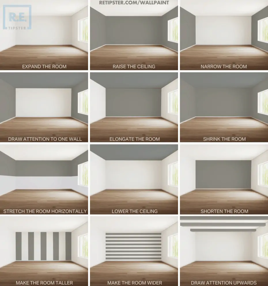
Am I dumb if these all just kinda look the same to me lol
The difference was more clear before this image was reposted to hell and back and got all blurry
Light interacts with colors and paint and will refract more or less accordingly. Because our eyes work through light capture, that’s how this concept works for us.
I might wage that unless you’re in said room it will be harder to realize this effect.
I would also say that this only effects perception and I guess a windowless room will need a lot of artificial light (just a guess though).
Pretty much look the same to me too, wonder if it is different in person.
No differences, none at all.
Would paint everything white for more friendly atmosphere, would hate to sit in a dark cave. That’s all I care about.
They are all the same, except that the color is different.
This is a marketing ploy by an interior decor site - it’s just make-believe. Colors can’t make things look bigger or smaller, as anyone who’s seen colors knows.
I don’t know if you are just trolling, but optical illusions are very real. Our brains are surprisingly easy to trick.
Our brains are surprisingly easy to trick.
For sure! But in this case the brain is being tricked because we benefit socially from going along with what higher status individuals say is true. This is the social illusion of marketing, not a perspective trick or an exploit in how the eye and brain process light.
I don’t think I would have known what each one was attempting to show without the explanation.
The one that says “shortening” actually looks longer to me - like a long tunnel going off into the dark.
Same here. The “stretching the space vertically” looks like it’s elongated it horizontally to me.
Maybe it depends on whether you think walls should be lighter colored or bot?
“How to use the bottom of that dark grey paint tin you’ve had in the cellar for ages”


