I really liked this artwork, is one of my favorite pieces of video game art.
The box art on the SNES game was a small portion of this:
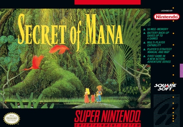
A while back, tried digging up a copy but couldn’t, spent a long time looking online and was delighted when I finally managed to dig the submitted image up: good-quality and high-resolution. Just remembered this community, and putting it up in case anyone else is in the same boat.
It looks like, from this YouTube video of the re-release’s title screen:
https://www.youtube.com/watch?v=upe2EzebE9I
…that they did some touch-up work before the re-release to improve sharpness, but they also lost the kind of texture that the original (I would assume) natural-media artwork had, which is part of what I like about the original.
deleted by creator
I dunno, there’s the 3 characters, some birds, the enormous Mana Tree; those are all in the game!
The art doesn’t look like this, but neither does the box/concept art in:
- any MGS game
- any Final Fantasy
- pretty much any NES, SNES, gameboy, Sega, or PC game from that era
Game art used to be a lot more like the illustrations that came with a book or hand-drawn movie posters: a supplement to the core media that gives you some additional visual cues.
Yeah, I was gonna say “that seems unreasonable”, but I guess if this era in gaming predates a player, that convention of having promotional art to set the flavor of the game is maybe not obvious. I mean, the SNES had to output to PAL or NTSC – the resolution of the display alone won’t let you do too much with an image like this, putting aside the fact that it didn’t have the kind of storage to spend on in-game graphics.
https://en.wikipedia.org/wiki/Super_Nintendo_Entertainment_System_Game_Pak
According to this, the largest SNES games ever made made hit 6MB of ROM space. This one image is 8MB, larger than any SNES game ever made.
pretty much any NES, SNES, gameboy, Sega, or PC game from that era
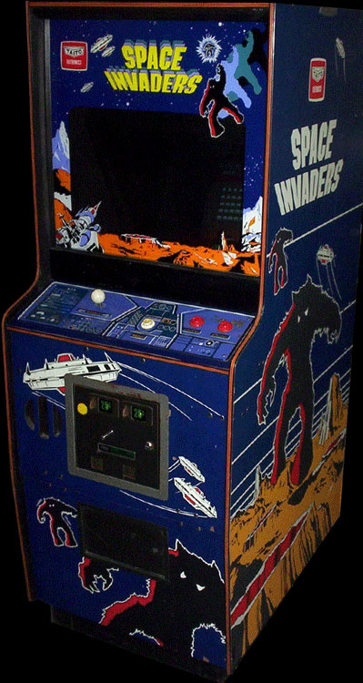
Or for another example: any arcade game from then is gonna have high-resolution cabinet art that’s there to set the flavor. The display hardware on arcade games from the era isn’t remotely-capable of producing an image anything like the cabinet art, much less the computing portion being able to work with that kind of stuff.
I guess you could imagine a point-and-click adventure that looks something like this, but honestly, even today, I’m not sure that any gaming device reliably (i.e. the developer can’t rely on the player having it) can cover enough of someone’s vertical visual arc to make the submitted image practical. Like, just playing pinball games on a monitor with a typical orientation is kind of limiting. Maybe with a new VR headset and taking advantage of head-panning, or a using a particularly large and high-resolution computer monitor and a PC game. I don’t think that any console conventionally gets that much of someone’s visual arc; the displays are larger, but also further away. Maybe if you have a high-resolution phone and hold it near your face.
Another quirk – which doesn’t really affect Secret of Mana, but was common – is that the in-game design of characters sometimes…didn’t look all that much like the box art or cabinet art. My guess, though I don’t know for certain the factor here, is that what happened is that the early concept art went to both the game artists and the cabinet/box art guys, and sometimes things changed over the course of the game’s production.
Here’s a shot of Space Invaders cabinet art:
https://lemmy.today/pictrs/image/96d406cb-83fa-4f18-bbe8-9f81fa04924b.png
And a game screenshot:
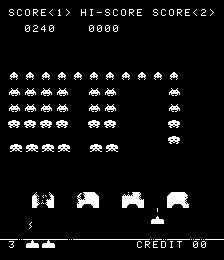
Like, they’re not trying to do a bait-and-switch with the player – the prospective player can see the demo running on the cabinet’s monitor, knows what the game looks like. It’s just that the hardware at the time wasn’t remotely capable of displaying anything like what the artists would like to do to set mood, so you went with other, out-of-game forms.
EDIT: To try to put this into perspective for the submitted image, the SNES could at most display an 256x224 resolution image. It technically had the ability to choose from among 15-bit color options, but any use of those was greatly restricted:
https://megacatstudios.com/blogs/retro-development/snes-sprite-engine-design-guidelines
Each SNES sprite can have 16 colors and a palette slot out of 8 total palette slots. Disregarding advanced tricks like rewriting palette data during a scanline, this is the general limit. The 0th entry of each palette slot is transparent, regardless of what color is specified there.
Total On-Screen Sprites: 128. That’s how many simultaneous entries there are for sprites.
EDIT2: The SNES game’s title screen did briefly display a piece of the actual image, and I’m sure that the SNES guys optimized the hell out of it. Running it in
aresand then taking a screenshot, this is what they were actually able to display: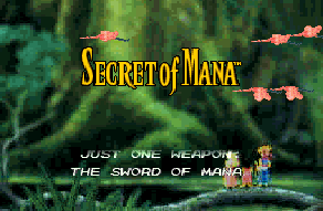
And they wouldn’t have been able to spend that much data on a ton of screens in the game.
For a few other games that I’ve played:
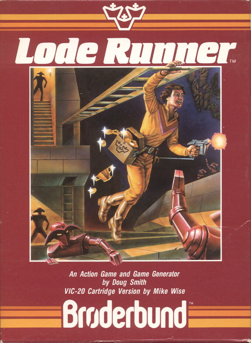
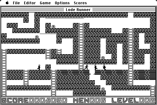
Lode Runner for the Mac
Box art:
Screenshot:
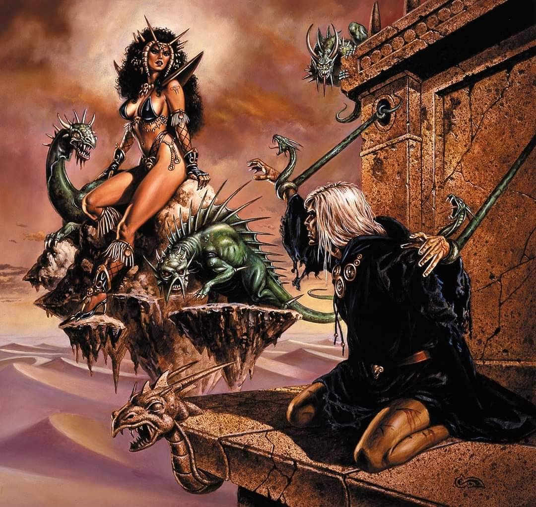
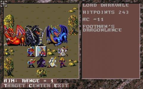
Dark Queen of Krynn
Box art:
Screenshot (and this is if one had the fancy color version of the game):
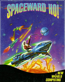
Spaceward Ho!
Box art:
Screenshot:
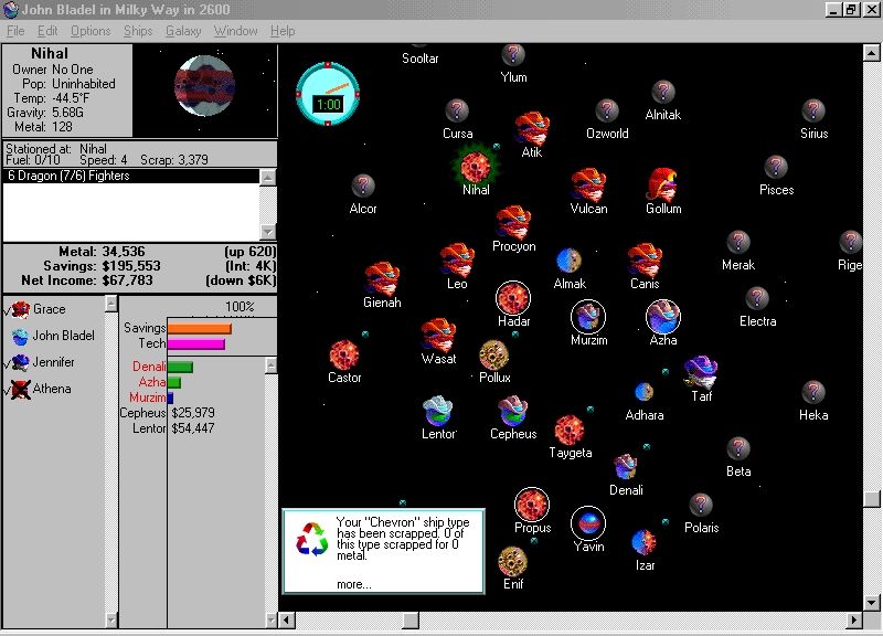
Mac/PC games normally had (small) screenshots from the game on the back of the box, so someone browsing a store could see what the game itself looked like when being played.
OMG I’ve been looking for this art in better quality for sooo long! Just beautiful! Where do you get this from?
Honestly, I don’t even remember now. I didn’t scan it, downloaded it somewhere. The last-modified time on my local copy of the file is August 24, 2023, so that might have been when I picked the copy up, but it could also have predated that.
I’d been looking for a good-quality version on a number of occasions. Then some time over the past few years search – maybe it was Google Images or Tineye or something – and found that someone had finally put a really good quality scan online.
I also don’t know what the actual physical printed source of the scan is.
The form I originally saw the artwork in was a centerfold in a Nintendo Power edition in probably the early 1990s. I don’t think that this is likely the source, because there are no visible folds; if that was it, someone did a really outstanding job of cleaning it up. Also, I doubt – though I can’t remember, as it was about thirty years ago – that the centerfold had “Printed in Japan” on it. I assume that the “Printed in Japan” text in English probably means that this is some kind of promotional print aimed at a North American audience.
The aspect ratio on it is .7585 (2758/3636). Assuming that Nintendo Power used US Letter pages, then a three-page centerfold (which I think the centerfold I recall was) would have had an aspect ratio of 8.5x3/11= .4313. If it was a two-page, then it would have been .6471. So that’s also an argument that whatever the promotional material here, it’s not from that centerfold.
Looking online, there was apparently a poster included with the original game, though I’d have to assume that that would also have shipped folded, given the constraints of an SNES video game box. If you can find the dimensions of that somewhere online, you might be able to make an argument that this is the source – that someone did a really good job of smoothing any folds out, and then ran it through a large-format scanner.
searches
Whatever the source, if I found it via Tineye, it’s no longer available online wherever I originally ran into it.
So…sorry, I don’t know what its origins are, just can narrow it down a bit.
That’s ok, thanks for the reply and upload anyway i realy appreaciate
I have strong memories of the first fight when you fall through the pit or what ever. Was able to track the game down as an adult thanks to just that fight. I absolutely love the music of this game, but I remember having a bit of a tough time with it. Always a good excuse to try it again, and this time I can get my partner in with me
Edit: just an FYI for anyone it might help. The game either natively supports the multitap for 3 players,
or there is a rom hack, I don’t remember whichLooks like it is native
I absolutely love the music of this game,
If you just like the composition, but aren’t specifically into the chiptune-style audio – the SNES’s audio hardware can only do so much as to fidelity – I’m pretty sure that you can get the soundtrack.
kagis
Looks like it.
https://www.amazon.com/520-524-VARIOUS-ARTISTS/dp/B0788XWK63/
https://open.spotify.com/album/6M9aWlXAbhmldOntn8Z46I
Also, you can get MIDI files reflecting the game, render them with a newer soundfont in something like
timidityorfluidsynth. I’ve done that myself with some other SNES games. As long as it’s done with a soundfont that reasonably reflects the timing and amplitude and such of the source, it can sound pretty good. If you’re interested, I can go take a stab at that, throw you a render – I’m sure that someone has done up Secret of Mana MIDI files.Aight, you’re probably very familiar with the situation, then. :-)
Yeah, sorry if that came off condescending. It wasn’t meant to. I’m fairly autistic and emulation was a huge special interest at different times in my life
No, wasn’t offended at all. I just didn’t want to waste your time if you already were familiar with the situation; I know people who own the OSTs to various games from then or had elaborate setups like you did, and for someone like that, this is gonna be old hat, but if you were super-gung-ho on that particular music, and hadn’t run into it yet, wanted to open the door just in case. :-)
I appreciate it! I’m never opposed to learning more or passing on my own knowledge
Best one in the series.
