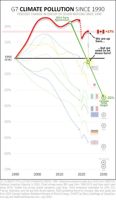
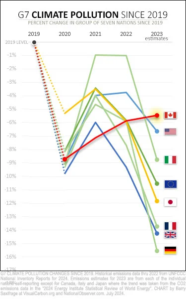
Canadian emissions rose for the third straight year in 2023, according to the seventy-fourth edition of the venerable “Statistical Review of World Energy” report. The reason I’m turning to data in this report is because Canada won’t release its 2023 numbers until next year. This delay, which can exceed two years, keeps Canadians in the dark about where we are and where we are headed.
Many of Canada’s peers in the Group of Seven (G7) nations have already published their 2023 emission estimates — including the United States (U.S.), European Union (E.U.), France, Germany and the United Kingdom (U.K.).
So, to try to provide some current insight into where Canadians are now in the climate fight — and what it will take now to hit our 2030 climate target — I’ve gathered all these numbers and created a series of charts.
The dizzyingly steep path to Canada’s 2030 target
 .
.

Our cars keep getting bigger, our houses keep getting bigger, even places like walmarts feel like they are getting bigger. We aren’t building any electrified transit, we aren’t heavily investing in renewable energy sources, we haven’t been shifting away from a natural resource based economy.
No one should be surprised Canada’s pollution is increasing, overall Canada isn’t really trying to reduce it.
Does this include emissions from tar sands oil or fossil gas when it’s burned abroad? Usually these numbers only include stuff burned in the country. But Canada’s a oil-exporting petrostate, so it would look way worse if the tar we dug up was all included, no matter who burns it.
Great question, unfortunately I don’t know and can’t take a look right now, but I believe the energy report cited and linked to is open access
Does this include pollution from natural causes like wildfires?
I don’t think it does. I think it’s only direct pollution from energy use, but I’m not sure
Yep it looks like the report only takes into account emissions from consumption, not from wildfires etc.
Sorry to hijack the Canadian topic, but can someone tell me why Germany is always the butt end of nuclear energy fans with numbers like shown here? Either we’re the worst of the worst or the numbers here aren’t accurate. And I don’t think they’re so far off. So what’s the matter?
Oh and Canada: wrong direction. Line go down please.
Germany seems to be doing 2 things with its energy generation: increasing renewables, and pivoting to coal while it gets off nuclear. The progress in the charts is presumably because its increasing share of renewables is outpacing its pivot to coal. People are still entitled to think the nuclear to renewables via coal transition in 2024 is dumb. Like most important things, there are many different ways to measure things, and the approach matters a lot to what the results look like. These charts aren’t intended to compare pollution across countries, but to compare countries’ progress on reducing emissions relative to their own 1990s baseline. So, where each country started from matters a lot to the slopes.
Believe me, many Canadians wish we weren’t a petrostate, but the oil and gas industry basically control politics and the media. When we had record wildfires last year, I started seeing the word “wildfire” censored in the news in favour of “air quality issues.” This year, there is very little wildfire-related news, because it’s taboo to corporate interests.


