

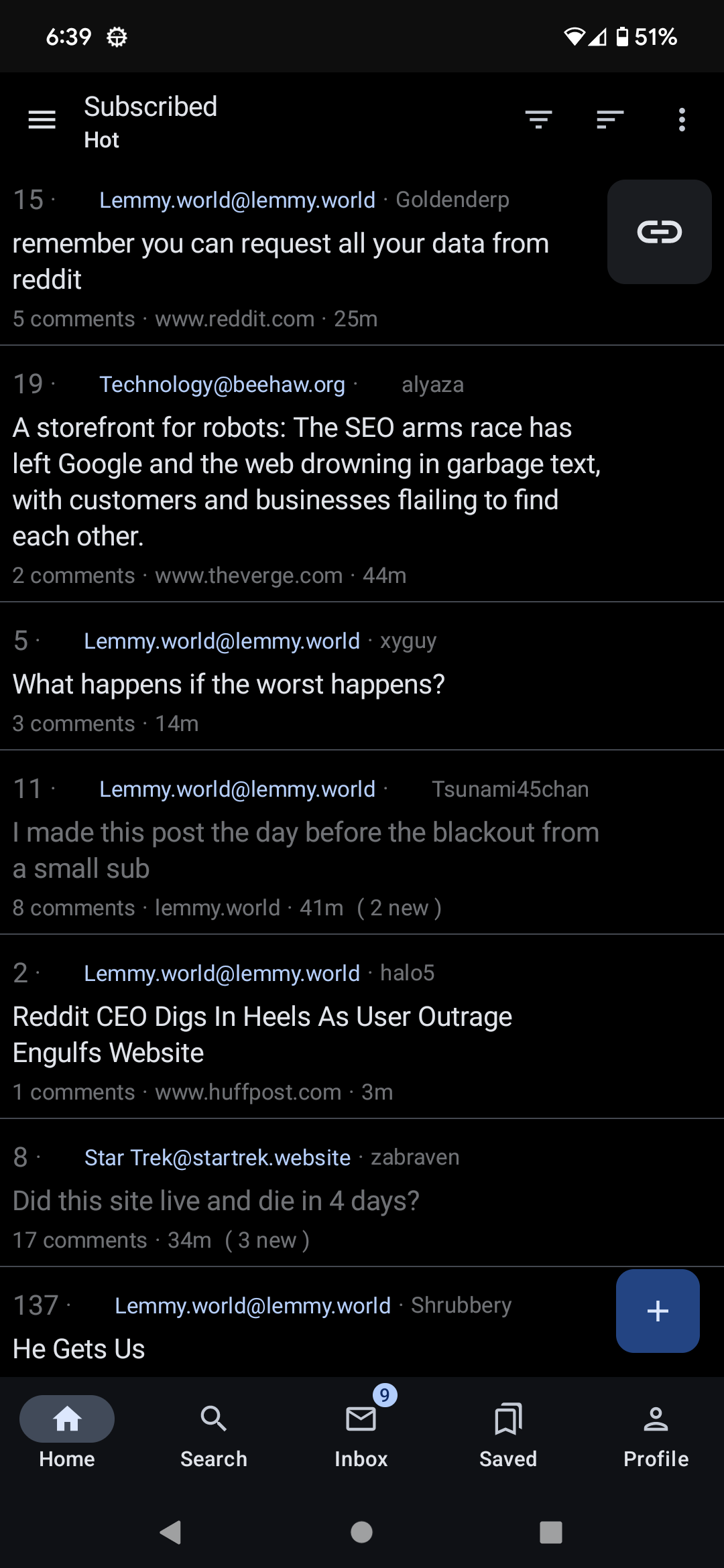
Seems to be placed exactly where my finger wants to land when I’m not paying attention. I think it should be removed/moved to the full post view.
I’m willing and able to contribute that change myself if other people agree it would be a positive change.
Edit: Ah, realized this issue really only applies if you use the “list” display option. For the “card” display option usernames are far from where you’d typically click, and also account for a much smaller portion of the total clickable space.
Edit 2: Well I’ve opened a PR. Now we just wait https://github.com/dessalines/jerboa/pull/710
Yes, all the time. Would love if this can be fixed, as I do prefer list view. It’s not even necessary to remove the field entirely (it’s useful to see sometimes), but it shouldn’t function as a separate link. Same for the community name.
All day
Yes, I always go into someone’s account when trying to go into comments.
Same here. I’d move the community link inside too.
Yeah, same here. Keeps happening. I’d love to learn more about coding so I could help contribute to the app and to Lemmy in general. Right now I just have some rudimentary python but some hands on experience would be ideal.
Yup
@greed. To easy to tap the wrong bit. On single line posts its the worst
deleted by creator
Yes, I do.
Absolutely. I also find the app doesn’t always respond when I tap the title or comments so I have to tap again in the proximity which tends to lead to going to user profile or the community.
Which is odd because I’m used to a similar layout in Boost but I never seem to run into that problem there.
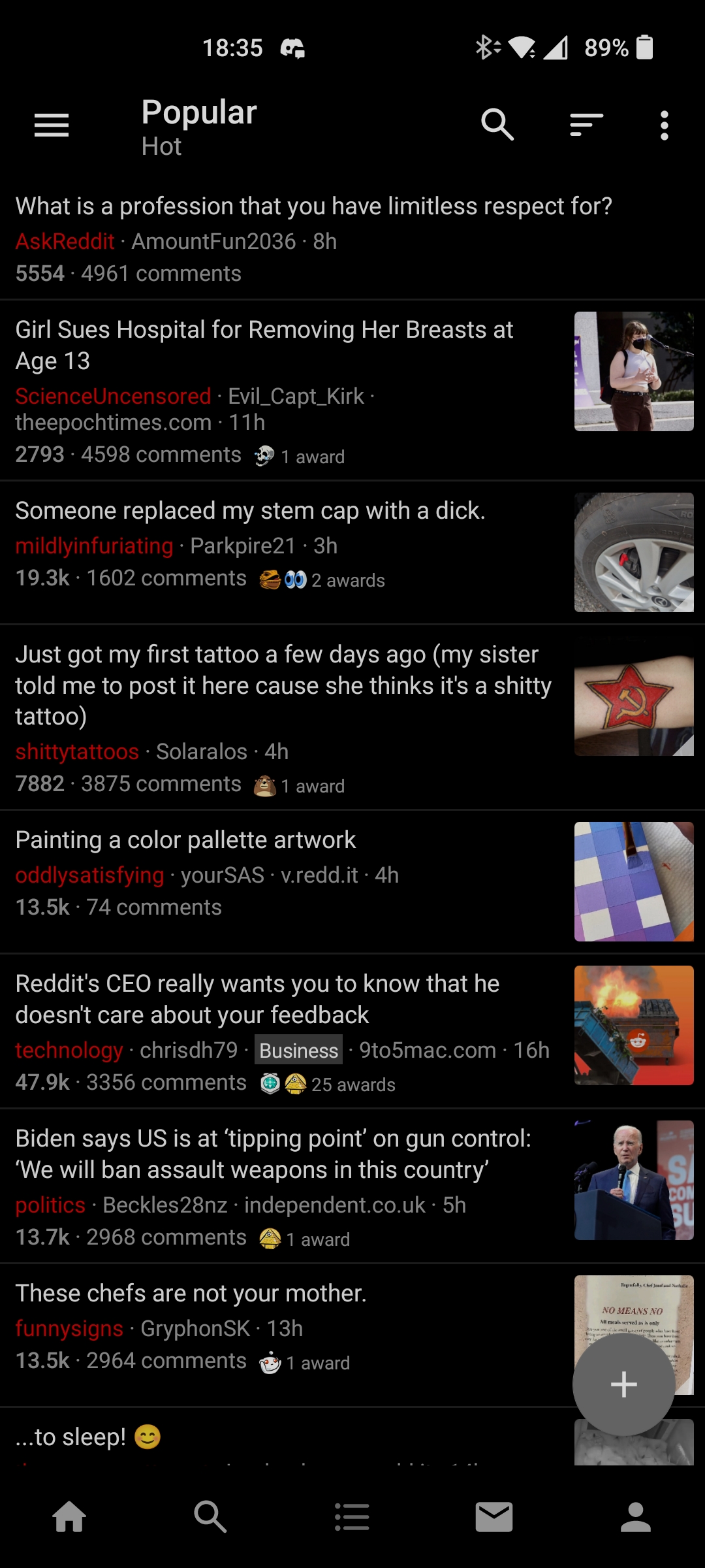
I used Relay for reddit, user and link buttons were hidden behind the swipe, while tapping always either expanded or collapsed comments.
I keep tapping random shit while attempting to do that.
Yeah, I’m also coming from Relay. You may be interested to see the list view rejiggering I just started working on which makes it look a bit more like Relay. Don’t know if they’ll accept it though. (Ignore the missing thumbnails everywhere, seems to happen in any build I make, even without any changes. Not sure why)
I like this better than the current layout! My brain wants the context of the community name before processing the title, so this flows more naturally.
Looks good in my opinion, open a PR when you are finished and let’s see if the maintainers like it
