
Hey all! Thanks for all the valuable feedback that continues to roll in!
An amazing person is making us some Figma designs for memmy. These are some early designs, but I’d like to get some user input on them. Please check them out and reply here about how you feel, what you’d like to see added or removed, etc.
Thanks guys!
this looks amazing!
looks slick! can’t wait to try it out
Will this work on Android?
Yes, it will be available for both iOS and Android. iOS is the focus at the moment as Android has a few issues. But it will be cross-platform.
Thanks! It looks awesome.
Looks great!I really enjoyed the text.
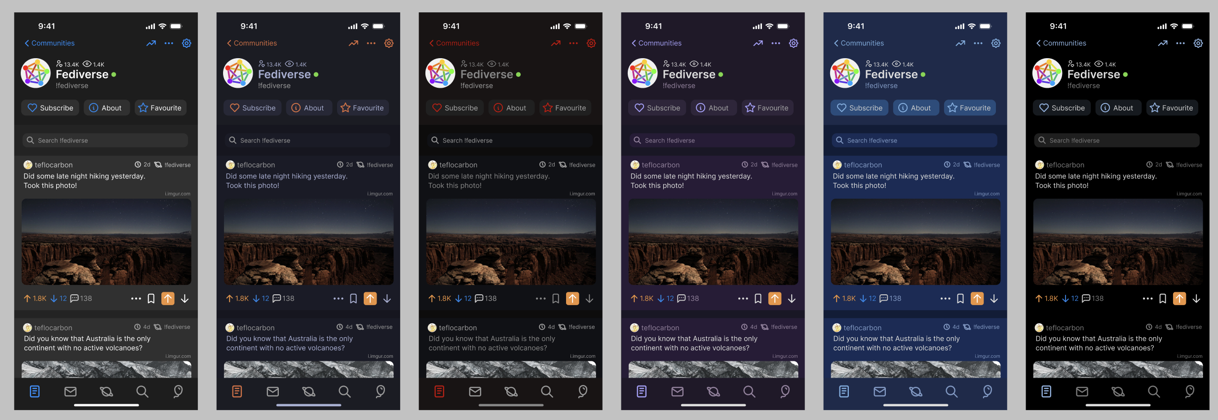
I agree that orange for upvotes seems odd. I liked the comment thread lower down with different colors for the levels of comments, that’s helpful. Agree it could be a little bit tighter spaced but I don’t hate the way it looks now, a little bit of real estate is nice on the eyes.
Good to hear that you liked it!
The upvote/downvote colours will change. As mentioned prior, it was honestly just my brain automatically assuming they’re still orange/blue. It’s hard to get that idea out when that’s what you’ve seen for the last decade.
As for the comment threat, I’ve been debating the spacing internally for a bit. It’s almost a verbatim copy of Apollo, since I think if there is one thing Apollo nailed, it was the comments section. Although I didn’t really want to make things feel too boxed in. Sync has it very tight together and it feels very off to me. Apollo has them a tad shorter distance than this but also has shorter bars. I went for longer bars since it makes the rainbow look cooler. (sorry not sorry)
I did go for a bit of a real-estate focus for this. Social media can feel like information overload at times and I wanted to make it feel less like a barrage of information and more comfortable. I’ll have to tinker with it and see what is a happy medium. The spacing was done very quickly and hasn’t changed since the very beginning since I mainly wanted to get the view cards out of the way.
Appreciate the feedback though! Thank you.
Y’know, it’s funny. I’ve been using Apollo since I switched from Android to iOs about 2.5 years ago and I could not have told you what colors the upvote and downvote arrows were until I just went and looked. Keep the colors the way they are, or get really crazy and let users choose in the settings.
And as for spacing, keep it as close to Apollo as possible. My monkey brain hates change.
Some others have talked about the spacing. I’ve edited it a bit more to align it more to Apollo. Let me know what you think. https://imgur.com/a/vqJQiPI
The idea is to have similarities to Apollo and Sync. It’s the philosophy that I went with going into this.
Colours… I’m still debating honestly, green and white didn’t seem great for visibility and the text is a bit small for the upvote counts. I’ll have to experiment a bit more.
Please let me know what you think of the modifications.
Looks awesome!
Themes would be a great addition, will you allow custom themes?
Coming from Apollo, ease of reach with one hand would be such an improvement.
Keep up the good work
Yes! Custom themes will be implemented. I’ve already been toying with what some themes would look like.
Hey @gkd, are you looking for help with the designs of the app? Currently working as 3+ years experienced UX designer and i have some spare time to maybe help you?
I will also take a look at these designs on monday to provide some feedback :)
Looks great, even for an early draft.
I like the current green upvote color more than the orange in the proposed design, I associate orange with negative, maybe as it’s closer to red. Green is positive for sure “Green light go!”.
I think the border between posts is a bit too big, could be halved. Some gap between posts or a border is good, but too much costs information real estate.
The community search bar at the top is a good addition, though might be better to reveal on a short pull down action. Brief or short pull down reveals search bar, longer pull down refreshes feed. This perhaps could be true of the subscribe, about, favorite buttons. I’m just thinking of most common use, and all these things are more of an occasional/secondary use.
Hey there! Thanks for the feedback.
I agree on the upvote part. Honestly, most of it comes from my memory of using Reddit apps for it being orange/blue, that’s just engraved into my brain from usage. It’s easy to change though and might even be able to be changed in a theme. For default, I’d probably keep it either Lemmy colours or the current current colours. I’ll have to think it over.
The borders are a little bit wide. I haven’t really worked on getting an optimal height for them but I have a personal preference of more white space to differentiate content. You are right that could be at the cost of losing content. I’ll tinker with it a bit and see what I like.
I’d really prefer the community search bar to be at the bottom. I’m trying to think of ways to implement that properly but I haven’t really fully thought of one yet. I’m trying to focus more on reachability than Apollo did. Without sacrificing too much that is. As for the pull down, that would only have to occur at the top of the screen. The balloon menu contains some quick actions to press when you’re lower down, making them easy to access if you need to. The search would be floating though as you say. If you’re scrolling down and then suddenly scroll up, it’ll appear regardless floating and you’ll be able to search. At least, that’s the plan.
I’ve modified the height between the borders, cards are 7px and compact cards are 4px. Let me know what you think.
These look gorgeous! I’m a big fan!
This is amazing. I’m so excited for what you’re gonna turn this into now
I’m going to take a stab at implementing one of these now. You’ll notice which screen it is when the update is released :)
Love your work btw! I’m a software dev and have always wanted to build an iOS app but of course my laptop screen breaks when I want to lol.
I didn’t see any update today besides this morning I think and I thought that was off from previous days so now I’m pretty curious on what this next update you release will entail since it’s been longer than usual.
That UI looks so good. A UI like that will easy get people on it
I’m trying to roll out a few different features at once and step back and fix some of the lingering bugs. I do still plan to keep pushing nightly though.
These look great! I like the ones towards the end that seem to show a combined upvote/downvote button and counts. Rather than having 4 separate elements for up count, down count, upvote, downvote. If that makes sense. I’d attach a pic, but I’m using your app right now, and… you know. ;)
Ouch…haha don’t worry, won’t be long!
I’m just teasing. You’ve made incredible progress already.