

I feel like there was probably a better way of graphing this tbh
Stacked area has to be better than this right?
Almost lmao
Third party candidates
They’re at the bottom, where they’ve always been.
I was just explaining why the D and R mirroring was “almost” rather than exact.
There should be a small, but not totally insignificant, probability of EC tie.
Which throws it to the house to decide.
We do not want this.
What kind of graph is this?
Buttplug of best fit
I think it’s just a plain Jane line chart right? The reason it looks like this is because the two lines are n and 100%–n.
You might be thinking of a population pyramid chart which looks somewhat similar to this if it were rotated 90°
But why Bernoulli?
Bernoulli was a mathematician: https://en.m.wikipedia.org/wiki/Bernoulli_distribution
The Probability Distribution named after him models binary variables
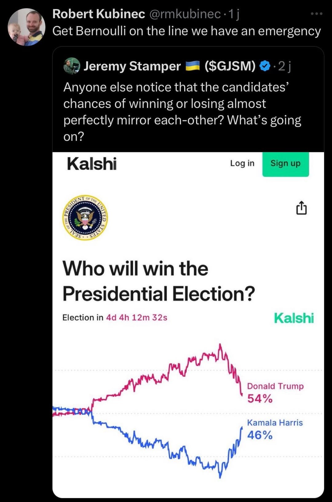
Where is this chart from?
As someone else said, it’s a betting site, and the numbers it is showing are based on how much has been bet on any given candidate.
I think it’s fair to say that it’s not a reliable indicator of actual odds. It’s essentially a money weighted poll from a self selected population (people who would use an online betting site to bet on an election). So, it is not a good random sample of American voters, let alone a random sample of voters from swing states that actually decide the outcome.
It’s a stupid betting site
