

Everyone, we need to spruce the place up, so we wanted to reach out to you all for submissions for the icon and banner. Here’s the idea: submit icons and banners (SFW please). I’ll leave this stickied for 72 hours, then we’ll pick the most popular of each by upvotes.
I couldn’t find specs on icon dimensions, but it appears icons are square and tend to look best at least 256 x 256. Banners tend to be…rectangularish. Here are three banner examples: ( 1 ) ( 2 ) ( 3 )
As always, let me know if you have questions.
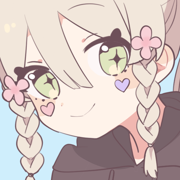
@[email protected] submitted this icon earlier so I wanted to ensure it gets in.

new icon added! :3
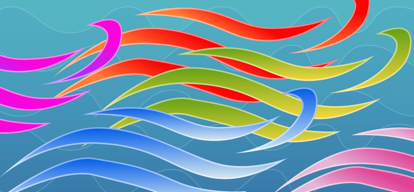
Surfacing this to the top for visibility, the old banner but as a Niko Oneshot textbox:

I think if we’re gonna tell any extremists to fuck off, it should be nazis. Obviously tankies are shit and not welcome, but as a left leaning person I’ve been called a tankie for vanilla anticapitalism, and seeing it on the banner always put a bad taste in my mouth
Part of the problem is that tankies might actually think they’re welcome, not just here, but most places on this instance. Nazis know they aren’t welcome in a queer instance by its very nature.
That said, I get what you mean. It’d be best to have protecting queers & other minoritized groups in a banner as well, as Nazis are who we usually need protecting from

Niko ftw!!
new banner added! :3 also it was the only other than the old one X3
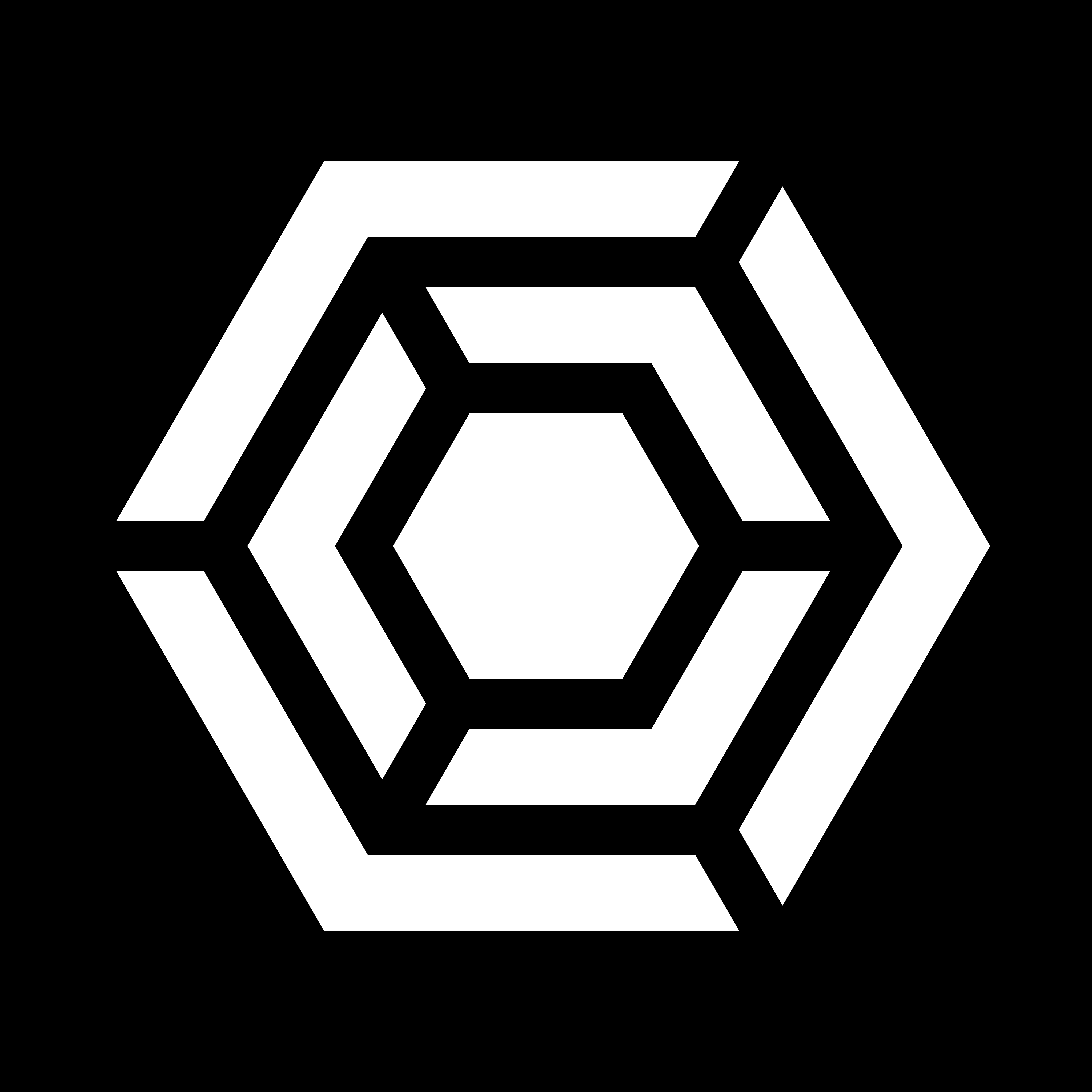
Here’s a 512² icon:

If anyone wants the SVG file to edit it further, here’s a link.
The shark was stolen from a Reddit post and then manually redrawn by me.
That’s beautiful! Chef’s kiss mwah right there!
Well done!
This is my vote. This one’s quality.
the other one with the trans rings got more votes so we added that one :3 but would u like to use this one for the matrix community? (yeh we have one X3 I made it as an unofficial space for the other 196 months ago but I guess its the official oneninesix space now :3 I’ll make a post about it later)
Feel free to use it for the Matrix community if you want! Or this sub. Or… dunno, any space that you want, to your hearts’ contents :3
okie thank uuuuu! :3
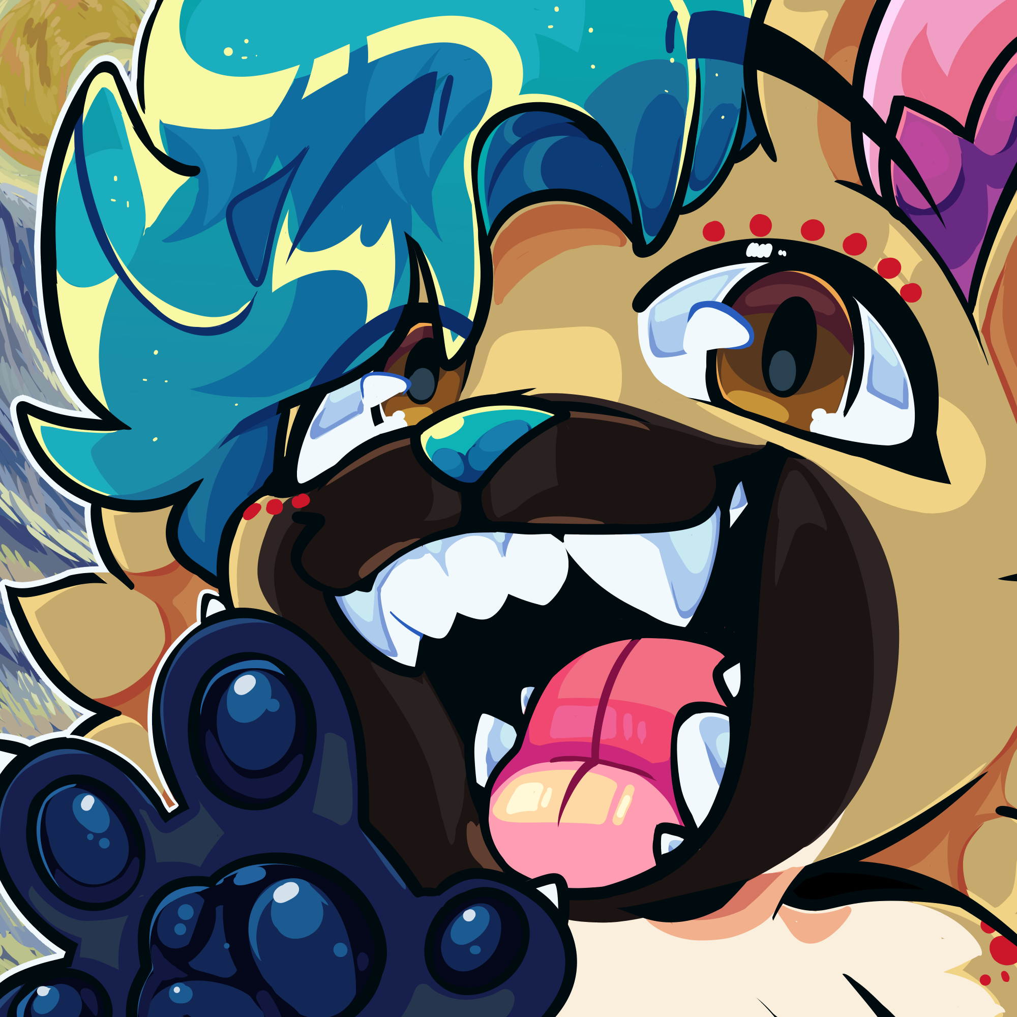
Is the shark mascot somebody’s IP?
I don’t know. Perhaps Ikea’s? The whole mascot thing is because of the Ikea toy blue sharks.
Oh ok cool, as long as we don’t use the same name they gave it we should be guchi
The name of the mascot is blåhaj, that this instance (and the trans community in general) has been using for ages. I don’t think that it’s IP-able because it’s a plain word (it’s just the name for blue sharks in Swedish).
I might be completely wrong however, so don’t trust what I said at all, it’s just conjecture.
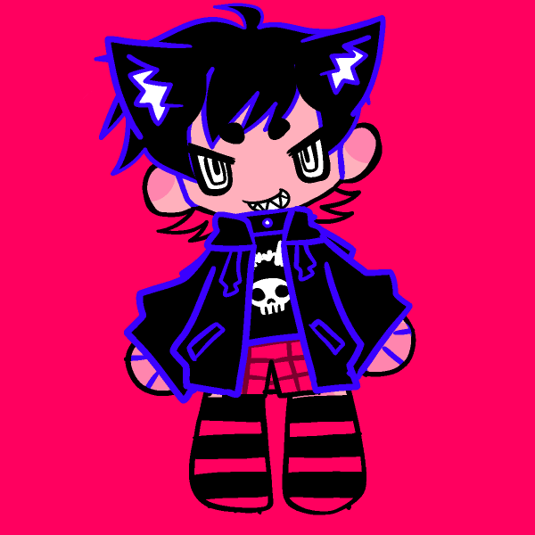
@[email protected] also submitted an alternate icon version.
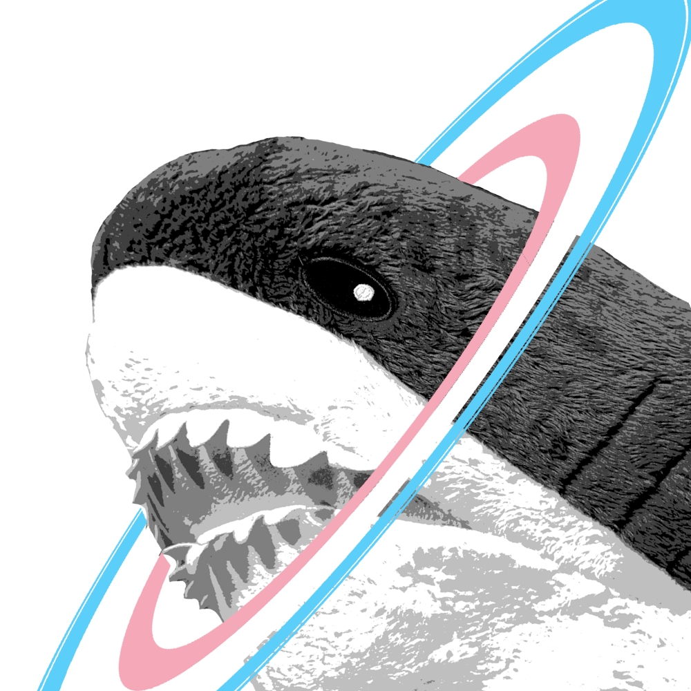
I’m voting for this one (and the one with blue bg too)
no rule in title = eat 100 gummy sharks as punishment
196 you mean.
no rule in title = molten gold poured down ones throat
thatescalatedquickly.gif
On the default lemmy ui at least, it looks like icons tend to be either ~20x20 when they’re the small circle in the actual post, and 120x120 when they’re in the community view as the 2 main sizes, and 24x24 also shows up in the community list section. Figured I’d mention some sizes in case it helps anyone designing an icon!
Folks might want to see how these look at those dimensions:
20x20

120x120

Good idea yeah! The 20x20 one will look a little more crunchy than the actual icon would end up, since the actual image file is still higher quality than 20x20 in terms of pixel density, its just the displayed height/width that gets smaller.
The 20x20 one will probably be closer to the same quality as the 120x120 one you posted (probably a bit more blurry), and the 120x120 size will be closer to the full quality one.
Thanks for bringing this up! I was skeptical anything remotely complex would look good in the 20x20 when I first saw the original response
I think it may be better to collect ideas first and then create a new post with all the entries as comments. Currently whatever gets commented first has the advantage of time to collect the votes. Just a thought tho.
Probably let this thread run for a few days, and then create a poll thread with all the suggestions
As this community shows up as 196 in web (not on yoyager) Can we rename it to 198? Just so we can easily see which one we’re going to? 😅
yeh tru >v< another option is calling it OneNineSix so one is numbers and the other is letters :3 also why 198? did u mean 197?
No, meant 198 - saw a comment saying it was less cool or smth, and 198 would be funny
hehe yeh it would be funny tbf X3
I like the icon
I like the banner
Why not use the one from Reddit, it has 196 Mascot in it
I’m not sure if we’re really allowed to use their mascot as if it were our own.
We might be alike in name and purpose, but we might want to distance ourselves from their named characters and unique IP.
Rule old rule
Icon:

Banner:

Bad memories rule.
Like someone else said, bad memories for that though i would rock with the same banner text in a different design
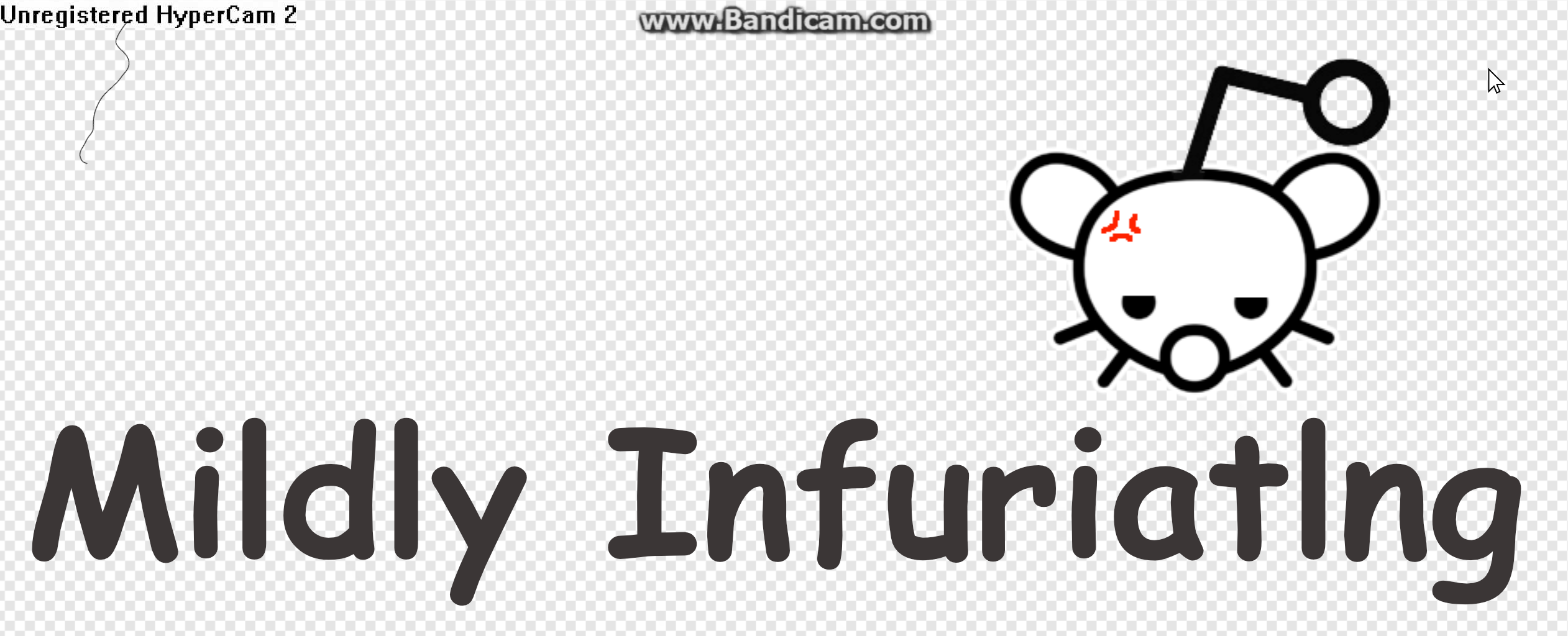
but also, taking one last opportunity: wtf is the icon?
i recently realized half of it at least is Armenian Corey
something else is overlaid and i can’t tell what…
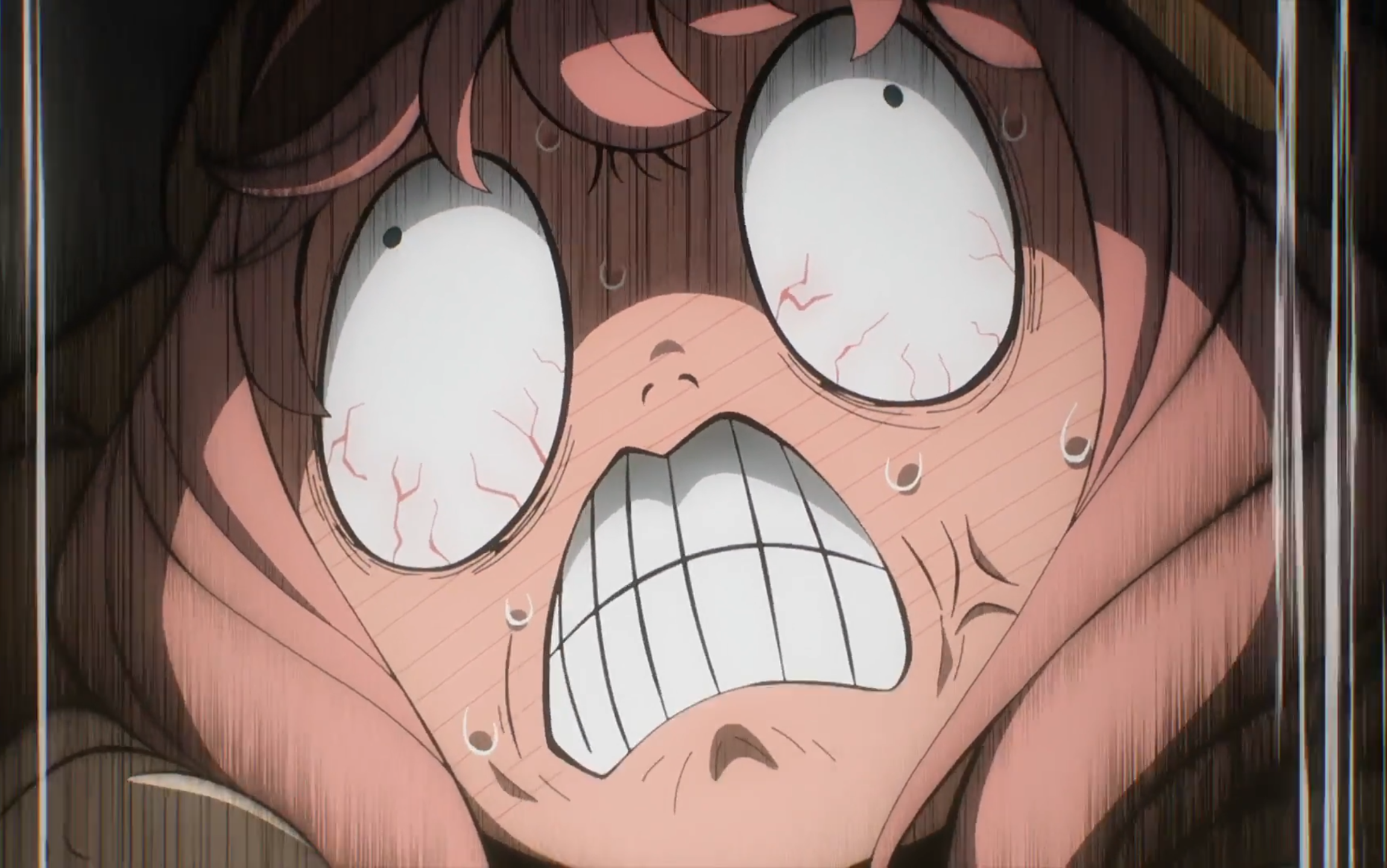
How about a Niko Oneshot textbox:
yus ! 😍😍 please post as a top level comment if you haven’t so it can be considered
Done.
It was the reddit icon at the time of migration two years ago. It’s the default subreddit icon overlayed with armenian corey overlayed with a funny looking bird.
ah! i see the subreddit icon but i can’t make out the bird
the bird is a little difficult to see because I’m pretty sure they were slowly adding more opacity to Armenian Cory
I like the old banner, just needs something behind it


