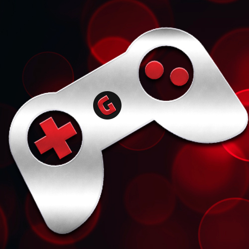

Hi, I tried a new Lemmy app yesterday. I was already kind of annoyed by different sort icons when using Photon and Voyager, but something snapped when I opened the menu in Interstellar. The third meaning of this arrow was too much.
 |
 |
 |
|---|---|---|
| Voyager | Photon | Interstellar |
Here’s a table of all sort icons:
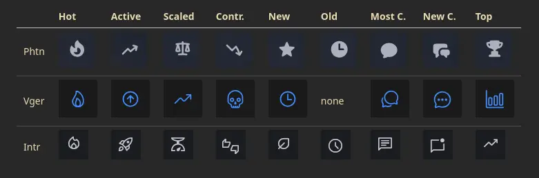
Some of these differences I’m okay with, like controversial sort, but others not so much. Especially when the same icon is used for different things. The symbols become useless if the meaning is different in every ui. I guess because Lemmy-UI doesn’t use icons for sorting, other devs just picked something in isolation.
So, my solution is to build a reference icon set that apps / frontends would loosely follow. This could then be added to Lemmy documentation. Any thoughts?
My ideas so far:
- Hot: fire
- Controversial: Anything negative or conflict
- New: leaf, sprout
- Old: clock, hourglass
- Scaled: I don’t like the scale icon, but it’s still better than random.
- Most comments: Multiple speech bubbles?
- New comments: Single speech bubble? I like the unread dot in interstellar.
- Top: trophy, medal, podium
- Avoid: star (reserve for favorites)
This post was kinda lemmy-specific, but I’m posting to the generic /c/fediverse since other platforms could have similar issues, and extra perspectives don’t hurt.
Links:
- Lemmy sort modes: https://join-lemmy.org/docs/users/03-votes-and-ranking.html
- Material icons: https://fonts.google.com/icons
Controversial: 💀
I’d go for the nuclear option.
Guess this a good example of what I don’t want to affect. IMO the examples for controversal in this thread range between acceptable and amazing.
The core idea of having recommended themes for buttons is great, especially if it leads to communication between devs and group concensus so the best ones rise to the top even if not everyone follows the recommendations.
Should be a toxic icon
Controversial: ☣️
I do think having recommended thematic icons would be great, and the Hot example is on point for all three. The fact that new and old use very similar icons between the three apps is both understandable and would be annoying if trying out more than one.
I like Voyager’s clock for “new”, but “old” needs an icon, so I suppose a clock would work there. So then I wouldn’t mind a leaf/sprout for “new.” Reminds me of sprouts aka new players in FFXIV lol
Anyway it’s not a huge issue for me, I barely look at the icons to be honest.
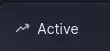
Meanwhile, I’m still not clear on the difference between “Hot” and “Active” (even though I remember understanding at one point). I bet I’m not the only one.
They say spaced repetition helps the brain remember things, so here you go:
Active (default): Calculates a rank based on the score and time of the latest comment, with decay over time Hot: Like active, but uses time when the post was published
Oh I get it! But unfortunately that is so completely unmemorable and unconnected to the terminology that I’m now certain I’ll soon forget it again. In fact I think I’ve forgotten already.
Hot is popular, implies new bc who are we kidding
Active is… active as in ongoing discussion, even if it’s a week old
(Scaled is the one I never use, so someone else would have to take that one)
The obvious solution to this is Lemmy devs noticing that this is a feature most/all apps use without active support and thus add support to Lemmy itself. Devs will naturally keep to icons that are similar to the default icons
It’s a legitimate thing to want and would be a great addition for sure
No. Fuck homogenized UI design. Let devs do whatever they fuck they want. Pick the app you want and then learn its icons.
Fuck homogenized UI design
I agree with the opinion, I like diversity, but disagree on what counts. It’s a spectrum, and this is at the lighter end. I’m hoping to make the suggestions as loose as possible, just enough to avoid stuff like the first example.
Let devs do whatever they fuck they want.
The point is not to force anyone to do anything, not that they even could be forced. The point is to get people to pay attention to what others are doing instead of unintentionally reinventing the wheel. No hard rules.
Pick the app you want and then learn its icons.
There’s no “the” app. For example, I don’t like photon as much on my phone, and I very much don’t like voyager on desktop. Relearning how to read icons when switching apps can also suck.
But anyway, I’ll keep this in mind. If the reception becomes mostly negative, I’ll shut up about this.
^ How to make sure your app has no users.
The reason design has become homogenised is because we want things to be intuitive so that users don’t have to learn. They just know. And a more useable app beats a less useable one. Always.
The way I choose my icons for Photon is I kinda just scroll the list of my library and pick one that fits.
deleted by creator