

- cross-posted to:
- [email protected]
- cross-posted to:
- [email protected]
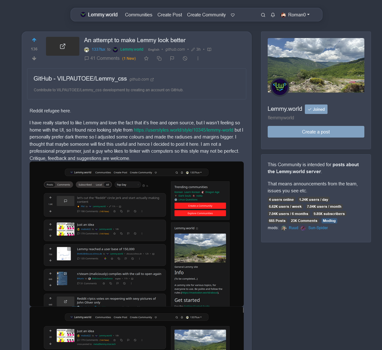
Reddit refugee here.
I have really started to like Lemmy and love the fact that it’s free and open source, but I wasn’t feeling so home with the UI, so I found nice looking style from https://userstyles.world/style/10345/lemmy-world but I personally prefer dark theme so I adjusted some colours and made the radiuses and margins bigger. I thought that maybe someone will find this useful and hence I decided to post it here. I am not a professional programmer, just a guy who likes to tinker with computers so this style may not be perfect. Critique, feedback and suggestions are welcome.
Edit: The colors are from reddit and if you want the colors to look more like the original lemmy, change the bg primary and default to hex #303030 and #222222. I really like this color scheme too
--bg-primary: #303030;
--bg-default: #222222;
Edit2: I have now made some small adjustments using the feedback and suggestion I got from you. I’m really grateful for the feedback :)
I also have now two styles, which have slightly different color scheme https://userstyles.world/user/VILPAUTOEE
Keep the feedback coming ;D Thx
You must log in or register to comment.
Lemmy Enhance Suite when?
We need this
I really like it. But I also think that it’s not a great idea to use colors similar to Reddit, it’s best if Lemmy (or each instance) finds its original design for those
Yeah I think so too, and that’s why I created two styles with different color schemes. I just think that some reddit refugees might have gotten used to the reddit colors and find them more familiar
Looks really great. My first tought was steam
This is what’s beautiful in open source. I wonder if any one has had any luck making the old.Reddit nesting style yet
I found this, if it helps. https://userstyles.world/style/10311/old-reddit-ish-lemmy
And what is it with the narrow aspects? I totally get the need for mobile support, but the default desktop view looks like it’s trying to play nice with old 4:3 aspects. If that’s the root design goal, I sure hope we can let that design goal die. In a 16:9 maximized window there is so much wasted real estate it pains me.
Lemmy doesn’t run very well on mobile either. It crashes and burns on my iPad (probably because it doesn’t fully support whatever fancy JavaScript it relies on), and Kbin is the only way to connect with Lemmy communities, since their site does work.
I think that’s the websocket connection that they are working on removing in the next version. Should make the loading issues on mobile go away.
That’s weird. For me it is kbin that crashes all the time. Lemmy works fine. I like kbin’s vibe and concept, I just figured it was still really buggy. Now I’m thinking maybe the problem is on my end.
Kbin does crash, but in my experience, that’s more of an issue of server load than anything else. Whereas my issue with Lemmy seems to be a problem with the client/Web UI (since my iPad is a bit too old for any of the apps).
Avoiding Kbin during the times where the US is most active (since it seems like they’re busiest around then) seems to help with the crashing issues.
deleted by creator
deleted by creator
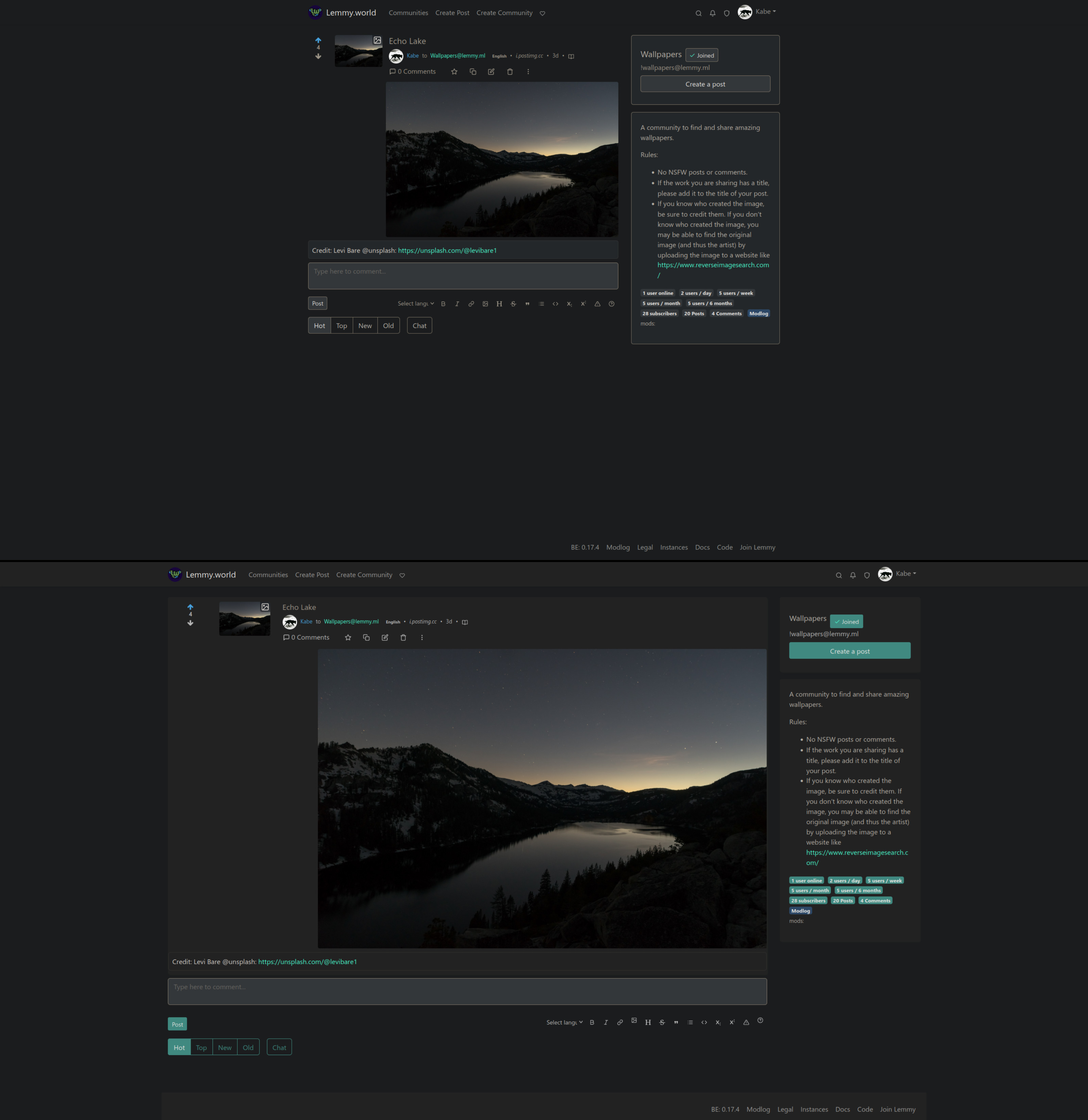
A funny “accident” I had with this is, that the first version of this style (which is in the screenshots) I created with a monitor that has an 4:5 aspect ratio. I then got some feedback and tested the style on my laptop that has 16:9 ratio and fixed some things. You can change the max-width in the line 222.
.container, .container-lg, .container-md, .container-sm, .container-xl {
  max-width: 150ch;
}
I would have liked that the max-width could have been in percents but that caused a weird bug on the nav-bar and it looked like this:
 Anyone know what could have caused this?
Hey! This looks awesome. Im a programmer working on a UI. I would really really really like to use this and work with you on completing my project.
You can use this freely and I’m open to improvements and changes to the code. You can for example make pull request to the github repo :)
I tweaked margin and padding. Is just a lot of wasted space if you ask me. .post-listing + hr.my-3 { margin-block: 0.2ch !important; } .post-listing { padding: 0.4rem 1rem; } :root { –radius-1: 1px; –radius-2: 2px; –radius-3: 4px; –radius-4: 8px; }
 ___
___What’s the best way to add this to my instance? I guess it’s just additional css to the default css? Can I use the default css and add the userstyles css?
You can add a docker volume mount to app/extra_themes leading to a directory in your volumes directory and then add custom themes in there. Pull the CSS for the theme you want to base off of from lemmy-ui’s github. Then add the custom CSS from above. Then set that theme as default for your instance in settings. I did that to my instance to make lemmy wider.
I tried this. I took the default dark theme and tried to add the custom css and it didnt work for me :( Not sure what i did wrong.
To be honest, I’m not really sure, because I don’t have much experience with CSS and web developing in general. Maybe someone more experienced could know?
I dont like the wasted vertical space at the top. Regardless, I think it does indeed look better overall, specially the visibility of the cards. Have you thought of doing a PR for this in lemmy-ui?
I haven’t yet thought so far, because this was just a personal little project, but I will think about it. I will probably just keep tinkering with this and try to make it better and maybe try to document this little bit
I would honestly look into creating a new PR. Check to see if they would rather this as a new theme or just the default thing… Please do it! Defaults are important, not many people are going to be adding a new CSS…
Yeah I will look into that. Maybe there is some kind of official community or discord server for developing, where I could ask about this
I know there is a matrix server. Not sure about discord.
Thanks. I will check that out
Is there any way to get it working on Android?
Use a browser that allows you to install extensions.
Firefox and brave does not support it, unfortunately. Anyway I found an alternative which is the “thunder” app, although they still do not support comments/new posts. Apart from that it looks excellent and can recommend
deleted by creator
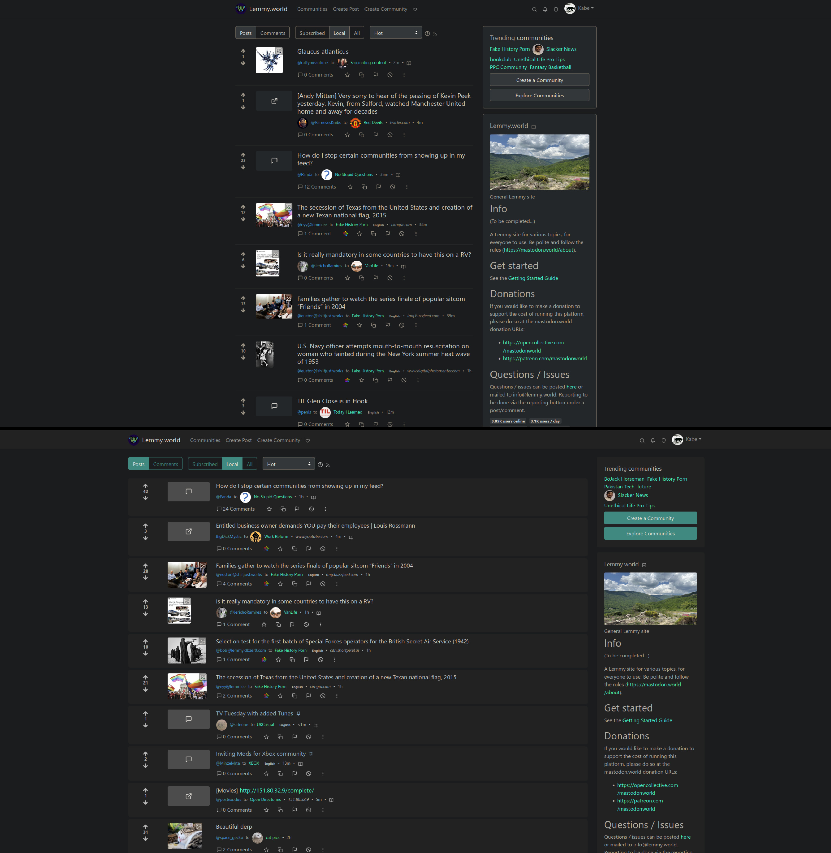
Lemmy looks too much like New Reddit for me. Lots of wasted space and mobile-centric UI.
I am surprised that they went with such a modern-looking UI, as opposed to something older like Reddit’s compact/old interface. Sure, Lemmy was not meant to be a Reddit replacement, exactly, but Old/Compact Reddit did have a nice, performance-friendly UI, even if it was a bit visually dated.
Yep, I really miss the “old reddit” style. More information dense, I can see 10+ post on frontpage before I need to scroll.
Lemmy (and new reddit) only show 5-6 post on full screen laptop.
It’s fine on mobile, but on desktop the default UI is ludicrously cramped.
On a 16:9 monitor, which the vast majority of people use, literally over half the screen is empty space.
Compare the default (top) to my custom CSS setup (bottom) in the screenshots below and you can see how much screen real estate is being wasted:
https://i.postimg.cc/PXsST8BZ/lemmy-UI-default-vs-custom.jpg
https://i.postimg.cc/rcpfccHf/lemmy-UI-default-vs-custom-2.jpg
I like the way threaded comments are colored in the default scheme. Makes it very easy to see which subcomment belongs to which parent.
With a bunch of vertical lines, I quickly lose track.
But I very much appreciate all the crafting and tinkering going on! It’s nice to see things grow.
Tracing those lines was almost a wasted effort for some more complex threads lol. Start going cross eyed. I like the colors much more.
This is just me but I missed the day when the site provided us to customize our profile page. Like friendster for example we can change the look of the buttons, we can change the size of the fonts and etc.
It shows us a little bit of our personality. But I know that it’s no longer a thing. The closes experience I could think of is how we design our linux desktop. In windows it would be using rainmeter.
Noob here. How can I use this?
Thanks! Should’ve checked out more carefully the Github before asking. It’s already installed
Does it work on mobile or only desktop? Thanks for making it!
I haven’t tested on real hardware, but when I switched to phone mode from the development tools, it kinda works, but some things behave weirdly because the resolution and aspect ration is so different from a desktop. If your on desktop, you can test by yourself, how it would look like on phone. Phone mode Chrome Firefox
Thank you for the reply and letting me know!
It requires tampermonkey, greasemonkey or any equivalent but this also works wonder to get a more compact look while fully utilizing the entire screen.
Nice, thanks. I don’t feel like installing Stylish but I do have a script manager so I prefer this solution. Had to comment a few lines because I didn’t like how it was messing with font sizes, however.


