
This is a pretty big release with a large number of UI changes.
This release adds a lot of user requested features to the app, the biggest one being the post feed header. The post feed header adds some information about the feed to the top of the page. The post feed header is disabled by default and will need to be enabled.
This release also updated the designs of a lot of key UI elements. To be honest I’ve spent so much time working on the UI that I can no longer tell if it’s better or worse than before. User feedback on the new UI is greatly appreciated.
Full changelog
- Add a setting to disable auto-linking IP addresses. Note that auto-linking IP addresses comes free with Android so enabling this feature will actually cause the app to strip them which is a bit slower.
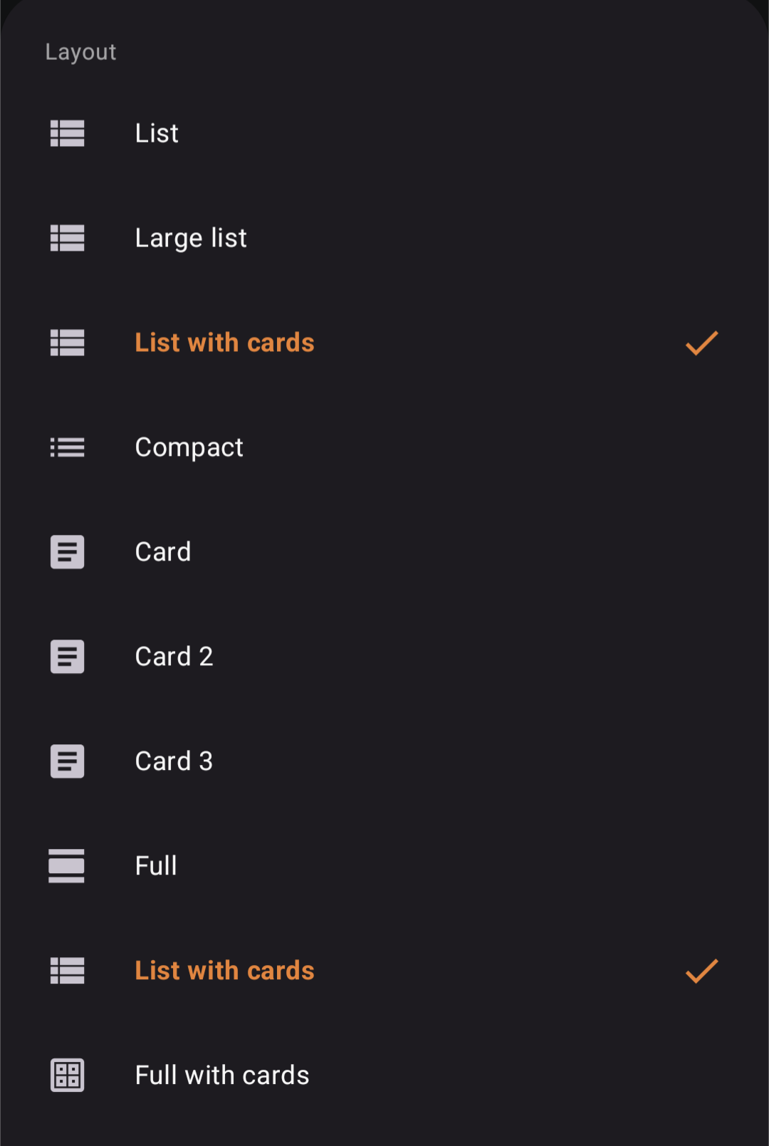
- Add a new layout: full with cards. This layout is the full layout but each post is contained within a card instead of full bleed.
- Add video caching.
- Add new post feed header. This is disabled by default and can be configured in Settings > Posts feed > Use posts feed header.
- Change the UI for the post feed toolbar.
- Change video volume logic to be smarter.
- Change the left side panel to have subscribed communities sorted by name.
- Change icons around the app from circles to rounded squares.
- Change some icon designs.
- Fixed a bug where sometimes expanding the context in the message screen would cause weird behavior.
- Fix locales being mixed together. (Attempt number 2)
- Fix a bug where inline video players are not destroyed properly leading to wasted resources.
- Fix a bug where cache directories are not cleaned up properly.
- Fix a bug where vote colors are not updated immediately in some places.
- Fix some minor UI bugs in the post feed.
Update
User reported some UI issues with certain layouts. Will do another release with the fix.
List with cards seems to be on the options list twice.
I feel mixed about the new UI.
I use List and now it feels pretty heavily padded. Compact is way too tight, but I feel old List let me see 2.more posts per screen. There’s just a lot of dead space now. If that thumbnail were tucked up in the enjoy space above it, I think that’s what it was like before and it seemed better to me.
The padding on the subscribed list you drag in from the left is somewhat the same in that now I have to scroll considerably more. It is nice seeing the community name and the c/whatever since it isn’t always the same, and it’s probably easier to click the right thing. I didn’t have an issue before, and I think the new way looks nicer, but I like it less to use, so I’m split on this one.
I live you’re still trying stuff though. Last week I would have said the app is perfect as-is, but I’m willing to play around with experiments to see if anything can still be improved. I can’t say enough what a great job you’ve done on this app though!
deleted by creator
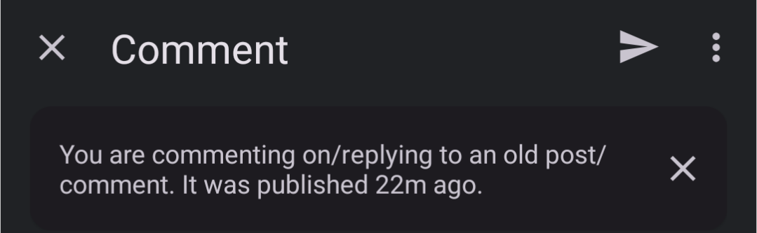
Looks like any post I reply to now gives the warning about replying to an old post/comment, no matter the actual age of the post/comment.
Same here.
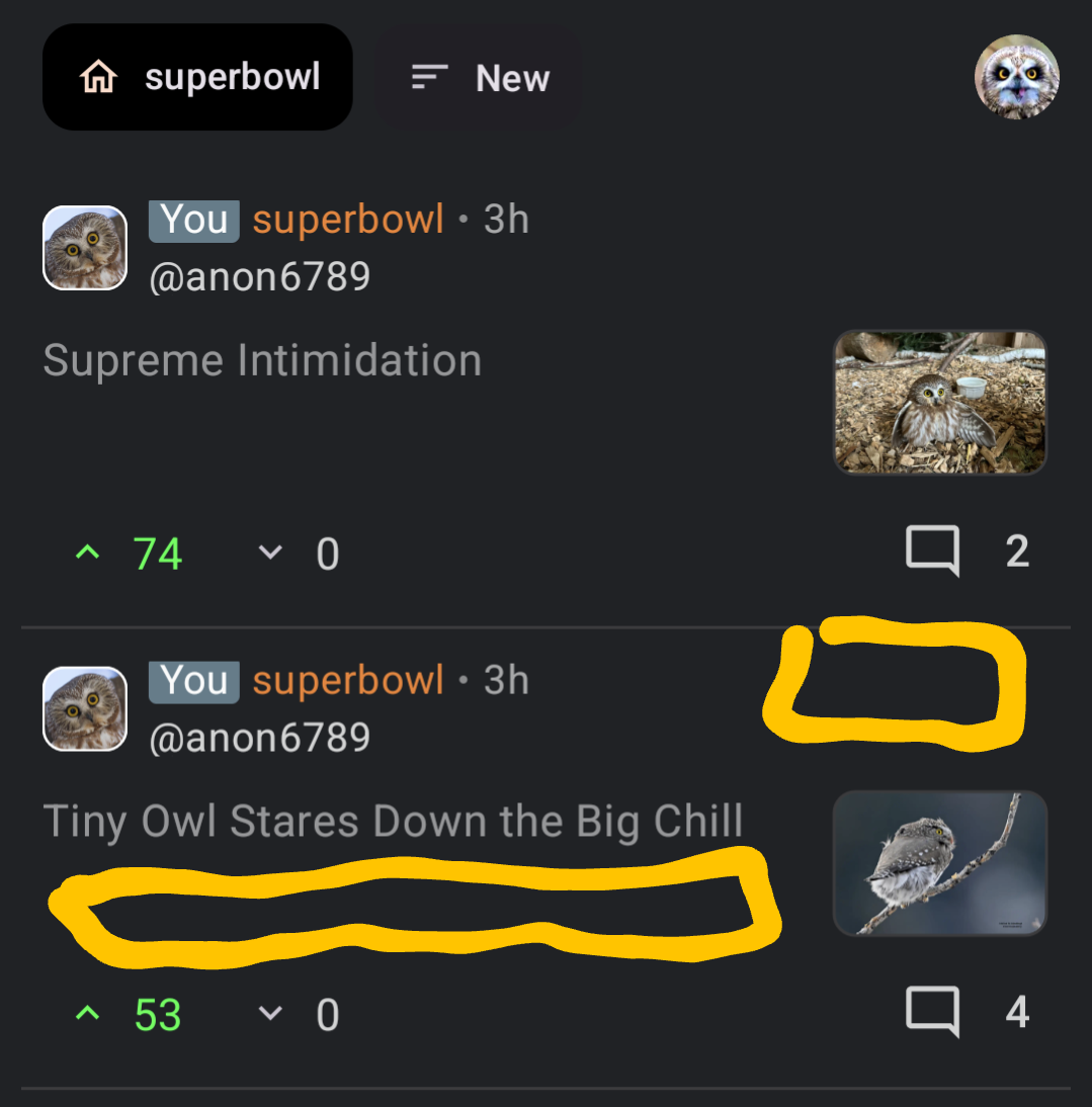
There seems to be a weird thingy. I’ve selected the card 2 post feed option (I always use this) and after the update I see image holders (rectangles) in every post that don’t have images at all…
Thanks for reporting the issue. I am able to reproduce the problem and will release a fix soon. The only unfortunate things is right after I made the release I did a full project clean up which might break more things. Fingers crossed :D.
Fixed with the latest 1.55.1. 👍
Damn, these are a lot of changes, can’t wait to try them