Hey Android enthusiasts!
Calling all customization lovers! 📱🌟 Show off your amazing homescreen setups and join the fun! Whether it’s sleek and minimalistic or vibrant and expressive, we want to see it all!
Share a screenshot of your homescreen and let us know your device, favorite launcher, widgets, and must-have first page apps! Bonus upvotes for before/after examples!
Let’s exchange some creative inspiration! 🦾
KLWP (Netrunner modified by me) & Nova Launcher

Wow! What device are you on? Google Pixel 18?
Nah, the Samsung 2100 FE
Are you Tony Stark?
This looks awesome, but is also giving me anxiety. 😂
Well done and good organization. Kustom rocks.
The “well done” bit mostly should go to the original creator of Netrunner, I only changed a few odd things. Kustom absolutely rocks!
https://play.google.com/store/apps/details?id=outtiefivethou.netrunner.klwp
The link goes to Playstore but not to netrunner, says retry.
Link doesn’t seem to work for me!

Wow that’s layout is so good the entire thing looks like a normal wallpaper. Really good job on the icons.
Keeping it clean
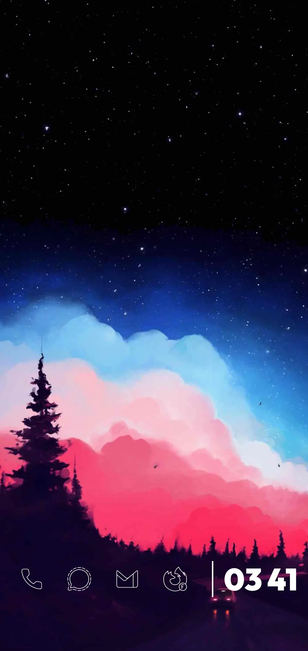
But a freak in the
sheetsapp drawer?OK? 😅
Klwp & Pixel Launcher
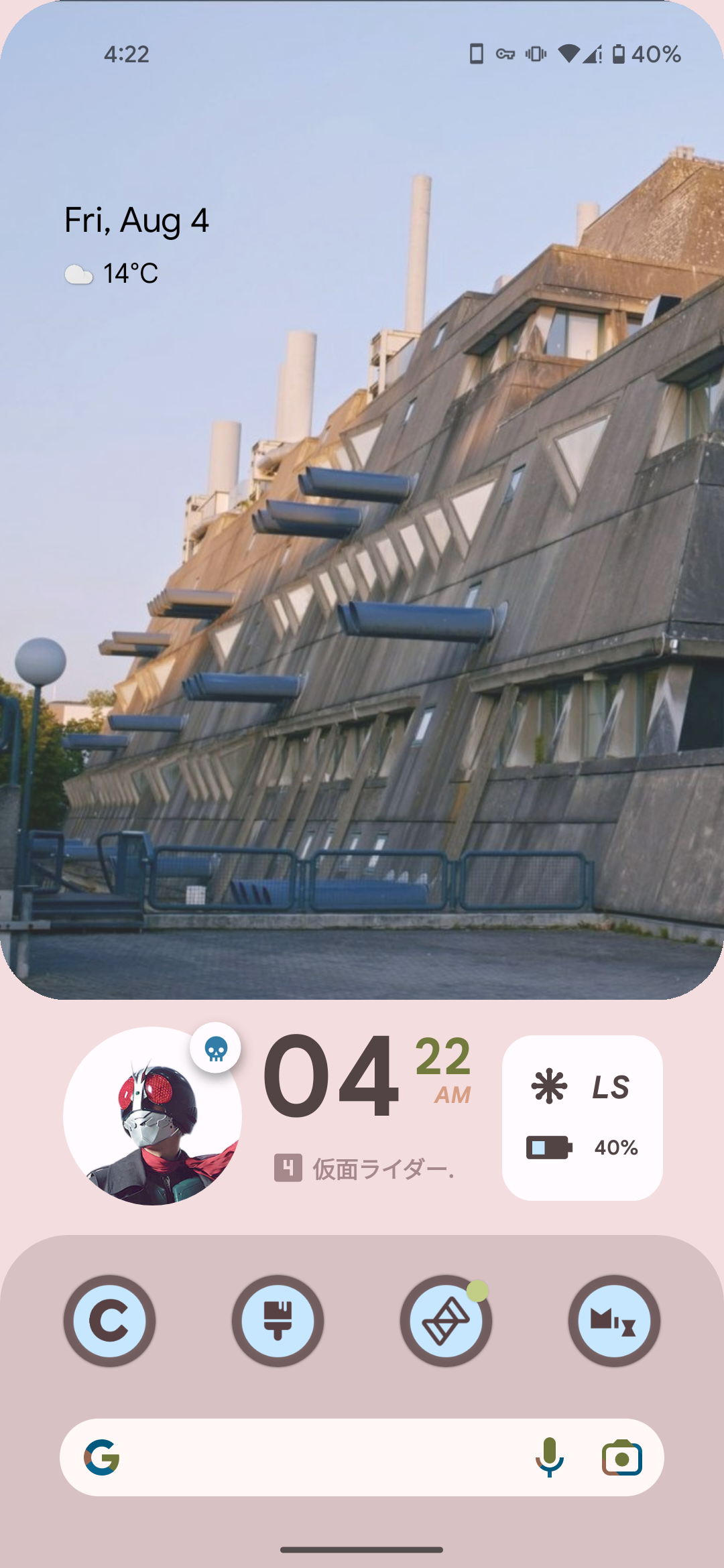
Having fun with material you
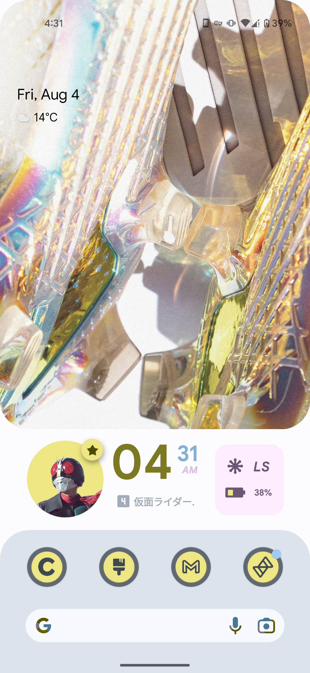
This is just art at this point
Hey, I like your dedication for the AESTHETIC and Kamen Rider. 👍
This is beautiful
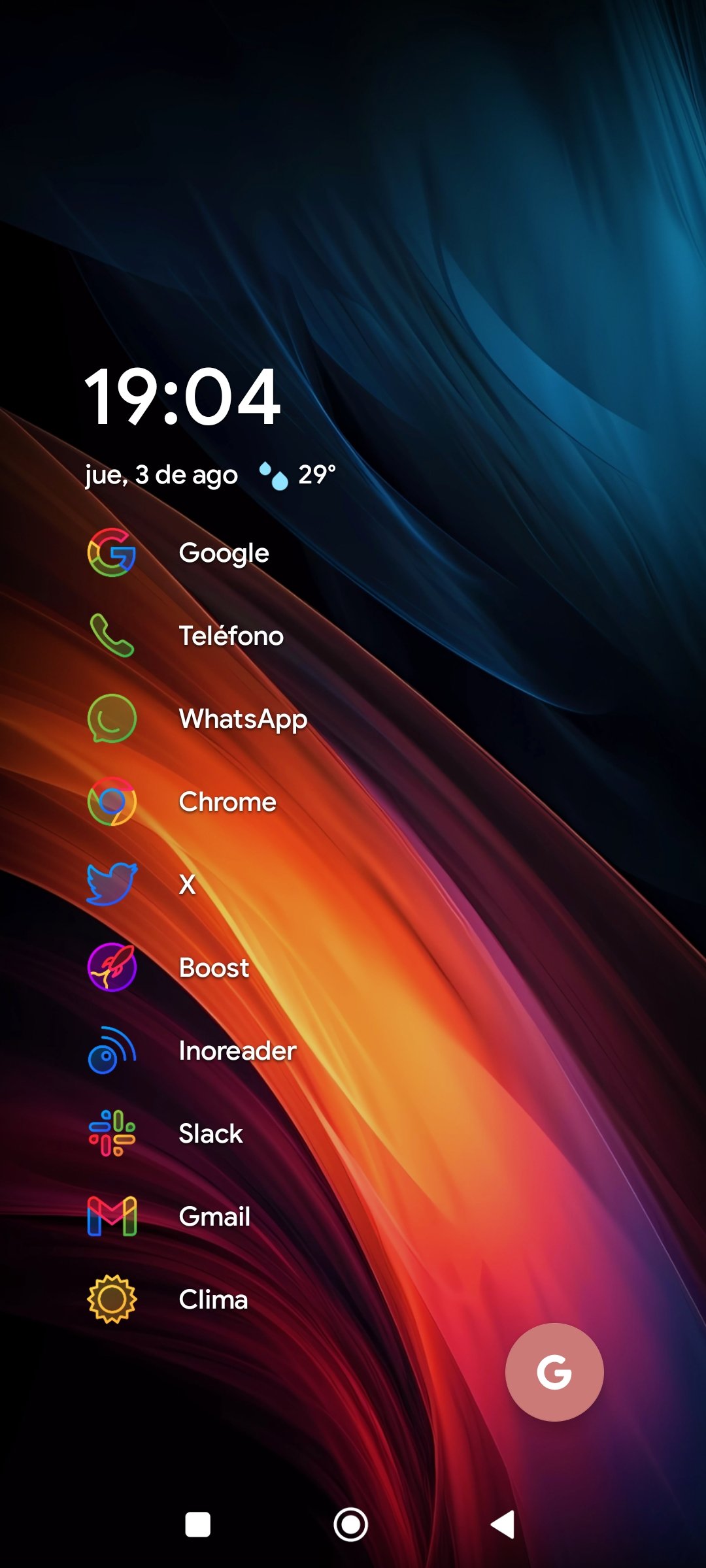
Niagara Launcher + Caelus Duotone icons
Nice, I would bring back Twitter label to X though…
You’re right. Will do that. The X just seems odd.
Really liking the icon pack. I already use Niagra so my home screen may be looking like yours now.
Nice and clean!
I LOVED Windows Phone, and was DEVASTATED when it got discontinued. As a result, for the past 5 years, I’ve slowly trudged along, trying to reach a position where I can make my Android phone look and (kinda) function like my old Lumia 525.
After years of research, Square Home Launcher. The dev is awesome, and the one-time fee isn’t that bad.
Here’s how my screen looks:
https://pixelfed.social/p/ElPussyKangaroo/592883078695439839
Yeah, high-five for SquareHome launcher. I never used a Windows Phone, but SHL caught my eye and it’s amazing. Props for the cat photo on the home screen.
Ah man you’re lucky you didn’t use a Windows Phone. You’d be crying yourself to sleep knowing Mobile OSes reached perfection and then it was cancelled 😭.
SHL is extremely powerful and very intuitive. Especially as a WP user.
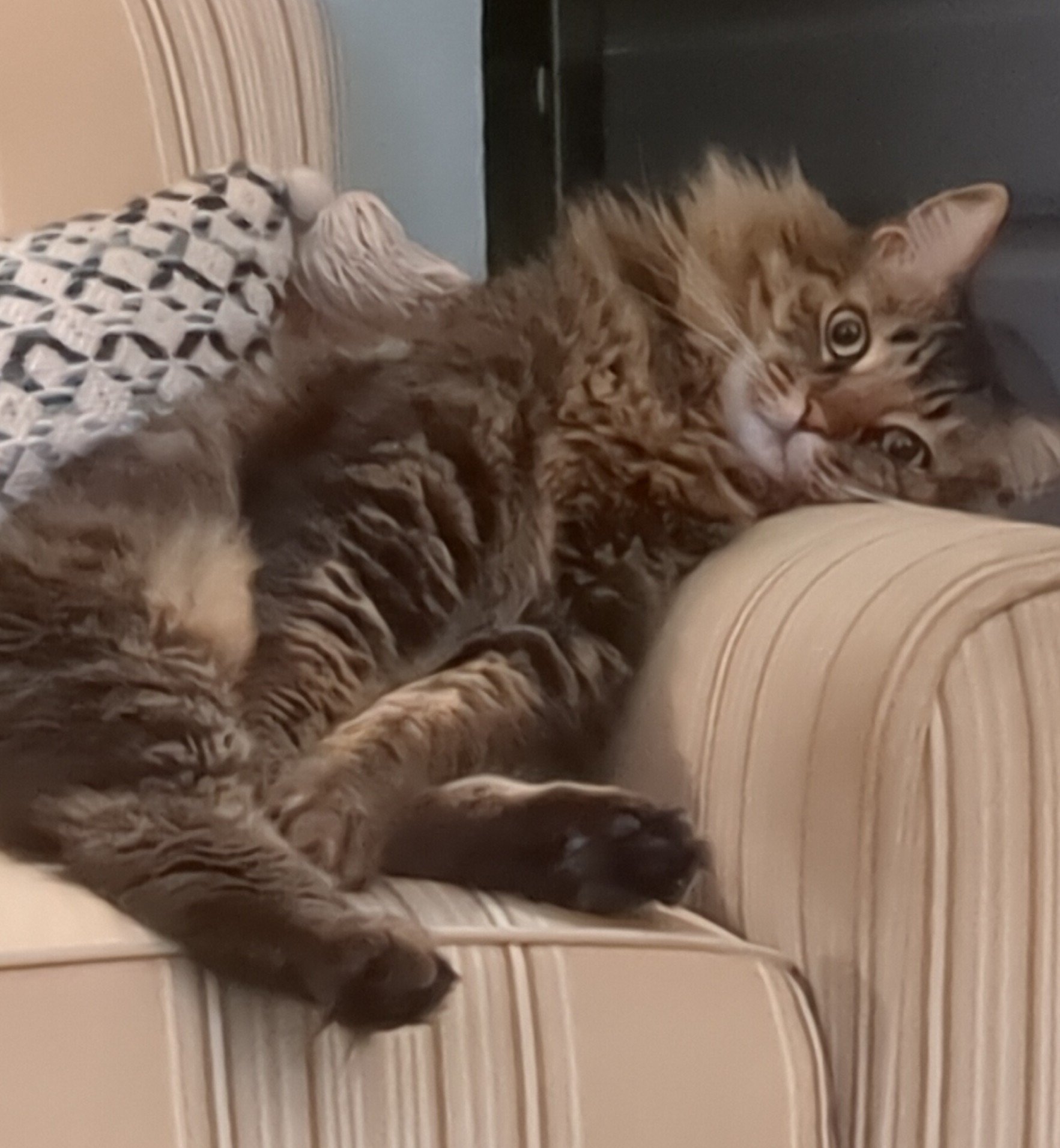
Also, I waited till the live tile updated to Simba’s photo. No meow, No post 🤌🏼🙌🏼.
I still have a Lumia 1520 and 1020 because I can’t get rid of them. For whatever reason, I never got on board with SHL though. I think I found it too long after I had accepted that Windows Phone was gone…
Ah man.
You could maybe sell them online?
Also,
I think I found it too long after I had accepted that Windows Phone was gone…
saddest sentence ever 😭
Sorry my wording was ambiguous. I meant I don’t want to get rid of them. I still have an old Palm Pre and Pixi around somewhere too. And an HP Touchpad and Zune…
I’m not nostalgic for much, but I love my old underdog tech. Lol
Nice.
Bruh listen, I’ve never felt physical pain when nostalgic about anything apart from the ending of Windows Phone. I get your sentiment 😂.
Nice kitty! Do you follow (All Orange cats have one brain cell)? Good luck with your Japanese class!
One Orange Brain Cell supremacy 🤌🏼.
Also, thanks 😂.
That is a great app and does a perfect job of recreating Windows phone.
Nice setup. Very informative.
Ikr. The dev is really responsive and is open to suggestions. I love it.
Thanks man. I miss WP 😭.

If it’s not cute, I don’t want it ✨
I love it
Nice aspect ratio! What device is this?
OnePlus Pad! The unique aspect ratio on android was actually one of the main selling points for me, not sure why it’s not more common outside of iPads. So convenient. Probably would’ve gotten the Xiaomi Pad otherwise as they’re the only brands with super fast charging
Huh, there was a thread for this earlier over on c/asklemmy
Anyway here’s mine. I keep the top bar on because I like seeing my notifications.

Nova Launcher, Crayon icon pack, Comic KWGT widgets
Edit: And here’s my old one on this phone, I found a screenshot of it.
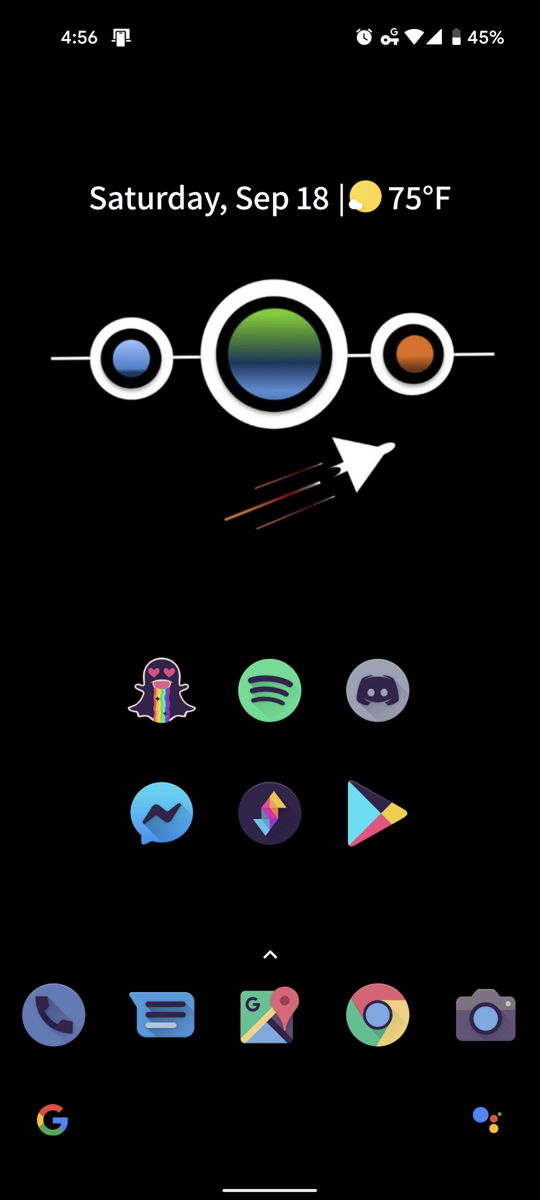
This screen has a good vibe, feels fun and relaxed.
Thanks! That’s what I was going for.
there was a thread for this earlier over on c/asklemmy
Interesting! Would you mind linking it?
Probably should have just done that in the first place lol
Thanks!
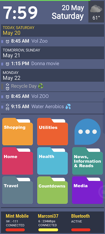
Launcher is SquareHome Launcher, populated (mostly) by kustom widgets. Using PowerLine for a quick-glance battery strength reading (green line) at the top. The calendar at top scrolls (from calendar.google.com) and is part of a 6-sided shape with rotating faces — a SquareHome native widget. On that rotating widget cube I also have a Google Keep note for quick notes and info, a quick dialer, a favorite photo, and a list of recent alerts. The folders below, which are custom art, speak for themselves. The three-dot bubble opens up to Gmail, Google Tasks, Google Voice, Google Calendar, and a repeating alert app (Reminder Pro). The bar at bottom is another kustom widget, showing the status of the cell, wifi, and Bluetooth radios. Color bars indicate signal strength. • Also generally recommend the “Bottom Quick Settings” utility, and can’t live without “Missed Notifications Reminder” utility. You should check them out.
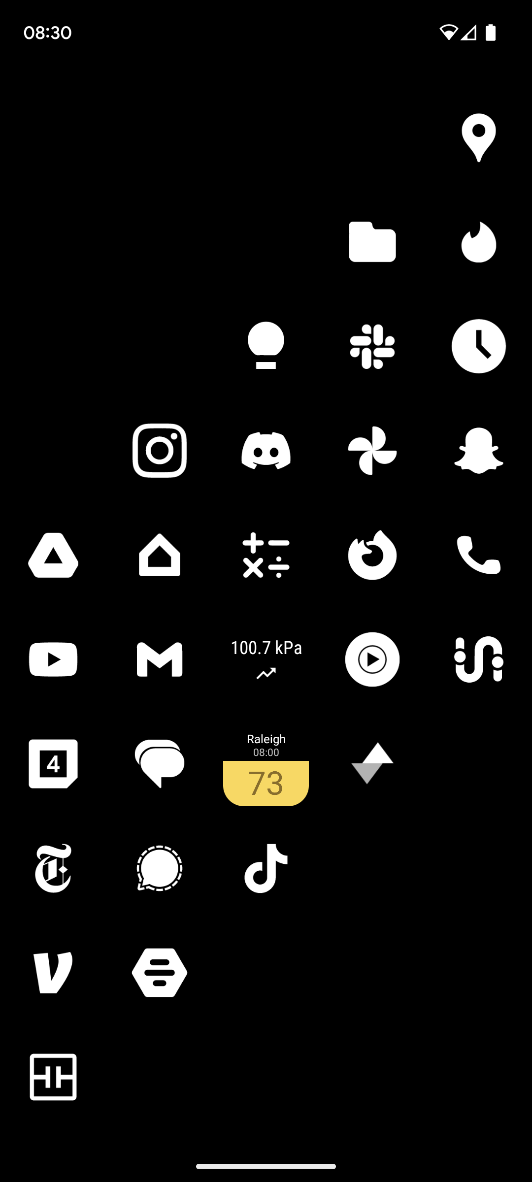
nova launcher with minimal white icons. as well as air quality and pressure widgets for managing my various health issues
Add in some red and I’d be getting MKBHD logo vibes.

deleted by creator
Love the vibe of this screen.
Wow! What’s in those two folders?
deleted by creator

I’ve had this setup for probably close to three years now and I don’t see it changing anytime soon. I have a very similar theme on my desktop with the background changing hue depending on different programs running. The launcher is Lawnchair with the Arcticons Dark theme from F-Droid.
First one that looks decent
Thank you!
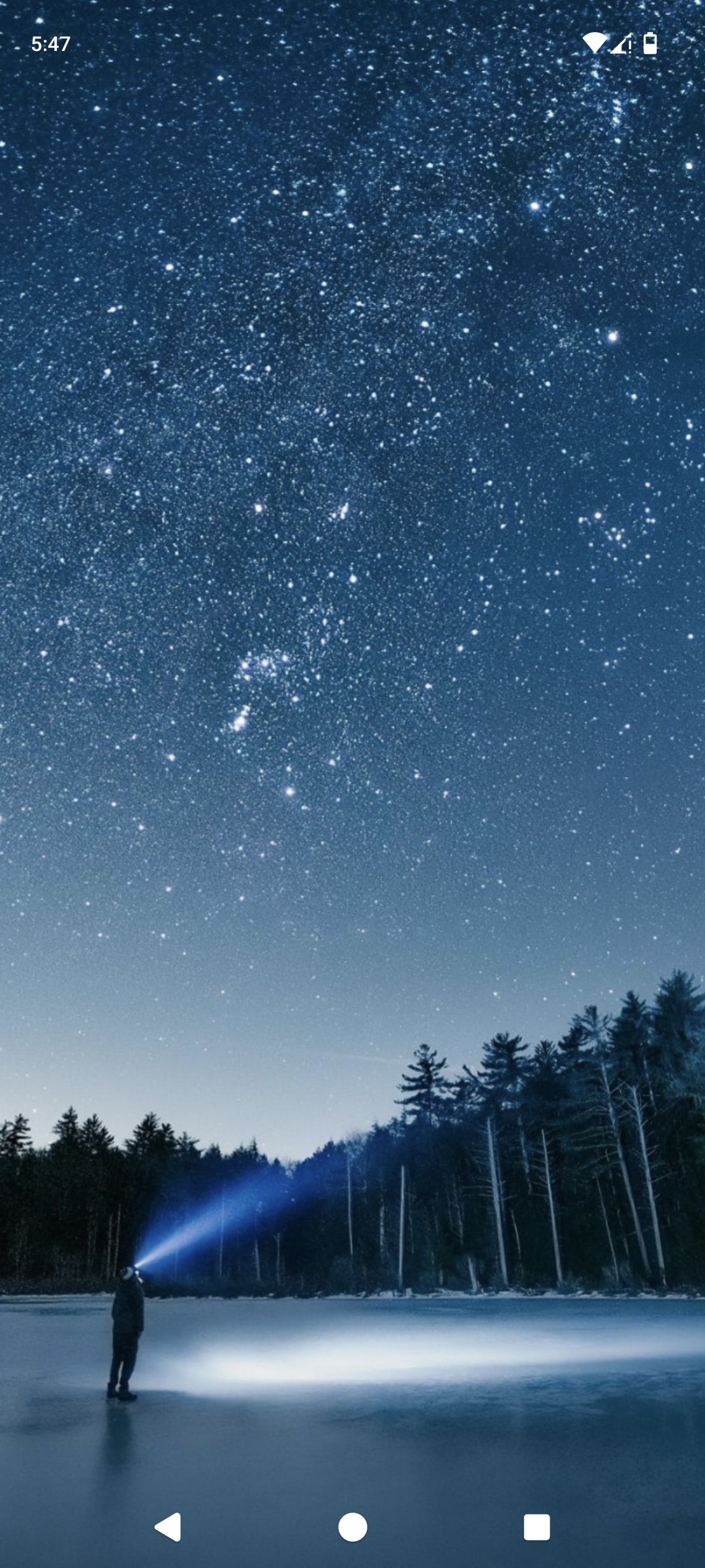
Clean is the way. All apps stay in the up-swipe menu.
deleted by creator
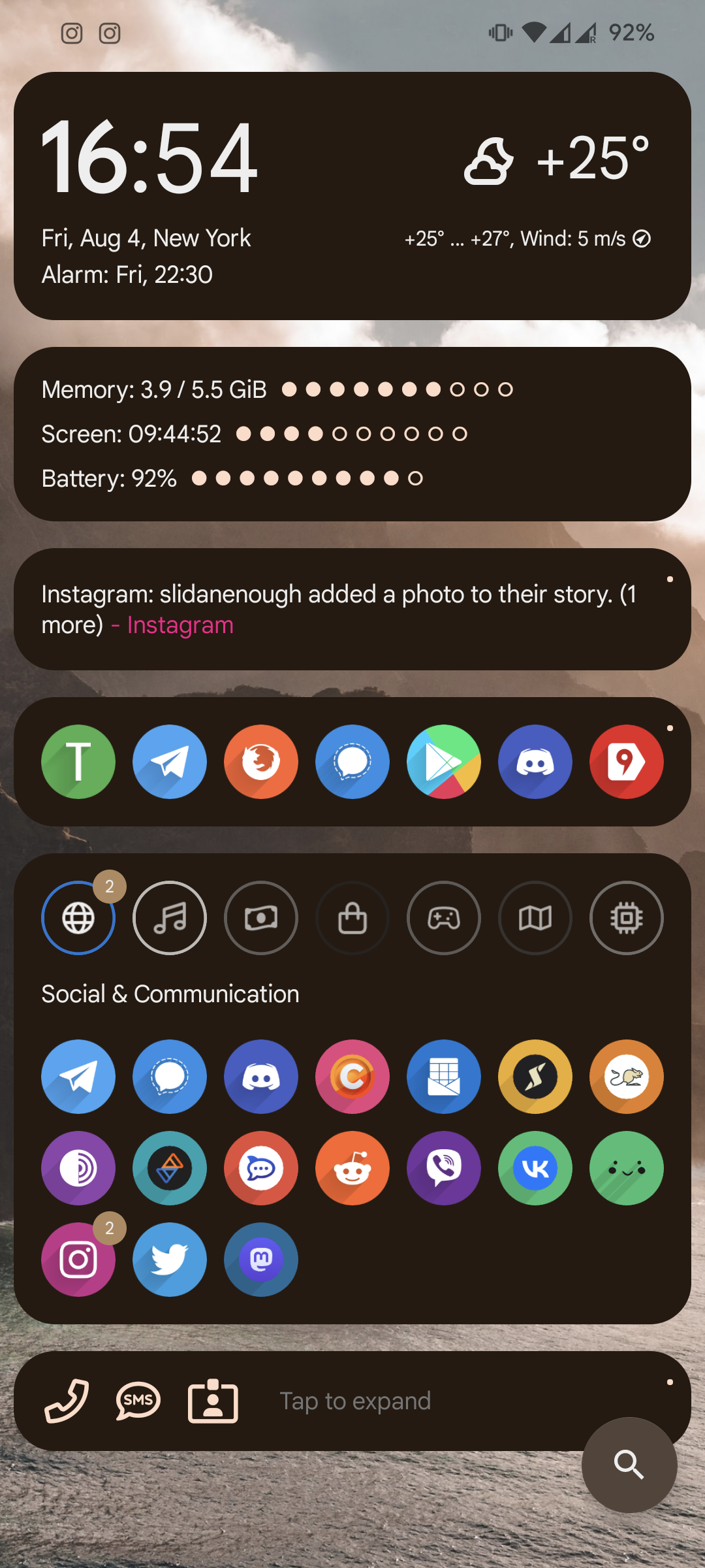
Material you based design, one of many in the AIO launcher Apps and actions can be launched via search, and there is support for DuckDuckGo bangs
Wallpapers change every day, picked up from the Internet.
All applications are placed in categories, the most popular above category for quick launch (updated automatically, depending on the launch count)
The most ugly - multi-colored icons. I have to use an icon pack close to the default android, otherwise, randomly installed applications without support of icon pack will stand out.
Not too cute, but quite humanly usable.

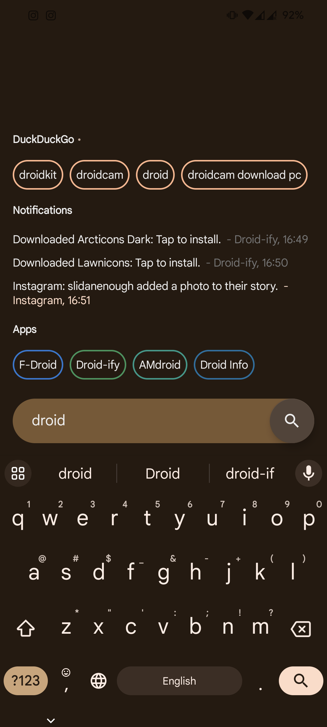
Ex AIO launcher guy here, I used it for well over a year, gave up because even though widgets are supported, they break so often.

Neo launcher + arctic icons dark
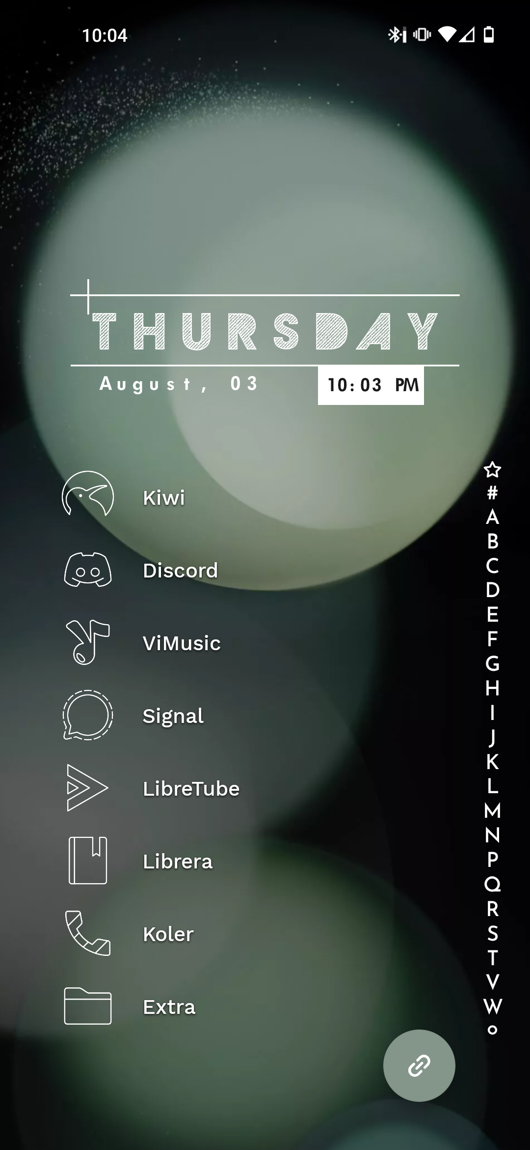
I’ve become pretty lazy, just Niagara


