
Doesn’t look anything like something i would click to submit a post
It now looks like this in 0.35:

Still should be at the bottom of the form IMO.
Came to say this as well. Still much better than before
This. It’s a pain in the ass to use with a big screen smartphone.
Agreed. It’s a UX nightmare to look to the top right to “submit”. I understand the desire to make use of an otherwise empty and useless space in the upper right, but it is unintuitive.
I think the Lemmy devs are great backend guys but quite poor at front-end design. That’s OK, but they should ask for some advice here. :)
Same with default Lemmy theme, its designed to be functional, not beautiful.
A normal button in the bottom right of the form/screen makes most sense.
deleted by creator
Loads better!
That’s much better
A new version of Lemmy was released, and the Jerboa app that updates to that new version isn’t released yet on Google Play.
Try the new 0.0.35 alpha here: https://github.com/dessalines/jerboa/releases
Or on IzzyDroid: https://apt.izzysoft.de/fdroid/index/apk/com.jerboa
It looks like FDroid main repo doesn’t have it yet, and it’ll probably be a week until the Google Play version is updated (it’s still on 0.0.33 lol).
Majority of people will use google play because it is the most convienent. Its not officialy released to most users if its not on google play
A new version of Lemmy was released
It’s not yet released!
deleted by creator
0.0.34 is still in the Google Play verification stage, 0.0.35-alpha is available on GitHub now to support the lemmy version that’s coming out tomorrow.
Google Play is slow, consider using FDroid for now until things settle down.
deleted by creator
Update your app. 0.34 has an arrow to post. 0.35 has more fixes, but its only on Github as of the time of this comment.
And on Fdroid Izzy archive now.
0.34 still has the + symbol for me, and I have it from fdroid. Will need to wait a bit i guess
Yeah, I keep tapping the “create post” text wondering why nothing is happening before realizing my mistake.
I kept closing my app thinking I had pressed create post my mistake
Same always wondering where to click, I think something on the bottom right would be better.
Top right is also fine but make it look like the Send icon when you’re posting a comment
EDIT: It’s been changed apparently, yay!
deleted by creator
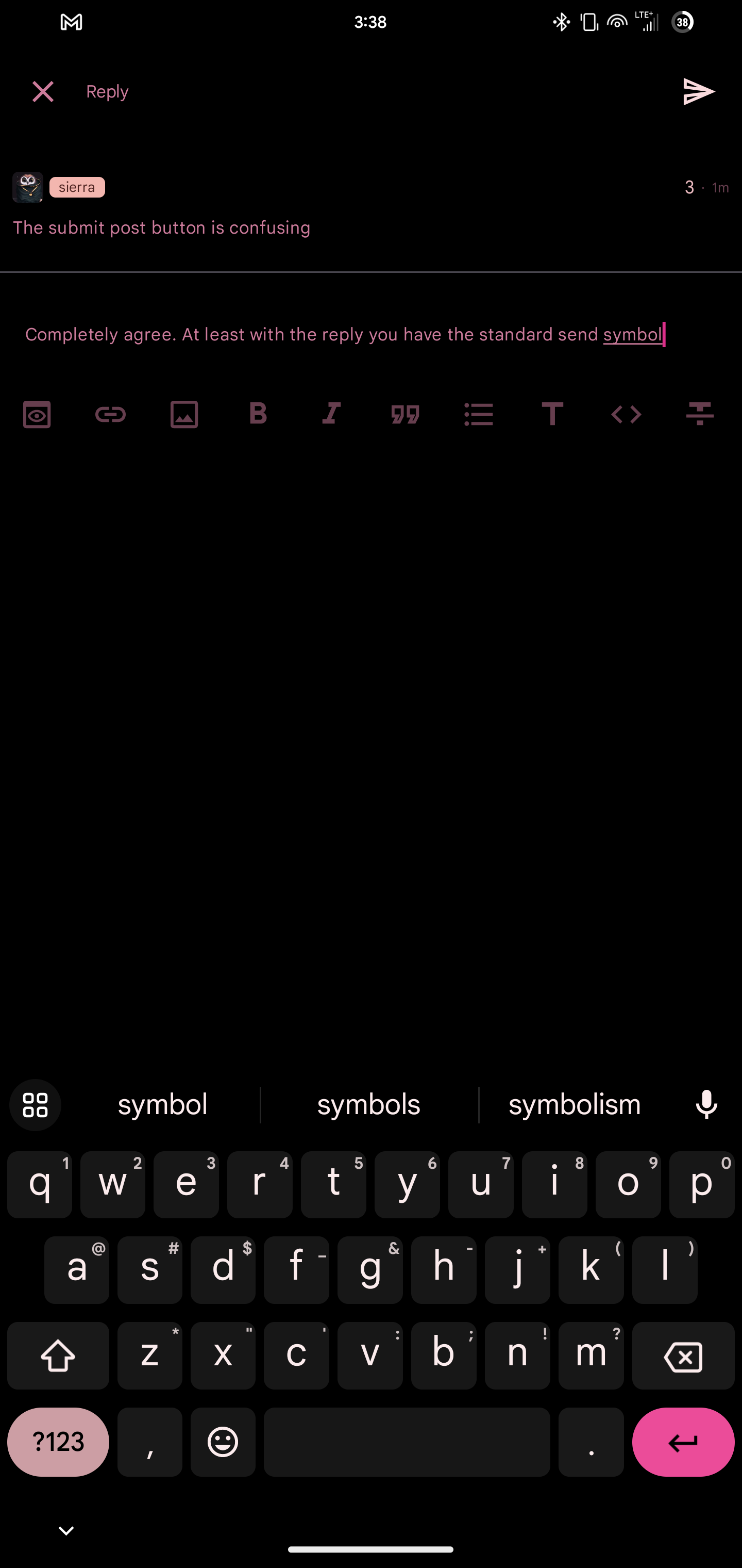
Completely agree. At least with the reply you have the standard send symbol
deleted by creator
deleted by creator
What makes you think he’s sweating it? He simply mentioned it…
deleted by creator
People always need something to complain about. If the icon and position of the submit button is the worst they come with, they are probably pretty happy.
I was not at all complaining. I was merely pointing it out to the community so that the app can get even better.
deleted by creator
No one’s sweating, all good. Great app. Let’s make it better
deleted by creator
deleted by creator
That’s not how UX design works. You need familiarity for a good reason
deleted by creator
deleted by creator