
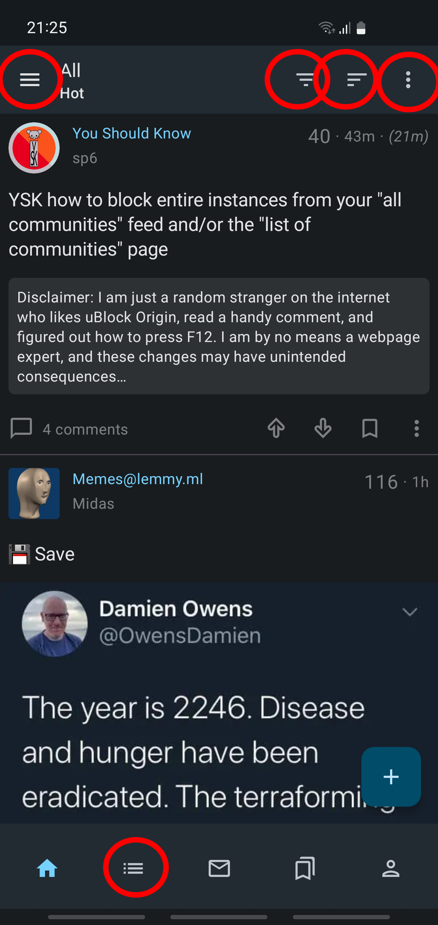
Lemmy is new (newish? I dont know I just got here). There are tons of stuff that could be done better. Currently the only android app for Lemmy on the play store Jerboa, that I use, has its growing pains. UX wise this one is the worst (excluding stability issues). I think that the right tripple dot menu is not needed and options there can be integrated to the hamburger menu on the left. The menu for choosing between all-local-subscribed should be a side swipe. We are only left with the icon for sorting which should look less similar to the hamburger menu. On the bottom I literally dont know what the house icon does. The bottom hamburger menu is sort of the same as the top one? Maybe merge these two into the bottom one. The bookmark function has way too big importance for what it is. Who bookmarks stuff in an app like this anyway?
Like this we would incredibly simplify the interface while making it more intuitive and faster to use.
What do you think?
Jerboa is open source, so you could actually raise a PR addressing these issues if you like
Great!
Agreed. The sorting/view should be selectable by tapping on the indicator (in this case, All/Hot) rather than some inscrutable lines on the other side of the screen.
The “home” icon returns the user to the feed, which IMO makes sense.
I don’t have any UX input, but am honored that my YSK post made it into your screenshot 😂
deleted by creator
Oh! I didn’t know it was behind on playstore! Id love to help really, but job & kids… I was hoping I could help gather a UX community where a mass of people would be available for the many projects going on.
deleted by creator

