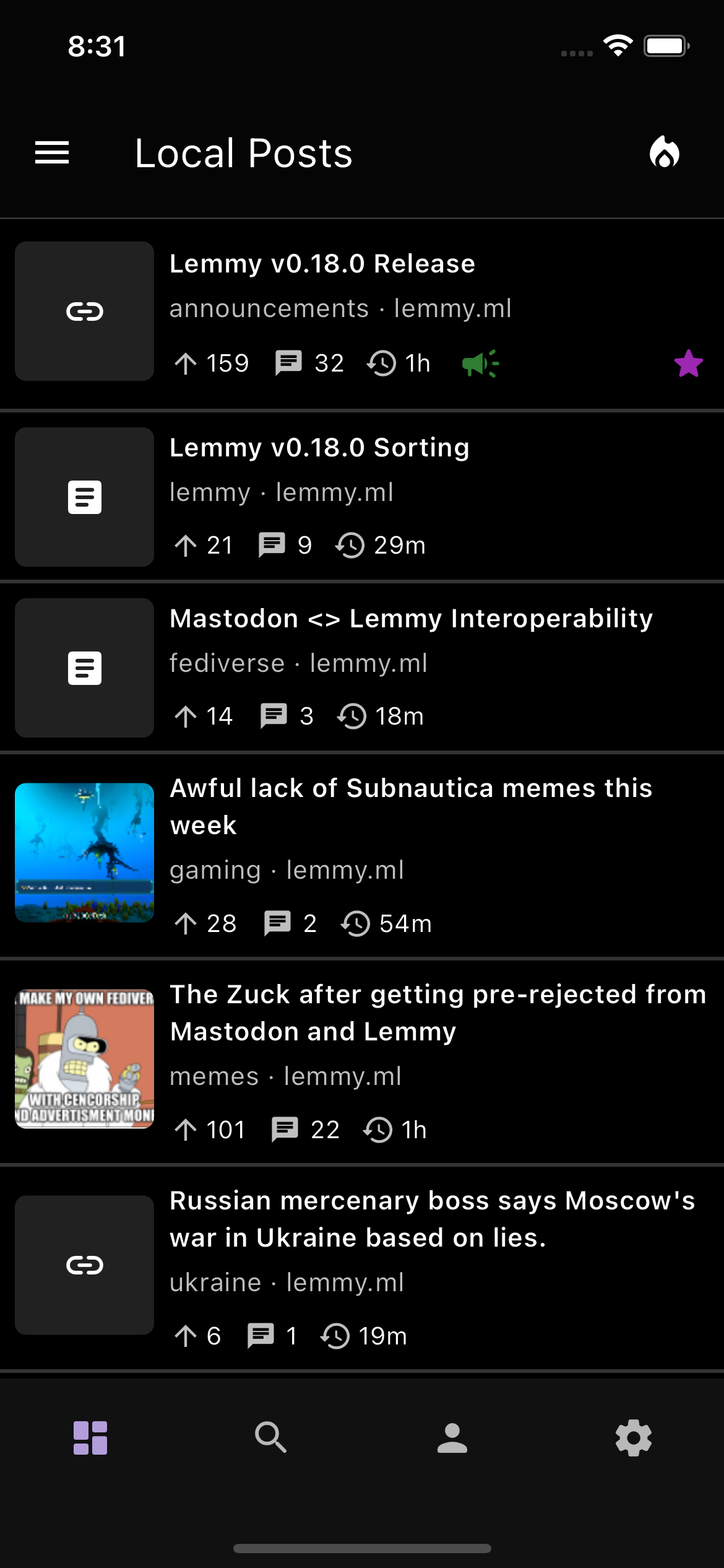
Sneak preview of OLED Black theme, and also a more compact view for those who were requesting these two features!

+1 for compact view :)
Any plans for font size options?
Thanks! There’s still a bit more testing to be done, but I think it looks pretty nice
There’s nothing yet for font sizes as of right now, but definitely something to think about in a future release. Right now, the font sizes should follow what you set in your system settings!
Looks epic, will it be ready in the next update?
Yeah, It will most likely be included in the next release as long as no large issues are found! crosses fingers
Where can I try the app?
On fdroid for android, testflight for iOS
Edit: So android version is not on fdroid yet, but it’s on izzyondroid repo. Alternatively you an download straight from github
I love the compact look! Feels like you’re showing just the right amount of info here. My two questions/thoughts:
- How does voting work in that view? (I’ll admit I haven’t logged in to Thunder yet so I’m not sure how voting works in-feed using the default view, if that’s possible)
- could there be an option to put the thumbnails on the right side?
Honestly I really like Jerboa’s list view with the voting arrows on the left, but your compact view looks even classier since you iconified a few things that they currently represent with words. Excited to try your compact view once it’s been implemented!
How does voting work in that view? (I’ll admit I haven’t logged in to Thunder yet so I’m not sure how voting works in-feed using the default view, if that’s possible)
Voting in this case can be done through swipe gestures, similar to how voting works in the comments! I was trying to think of a way to maybe add in voting icons as well for those who don’t particularly enjoy the swipe gestures (this will eventually make its way in the future once its more polished out)
could there be an option to put the thumbnails on the right side?
Definitely, that’s possible! It might not be the highest priority thing at this time (unless the community strongly votes for this to be included earlier), but I do want to make it as customizable as possible to cater to as many people as I can
Right thumbnails would be amazing!
deleted by creator
That is really nice. I like compact views as i am blind and pictures are nearly irrelivant to me. I like information density much better than tons of color distraction like you get by showing pictures in card view
Thanks, that feedback is much appreciated! The views will continue to be adjusted based on community feedback, so keep them coming


