are there any pixel/stock like launchers currently in development? went from motorola to oneplus and missing stock launcher, nova launcher isn’t developed since 2021, lawnchair haven’t seen any release since 2018-2019, ruthless can’t be officialy installed because it’s ‘made for older devices’, hyperion is weird with icons, they look small at 115% and clip if set to larger percentage etc.
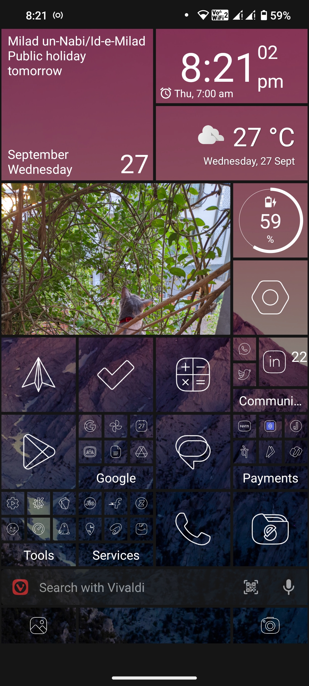
As a big fan of Windows Phone UI, I use the Square Home Launcher. It’s pretty cool! Sure, Android doesn’t let 3rd party launchers customise recent apps and gestures, but for what it does, this is SO good 🤌🏼. The icon pack is Vera Outline White.

This is so nostalgic.
IMO Android or Google fucked up all custom launchers since A11 or A10, I don’t recall, especially for the animations, if you don’t like animations and have them turned off by default then I think you have some pretty neat options likd Lawnchair, Nova Launcher and some others.
Action Launcher is still receiving updates and is a fantastic custom launcher.
I’m very happy with Smart Launcher v6.
I have my icons in Hyperion at 120% and they look fine?
Do you have a screenshot? Is it only with certain icons?
There is a Nova launcher beta: https://novalauncher.com/beta
Thanks, too bad links don’t work, found it on APKmirror though, cool update
I don’t think so… What are the main features you’re looking for from a launcher?
IMO a lot of the launchers nowadays have matured a lot, and in some cases I can imagine devs for free launchers don’t have 2k sitting around to buy the latest and greatest phone each year to update their launchers for compatibility with the latest Android APIs etc.
Personally I moved on from the standard sameish app grid type launchers and now use Niagara… the minimalism and simple design were a big draw factor for me - paired it up with some Lines icon pack to make everything look cohesive.
Kvaesitso (hope I spelt it correctly?) is a solid free alternative with a very similar feel to Niagara.
Not sure if I’d go back to app grid launchers, there’s not too much differentiating them nowadays IMO, and each app having different icon designs feels kinda cluttered now that I’ve not experienced it for a few years. Material You’s new unified icon design looks pretty nice though.


