
Okay, I get this is totally not a priority, but this app icon bothers me enough that I don’t even want it on my phone’s Home Screen.
I bet you can see why.
You must log in or register to comment.
Someone is working now to contribute a much better icon for us. Should be done soon.
Nice. Any plans for community icons?
That would be cool custom icons like Apollo had
Awesome!
I can’t see why Why?
I don’t get it either, what a weird post.
Because of the white trim around the icon, which shows that it’s not actually the proper shape for an iOS app icon.
Sorry, that should be kind of obvious just from looking at it.
Ohhh, I thought something on the animal was supposed to be wrong

I actually never noticed it but now I’ve zoomed in on that picture I can see it.
Edit: actually nah I think that’s actually just compression from the screenshot, the other apps look the same and it’s impossible to see it when looking at it on my home screen.
Yeah, the white edges are a pretty common issue that happens when someone uses an icon template in Figma or Sketch, then exports the icon with the clipping mask enabled.
Gkd needs to remove the rounded corners from the icon graphic. The OS will round the corners for him.
This is good to know for my inevitable dive into Figma or Sketch in the future
Ditto for Android. Use the clipping mask in the design file to preview what the icon will look like, but when you export the graphic, just save out a square with regular old 90° corners.
Yes, but to be fair it looks okay in the Home Screen (no white trim).
It’s definitely still there, albeit less noticeable for some reason.
You’re right, but it’s really minor.
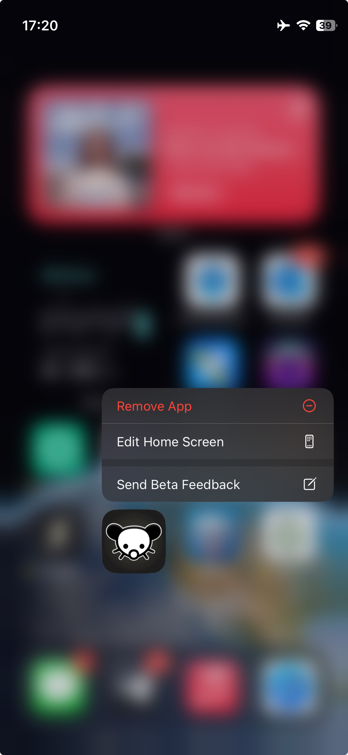
That’s only in the TestFlight page tbh
And only when it’s in dark mode
oh yeah that is really annoying
That’s the old icon. The new one looks completely different.
Ohhh, I thought something on the animal was supposed to be wrong


