Red to linuxmemesEnglish • 8 months agoAV1 Racereddthat.comimagemessage-square17fedilinkarrow-up1371arrow-down134
arrow-up1337arrow-down1imageAV1 Racereddthat.comRed to linuxmemesEnglish • 8 months agomessage-square17fedilink
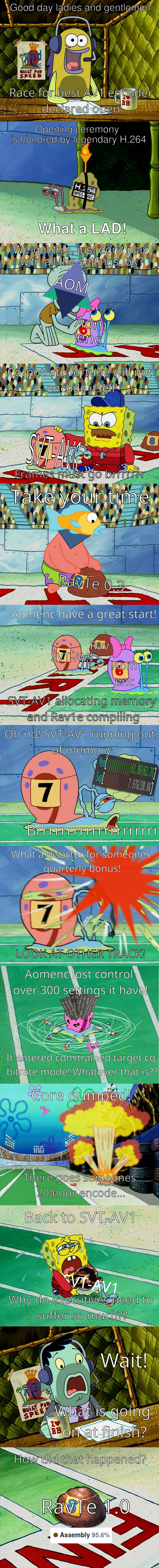
minus-squareKushanlinkEnglish93•edit-28 months agoIt’s incredibly difficult to read the captions on this meme, there’s not enough contrast with the white text on the light backgrounds.
minus-square@AnUnusualReliclink19•8 months agoAnd when you’ve finally managed to decipher them, that’s when the grammar hits you.
minus-square@Telodzrumlink6•8 months agoThe black outline that is intended to increase legibility is too thin. Honestly, a drop shadow works better than the outline, in my experience.


It’s incredibly difficult to read the captions on this meme, there’s not enough contrast with the white text on the light backgrounds.
Even less contrast…
And when you’ve finally managed to decipher them, that’s when the grammar hits you.
The black outline that is intended to increase legibility is too thin. Honestly, a drop shadow works better than the outline, in my experience.