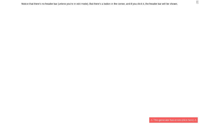
By “hide” I mean it shows a button in the top-right, which when clicked, shows the full header bar.
Examples:
Please let me know if you run into any issues or have feedback 🙏
Edit: Also, for people who know some JavaScript, you can use the public generator list API to get generators with specific tags like this:
let data = await fetch(`https://perchance.org/api/getGeneratorList?tags=foo`).then(r => r.json()); // returns generators tagged 'foo'
let data = await fetch(`https://perchance.org/api/getGeneratorList?tags=foo,bar`).then(r => r.json()); // foo AND bar


Cool cool… Could be an accessibility/contrast nightmare, but such are the risks we take for customisation I guess 😜
What you could do is, give the text in the bar a subtle lighter drop-shadow to help with contrast even when the background is dark. Or just straight-up give them their own background color so they always look the same.
Also, since I know you’re interested in this sort of thing: Today I also removed the
<div id="output-container"></div>inside the body to bring things closer to being “just HTML+JS+CSS”. So everything in the HTML editor goes directly into the<body>. For backwards compat, the<body>element hasid="output-container", and beyond that there were only a few generators that had to be semi-manually fixed. Small improvement, but that was annoying me for a long time. The bigger and more painful task (in terms of ensuring backwards-compat) is that square block vs script tag escaping stuff 🥲Would be grateful if you could tweak the default styles to not apply to
body, #output-containerbecause that overrides a simplebodyselector it seems.Oh, could you give an example?
Well the defaults set
text-align:center. I want it left-aligned. But if I just usebody { text-align:left; }it won’t override, because an id selector (as in the defaults) has a higher specificity. So anything you set in the defaults will still need to use that id to be able to override.Ah, thanks! Fixed
👍
Oh awesome! Nice one!
The code block thing is definitely a knotty problem. 😬
I currently do pick a text color that contrasts with the background color, but that doesn’t work if a background image is specified. For that, I have a brightness and blur
backdrop-filter. But yeah, won’t be perfect - I can always adjust things later if needed, so there’s no harm in releasing this as-is for now, I thinkYeah, it’s definitely a cool addition. And it won’t be used site-wide for now anyway, so people can test it and you can see how it goes 👍