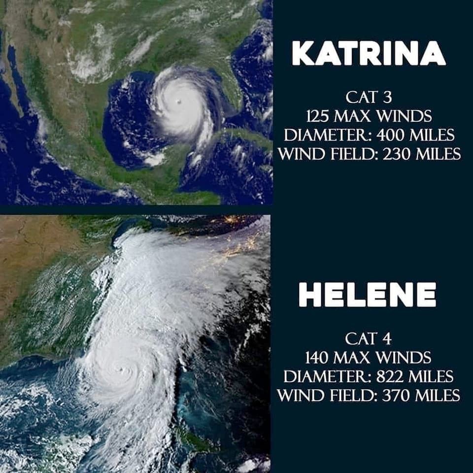
What I don’t like about these graphics is there is no data source so you have to look it up to know how much to believe about what they say. So for those wondering, per Wikipedia:
Helene was a Cat 4, its max diameter was between 400-450 miles, max wind speed of 140 mph is correct. Known fatalities so far > 227 and counting.
Katrina was a Cat 5, 400 miles in diameter as shown, but with a max windspeed of 175 mph, not 125. For those too young to remember, Katrina was a very, very bad storm. So bad. Over 1392 fatalities (official estimate; exact number unknown). BTW Katrina also had a big tail/wing(?) stretching to the north when it hit land like what Helene had, but thinner since further west–but those don’t count as part of the measured diameter of the hurricane.
My opinion of this graphic: Hurricanes are getting worse because of climate change, but we don’t need to convince people of that by downplaying Katrina or making Helene look scarier–Helene is also very very bad. It’s all bad, folks.
This infuriates me so much. I am sitting here like a dumbass saying that this storm is worse than Katrina. Like I know I should do research before being confident in what I know but how many small infographics like this do we digest and then regurgitate a political opinion based off of them
Worse is a hard metric to analyze when comparing 2 different storms. One may have higher winds. Another might dump more rain. Another might have brought a high storm surge to an area that couldn’t handle it. Another might come in kinda mild and just stall, battering one area for a long time. One storm might do massively more damage if it hits Atlanta vs. Miami. I’ll forgive people for getting a little hyperbolic when describing a storm that has personally impacted them. Storms may hit a broad region, but the impact of a storm is always hyper local.
According to wikipedia Katrina was only a cat 3 when it hit Louisiana. It did get up to a 5 at one point, but bot when it did most of it’s damage.
https://en.m.wikipedia.org/wiki/Hurricane_Katrina


What I don’t like about these graphics is there is no data source so you have to look it up to know how much to believe about what they say. So for those wondering, per Wikipedia:
Helene was a Cat 4, its max diameter was between 400-450 miles, max wind speed of 140 mph is correct. Known fatalities so far > 227 and counting.
Katrina was a Cat 5, 400 miles in diameter as shown, but with a max windspeed of 175 mph, not 125. For those too young to remember, Katrina was a very, very bad storm. So bad. Over 1392 fatalities (official estimate; exact number unknown). BTW Katrina also had a big tail/wing(?) stretching to the north when it hit land like what Helene had, but thinner since further west–but those don’t count as part of the measured diameter of the hurricane.
My opinion of this graphic: Hurricanes are getting worse because of climate change, but we don’t need to convince people of that by downplaying Katrina or making Helene look scarier–Helene is also very very bad. It’s all bad, folks.
Katrina photo: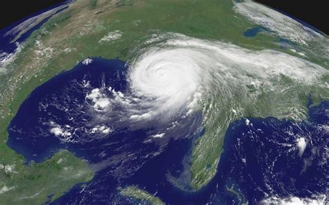
This infuriates me so much. I am sitting here like a dumbass saying that this storm is worse than Katrina. Like I know I should do research before being confident in what I know but how many small infographics like this do we digest and then regurgitate a political opinion based off of them
Worse is a hard metric to analyze when comparing 2 different storms. One may have higher winds. Another might dump more rain. Another might have brought a high storm surge to an area that couldn’t handle it. Another might come in kinda mild and just stall, battering one area for a long time. One storm might do massively more damage if it hits Atlanta vs. Miami. I’ll forgive people for getting a little hyperbolic when describing a storm that has personally impacted them. Storms may hit a broad region, but the impact of a storm is always hyper local.
Katrina was a man made disaster. It would not have taken a tenth of the lives it did if the levees had been maintained.
According to wikipedia Katrina was only a cat 3 when it hit Louisiana. It did get up to a 5 at one point, but bot when it did most of it’s damage. https://en.m.wikipedia.org/wiki/Hurricane_Katrina