Google is experimenting with bringing the tablet taskbar to phones running Android 15. This new version could be called the “tiny” taskbar.
Time is a flat circle. I remember when honeycomb launched with a bottom navbar, only for Google to delete it later in favor of a (terrible) phone like gui
deleted by creator
Honeycomb was a tablet only ui. Google ditched the more effective ux in a fit of unification, that I believe is significantly responsible for killing Android tablets
And why on Earth would I want that exactly?
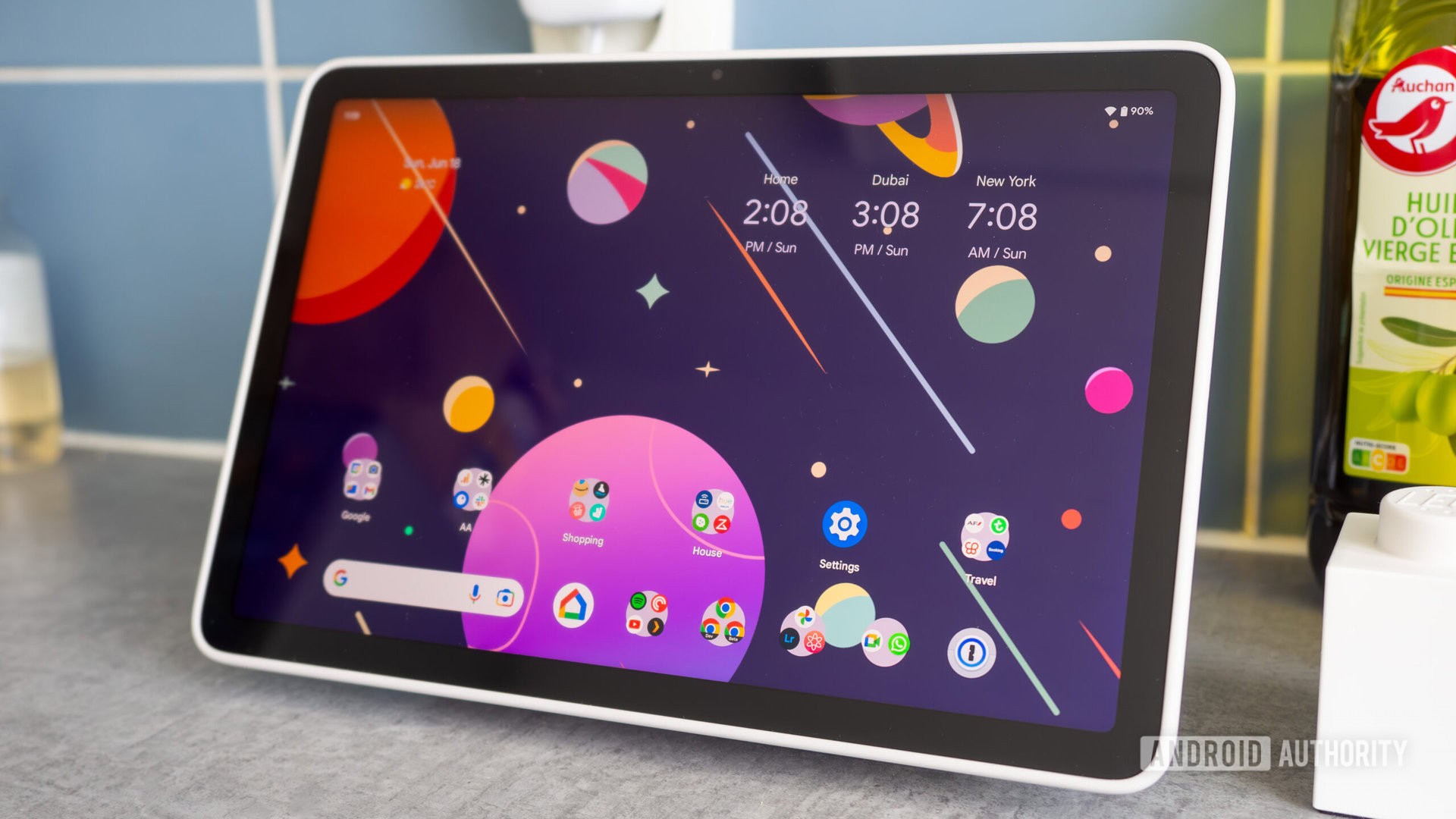
Have you checked Smart Dock? I think it is cool, and a faster way to launch apps.
Hey Google, I just…don’t know how to phrase this to you. Start doing some hard work on the Android platform to make the aging bits better, the dirty bits better, bring back more open-source, bring back more openness. Drop the YouTube crap and have dedicated apps on the phone for Music, Podcasts, etc.
Their current and next couple of years of dev cycles will probably be wasted on “AI” as the rest of the platform drifts and their C suite drools over a GPU-powered fever-dream that can’t even play Tic-Tac-Toe for more than 4 moves without forgetting the rules.
As it stands right now, I know several Androiders that see no reason to even stay with Android anymore and will likely switch to iOS for their next device replacement. I’m not sure I really want to bother sticking around either, although I’d prefer a tertiary alternative that as of yet doesn’t exist. (Speaking of, this dock sounds like something just borrowed from WebOS.)
Make the mobile OS something that can stand on its own instead of the data-mining marketing cesspool it has become, and put it on hardware worth buying instead of the janky Samsung modems.
Sincerely, some rando on the Internet
android phones are shit for multitasking anyway. things are constantly redrawing and reloading, even with a lot of ram.
Give me my janky choppy Android 11 multitasking back, I have 8GB of RAM and I’ll use it as I please
Ugh, and I thought my 6 GBs of RAM phone sucked for multitasking… You are discouraging me to get another one with at least 8 GBs of RAM lol.
Oh gdi we’re up to the point in Android models that we’ve reached Dragon Ball Z characters and my brain has to double take headlines.
I feel like I’m the only one who still reverts navigation to the 3 dots and doesn’t use any of the new stuff they’re releasing.
This taskbar looks like it’s going to make things happen without me wanting them to, I hope we can turn it off.
I hate, hate, hate, that I can’t turn off the “At a glance” top section as well as the “Google search” bottom section in my Pixel home screen.
They got rid of the Google Assistant microphone icon that I could tap and say stuff like “remind me to buy milk in 2 hours,” and replaced it with a similar icon that does voice search. Yuk (and no, shaking, squeezing, gestures or activating the always on ‘hey google’ prompt are not worthy replacements.)
The non removable Google search bar was one of the reasons I put Graphene on my pixel.
How do you like Graphene? Any specific issues you haven’t resolved yet? Can you access your bank apps and everything from it?
Here is a list of most banking apps and whether they work or not. I’ve been using GrapheneOS for a while and haven’t encountered major problems. Only thing I wish I knew beforehand is that multi-user profiles are more cumbersome than what most people say.
Thank you!
Huh, I actually had to look at the At a Glance but to see what you were talking about. I’ve just taken it as a given that I can’t use the top 1/3 of the screen or the bottom strip.
I’m not a gestures guy at all, I like buttons!
I would use that. I really hope they make it an option.
Taskbar is crap until it’s no longer baked in with the phones default launcher.
Oh yeah never thought about that, is the bar that pops up when you swipe when you’re already in an app also part of the launcher?
Wonder how they did that, or if they just gave their own launcher some special integration like they usually do, to allow it to somehow listen to global gestures or something.
Yeah, if you swap launchers it hardly ever works when you swipe up. Recents menu has been like this forever as well and why it can stutter / looks less seamless when using a different launcher, it has to run the system laumcher to show the recents menu.
I already don’t like that the navigation-gesture bottom bar takes up a few millimetres of my valuable screen space. Why does it need to be one click away and always wasting space as opposed to one swipe away and not? Hopefully it will be an option and not an Apple-style “we’ve decided for you” arrangement.
Navigation gestures… I opted for the buttons instead. And I surely miss the physical buttons.