
deleted by creator
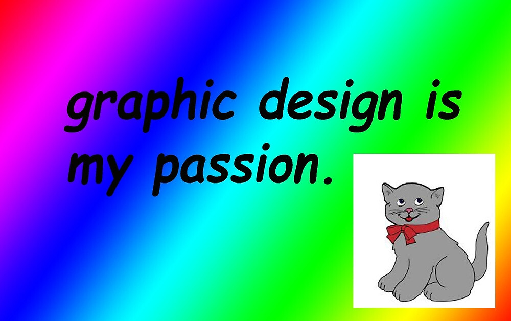
My big secret. I kill graphic design homework on purpose. I good designer. The best!
Didn’t use black and white text, obviously they suck at their passion (I know the feel)
And these days UX design is low-contrast, obtuse, hide information garbage, so there is that.
Not on dev portfolios, they usually look better than any billion dollar company’s website, and they have „more server per user” and they are also more optimized for the thing they do, so they are also a lot faster most of the time.
they usually look better than any billion dollar company’s website […] and they are also more optimized for the thing they do
That’s a low bar, honestly.
In webdesign, the less is more in both aspects, and companies don’t do that.
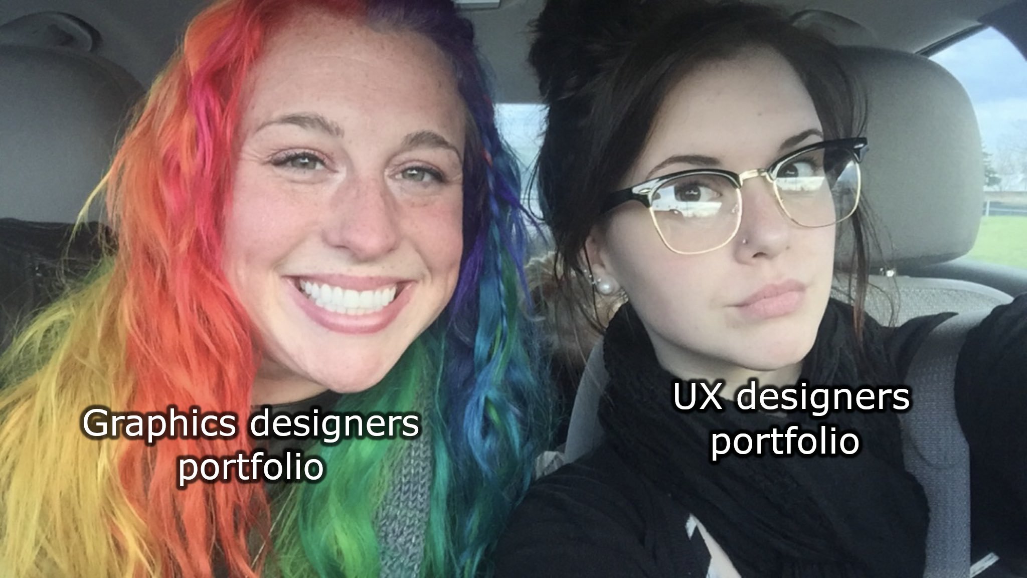
I know it’s an an olde, but I like this photo the more I see it. There is something heart warming about it
IIRC the original post was something like “My sister and I are like polar opposites”. I still find it adorable.
Im definatly a ux guy.
My man!
The more I see this picture the more I dislike rainbow hair.
Mind if I ask why? They have a radiant smile and appear to be living their life in a manner much more freeing/happy than I am.
Because I don’t like the way it looks? I’m sure she’s a happy and fun person, but I don’t like the particular hairstyle.
Oh, you didn’t meant the hairstyle “rainbow hair”, you weren’t addressing the lady on the left as “rainbow hair”.
No, I was not addressing the person as “rainbow hair”. I don’t know anything about her.
Hippy | Beatnik
My hidden portfolio

