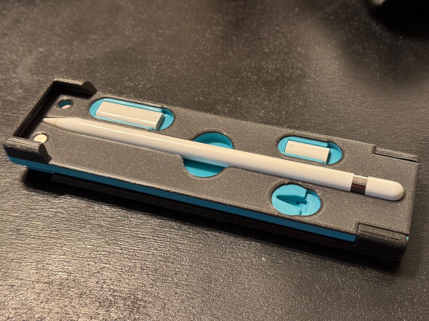
It’s a slight modification to my existing design which can be found here: https://www.printables.com/model/261466-apple-pencil-gen-1-case-mkii
The two tone was originally created by accident as we were running out of light blue and I decided to go all out on the top side.
She is very happy with the results.
I’d put my pencil in that
I too choose this man’s wife.
Damnit, i was really just trying to complement the case 😣
Nah it’s sweet for sure. I just had to say it.
No, you didn’t. It is not required that someone be a sleazy fuck in every post.
It’s a reference
Aw, I love you too!
Well done! Big fan of the two tone finish.
Was the top piece printed as a single part with a filament swap part way through, or is it two separate pieces stuck together?
2 prints, swapped after the last solid infill on the bottom, and before the first solid infill on the top.
I see. It came out clean.
If I may make a suggestion for if you make a similar design in the future, there is a model I found for a dice tower that has a logo indented maybe 0.2mm on the front of case. You print this side face down on the plate, it prints the face with the logo cut out; swap the filament before the following layer, and it will print mostly smooth against the build plate with your contrasting color.
Of course, what you’ve done comes out with a thicker indented logo, so if that’s what you’re looking for this wouldn’t be the same look, but just wanted to throw the idea out there in case you wanted to play around with it for the future.


