
And still people don’t realise what a blessing immigration actually is for everybody involved!
Better start f u c k i n’
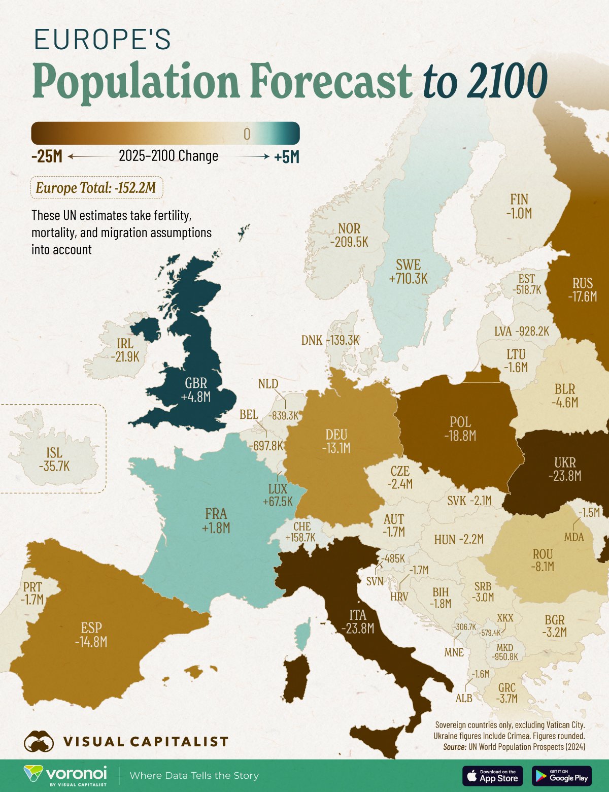
Demographics can tell you a lot about how it will go in 20 or 30 years, but trying to predict what will happen in 75 years — based on trends that have only been in place for a decade — is foolish.
It’s not like that the creators calling themselves “Visual Capitalist” wasn’t a dead give away that this would be based on foolish assumptions 🙄
And let’s not forget: Europe is literally drowning people who want to live there in the Mediterranean. There will also be refugees coming from whatever happens to the USA right now who want to get out. That map might be based on current population trends, but political events will change everything there.
Whose idea was it to make the color scale absolute instead of relative to the current population?
No kidding. That’s like half of Lithuania.
There is a joke they say sometimes, something along the lines of “ok but just remember if you’re the last to leave remember to turn off the lights”
I love that people are beginning to review cartographic methods, I distrust (and love) cartographers.
On the source there is a table with the percentages, so the creator of the map had that data but they choose to display this nonsense instead:
Then let’s add climate change to the table and all bets are off.
Oh no we won’t be considering that. We’re still pretending that’s just an issue for the polar bears.
Sure, Swiss is going to increase by exactly 158 POINT 7 Thousand.
We’ve been growing at 60k a year or so for decades. Went from 6m to 9m in just 25 years. This graphic misleading as it apparently ignores immigration.
I was referring to the false confidence of forecasting Switzerland to the hundreds.
It literally says it takes migration into account.
Oof


