

You must log in or register to comment.
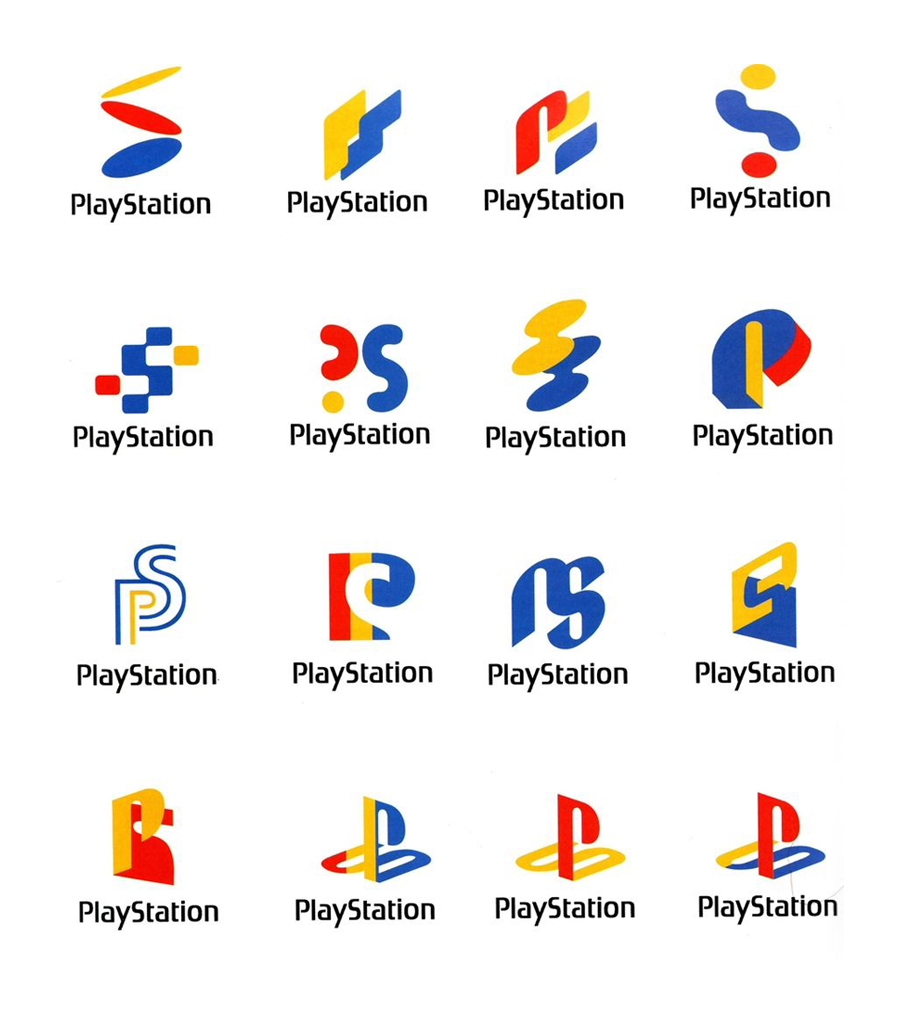
Weird how they all feel “old” compared to the logo they ended up choosing.
Yeah, it’s probably just because we’re used to it, but I feel the same.
If you read it left to right top to bottom it feels like a very exasperated client repeating “No there has to be a P and an S! No not a question mark! No not squiggles!” and so on until the final two.
alternative reality PlayStations
First logo definitely is inspired from the ill fated, Nintendo PlayStation
Is this user created alternative logos?
I believe the story behind them is these were that Sony came up with back in the day to choose from. They were looking for an icon that showed “depth” to represent the 3D graphics.
deleted by creator

