
Not all changes are always for the better. Is there anything that you liked and is now gone?
I have no idea which IOS version this was but, I miss the 3D Touch.
I remember using it a lot back when it was still available.
As far as I know, if you have an iPhone X or older, 3D Touch is still supported on current software.
I’m pretty sure they removed it even on the devices that had it. The watch definitely lost it. But I might be misremembering.
3D Touch is still working on my XS Max.
I’m gonna sorely miss it when I upgrade.
The con of Force Touch is when using gloves, you need to press harder to trigger opening apps and that triggered the menu instead. The other Force Touch I loved was hard press on the keyboard would enable moving the cursor around. But you can do that by long pressing the space bar. No significant loss in my opinion.
I had an iPhone X up until this summer and it still had Force Touch.
What was that?
Older iPhones had a screen that could interpret the pressure of your touch, giving the ui the ability to do multiple things based on how hard you press.
The best feature was pressing hard into the keyboard to get a cursor and then pressing lightly again to highlight text, all with just one thumb. It was super good. There’s an alternative to that now, but it pales in comparison.
Yes! That feature alone kept me from upgrading my iPhone X until the 12 Pro came out. The alternative is severely limited, and annoying to use
What I don’t understand about what we have now is that you can’t “undo” your highlight like you used to be able to. So if you overshoot the highlight using the new system and select too much text, well, screw you.
With the 3D Touch way you could really dial in your selection back and forth. It seems like you should still be able to do that with this new space bar version, but, alas, no.
A whole 2 years …
3 years, actually. It may not seem like much, but many people upgrade every year. Especially those of us who are into tech
There’s an alternative to that now, but it pales in comparison.
Walt, is there a better way than long-pressing on a word and then clumsily moving the little markers to where you want your selection to start/end? If there is I need to know, because I hate how janky selecting text often is.
Hold down on the space bar and you’ll get a cursor. Then if you tap — while still holding space — on the keyboard with another finger it’ll start to select the text.
Having to use two hands to do the same thing you used to be able to do with one is what I don’t like. But it’s at least something.
Hold down on the space bar and you’ll get a cursor. Then if you tap — while still holding space — on the keyboard with another finger it’ll start to select the text.
Thanks. I use the space bar to move the cursor a lot, but didn’t know it could select text too. Feels pretty damn clumsy though.
It was on the iPhone 6s to iPhone Xs
I don’t know if you’ve tried it yet, but setting the “Haptic Touch” option to “Fast” gets you a bit closer to what you could do with 3D touch.
It’s under Accessibility -> Touch -> Haptic Touch
Personally I like it better vs the default setting.
3D Touch. I used it all the time
Physical Home Buttons - my iPad still has one and I love it compared to the swipe up gesture
I liked 3D Touch, but I’m really glad we moved on from a physical home button. For one things like the app switcher feel so much faster and more fluent with the swiping. And for another I always feared the home button would break, no matter how well built.
Nah, its all about the button. Over my cold, dead, thumb ;)
You can still have it. Just get the 2022 SE. why do people need supercomputers in their pocket, or why does it have to be the camera-iest or titanium etc?
I use my phone camera for supplemental video to my photography, so unfortunately I do kinda need the nice new cameras they’re putting on them. I have a 14 pro max right now and tbh I wouldn’t give up the screen space.
Its the camera. It’s always the camera.
Cause it’s too small and my eyesight is shit
You can magnify, you know. In theory you’d still have all the same issues, font size being equal
It doesn’t really work great tbf. More so, I have the lethal combo big hands + bad eyesight so I’m cursed either way
If its irreducible past the point of personal preference, I’m not going to argue that. You just like it, case closed aha! Bang bang bang 👨⚖️
I’m just saying that I don’t really understand how a bigger screen changes anything if these issues are more within the province of “display/font size et”
I just noticed your username, it’s perfection.
Anyway, I seriously have big hands so a small display is quite annoying to use (so sad moment)
Thanks for the recognition ;) And ah k, I gotchu
Edit: now I kinda wish it was
nite_cheese
I dearly miss the precision video scrubbing from iOS 16 and I have no clue why they removed it. It was absolutely amazing and it’s now just replaced by… nothing. I miss it every day.
This isn’t really an answer to your question but it is related, and sticks in my mind as one of the biggest red flags of Apple’s constant enshitification after Steve Jobs’ death:
At some point in the Big Cat line of MacOS they either changed or forgot to implement a simple UI label change for a function—that being ejecting a “disk” (be it external usb device, optical media, application installer, etc.) the usual way to do it is of course dragging it to the trash—this has been the way in MacOS since time immemorial, and in the big cat series of the mid 2000’s when you performed this function the label “Trash” would change to “Eject” (the trash can would also change to an eject icon—icon may still change? I only have a Mac at work these days so can’t double check)
Anyway, this has been the case since about… 2011? Nowadays it just says “Trash” regardless of what you are either trying to delete or eject.
Other things like the angled corners of the new iPhones not really jiving with the swipe up of the buttonless models: this gesture made sense with the rounded edges of the iPhone 6–not so much the 12 and on.
The little touches that are missing these days just show that the company does not hold itself to the same QA standards it once did and clearly has some very disconnected / dysfunctional interdepartmental communication.
Yes, this (from iPad OS)
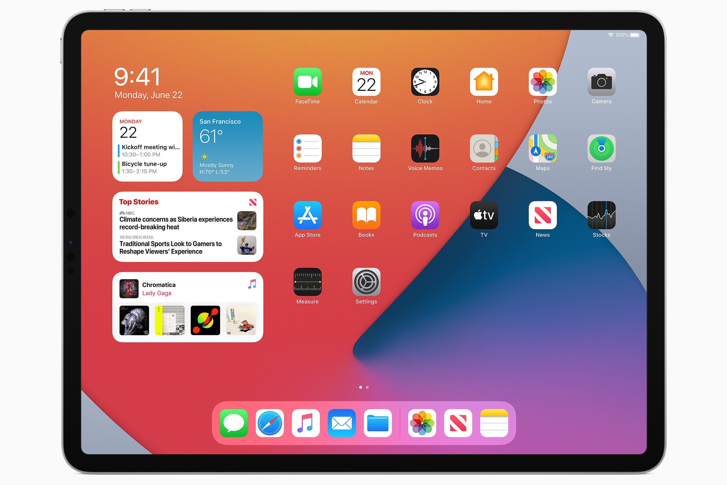
The digital clock widget? Other than that, it’s very similar to my current iPad Home Screen layout
The widgets you add to the home screen aren’t the same as this Today View. Know how you side left from the first page, and it has a widgets view? The iPad had the option to keep that view permanently on the screen and bunch the icons to the right. The option was called “Keep Today View on Home Screen”:
https://www.macobserver.com/tips/quick-tip/today-view-iphone-ipad/
https://youtu.be/Y6YY06bLEEo?si=w1MHfiw1GJD6yjSgIMHO, it was a much better implementation of home screen widgets than what we have now.
Yeah, I see it’s slightly different from today’s widgets on the Home Screen. That’s closer to how I wished it worked, but how it works now seems more flexible
Here is an alternative Piped link(s):
https://piped.video/Y6YY06bLEEo?si=w1MHfiw1GJD6yjSg
Piped is a privacy-respecting open-source alternative frontend to YouTube.
I’m open-source; check me out at GitHub.
The music app has gone downhill and been badly degraded ever since ohhh IOS 10? When they moved to streaming services they prioritized that and removed clear ratings, access on Home Screen to volume and progress of currently playing song and many other things.
I miss the easily accessible album view. Back in the day you could tap to ‘flip’ the cover. Now it’s hidden in a three-dot menu item.
Not iOS , but on MacOS, I hate window design in recent versions. The old versions had a clear distinction between single contents and the great/darker ‘chrome’ that made up the window header and toolbar.
These days everything is a blinding white (in daylight mode) both virtually no contrast between the two.
With multiple overlapping windows it is a complete pain to use. Loads of times I’ve gone yo grab the top of a window, only to hit the window behind and above.
Form over function.
I didn’t realise how bad it was until I used my wife’s old Mac running an old version of the OS and everything was just easier
An ad-free YouTube-app.
Battery life
Yes swipe to unlock and old app store icon
Yes