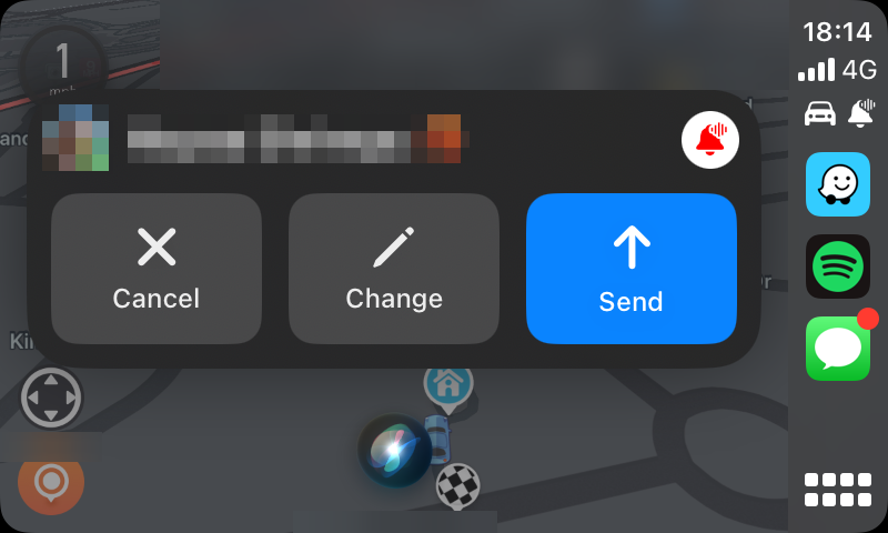
When sending or receiving messages, the popup no longer occupies the whole screen. It’ll now only display a box in the middle.

Interesting. One of my least favorite things about CarPlay is when I’m trying to scroll a list, and a banner appears at the bottom. The banner blocks my scroll gesture, and if I touch it to try to dismiss it or anything, I’m taken out of my current app.
The only thing you can do about it is to just wait for it to go away, which is not good for someone in a car.
I have this happen to me a lot, especially with Find My (leaving my AirPods or MacBook behind, which I never intended to bring with me). It’s quite annoying, but I think it has a dismiss button. It’s so tiny I’m always scared I’ll misclick it and open something else, so I just let it dismiss itself. At least with the messages here, there’s a massive button to dismiss the box.
Wow, that looks so much neater than before. Upsetting to see that they didn’t do phone calls though. Maybe iOS 23.
thank you Jesus. phone calls too?
Unfortunately not, it looks the same as it did on iOS 16.


