
Interesting website to see what you personally perceive as “blue”
Kinda wondering if you’d get different results for using a different display (especially of different technology)
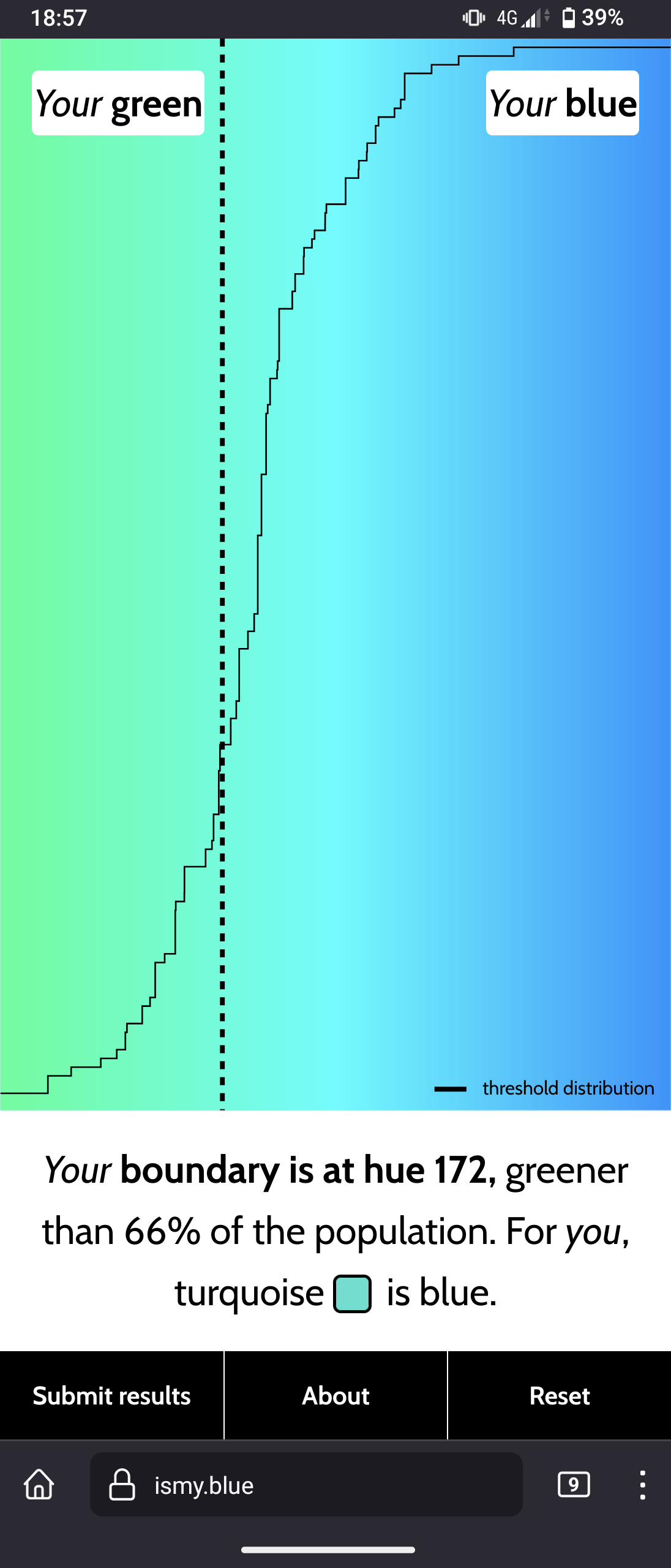
This what I got from two consecutive tests anyways (weird that the percentage is different)
Your boundary is at hue 168, greener than 81% of the population. For you, turquoise is blue.
Your boundary is at hue 168, greener than 85% of the population. For you, turquoise is blue.
I got 176 on both phone and monitor.
The percentage is based on how many people have used the thing, so if it is suddenly popular and a lot more runs are completed it can shift the percentage.
The percentage is based on how many people have used the thing, so if it is suddenly popular and a lot more runs are completed it can shift the percentage.
Ohh now it makes sense, thanks
Definitely different depending on your screens. I tried it on my desktop monitor, which is fairly decently calibrated, and I got 192 (quite high - bluer than 98% of pop. at the time). It was basically impossible not to notice any hint of green tinge in the background. On my phone, I got 171 (bluer than 68% pop. at the time). I took the tests back to back.
I moved the window between my two desktop monitors just now, and my second monitor is not only older tech, but it’s also not color-calibrated at all (or calibrated poorly). A lot of the greener-looking colors on my more accurate monitor looked sky blue on the other monitor.
Edit: eh… I just took it on my phone again and got 192 this time lol. It’s probably because the colors close to the boundary don’t fit into blue or green for me, I’d rather be able to select both/none. Being forced the choose one kinda makes it subjective to how I’m feeling about it at the time. But I know that’s not really the point of this test.
I got 171 on my desktop monitor.
I have the nightlight setting on my phone turned all the way up. Every color shown except the first one was green to me lmao
Shoot, I got significantly different results from two consecutive tests on the same device. I suspect the sequence of colors affects perception, too.
In my first run, I perceived greater differences between the sequential colors and I got a couple that were in the extremes, and got around 65% (I don’t recall the hue number). The second run, many colors were only a little different from their predecessors, and I didn’t get any really obviously blue or green - they were all subtle variations of turquoise, and I scored at 76% (177).
Depending on how shit your screen is, you’ll even get a different result depending on how far above or below you it is.
My IPS is fine, my cheap LCD second screen shows a gradient from green to cyan for most of it.
That screen cost me a whopping £30 from CEX. They said it had dead pixels on one side, but on closer inspection, it appears to be either ink or blood.
or blood.
Wait🤨
It’s a CEX in a small town.
I’m not assuming anything other than whatever money was handed over by the store for this thing was rapidly exchanged for the smallest available quantity of heroin from a local dealer.
Your boundary is at hue 175, bluer than 65% of the population. For you, turquoise is green.
Actually hard, because I use to distinguish Cyan from Green and Blue, so categorizing it to either blue or green was a bit difficult
Yep, for me the test felt like if someone would ask me if orange is yellow or red
Well, which is it??
If you could hurry please, I dont have much time leftMore like when does orange become red/yellow to you imo
I don’t think turquoise and cyan are the same color. Are you saying you do?
Yup, maybe because of computer graphics; I tend to consider Cyan, Turquoise and Teal as some kind of synonyms (or really similar to eachother); ususally I call it when there is almost as much green as blue “Cyan”
When looking at definitions, there are not the same colors, but are still all different shades of Green and Blue (I don’t personnaly recognize them well, so I consider them with the same name; like people call them Green or Blue here)
My rainbow wheel be like: Red - Orange - Yellow - Green - Cyan - Blue - Purple - Magenta - Red
Like for the pixels on your screen are RGB = Red, Green & Blue; and the paint in Inkjet printers are CYMK (Cyan, Yellow, Magenta, blacK)
Yeah, particularly digital to print graphics, working with CMYK had a similar effect on me.
If you start out with the primaries and keep mixing to get the hues between you’ll end up with 6, then 12, and then 24 hues at the quaternary level. Orange is a tertiary color with it’s opposite being Azure.
Ah. Teal/Turquoise are the same to me: a blue green. Cyan is a neon light blue.
Cyan, #00FFFF: https://www.canva.com/colors/color-meanings/cyan/
Turquoise, #30D5C8: https://www.canva.com/colors/color-meanings/turquoise/
According to your website, teal would be a darker shade of Cyan
Teal, #008080: https://www.canva.com/colors/color-meanings/teal/
And by what I read #30D5C8, so Turquoise is a nuance near to Cyan, but grayer/desaturated (there is a bit of red), and a bit more towards green than blue (D5 > C8)
Cyan/Teal (darker cyan) are the true middle between Green & Blue, with exactly as much green as blue in it
According to your website, teal would be a darker shade of Cyan
Hmm… By just the numeric hex code, I agree, that makes sense. Just lowering the G and B values makes it darker. However, lowering BOTH G and B lowers B twice, since G can be broken into Y and B by color theory, so blue is removed proportionately more. So, somewhat disagree.
I still don’t think Teal and Cyan are the same. I’d say Teal and Turquoise are closer, in my eyes. I think Teal is darker Turquoise moreso than it’s darker Cyan.
But at the end, color is all subjective.
Yeah, exactly that kind of nuancing problem, that make me tell Cyan/Turquoise/Teal as “the same color” in everyday use (and for my fellows French people, that do not use to use Turquoise or Cyan words in everyday life, I use to say “Blue-Green”; but I don’t like to call these nuances either “Blue” or “Green”, as nobody never agrees depending on the nuance, and that makes awkward situations)
The issue with the term light blue is that people think of light as being warmer and green tends to have a higher chromatic luminance. A true “light blue” would actually be periwinkle as it’s the tint of primary blue.
graphic designer with the same problem. also got 175.
Test is flawed. Does not allow for demilitarized zone between blue and green!
This leads to blueward expansion by green and a preemptive war by blue!
Turquoise is green!
Your boundary is at hue 185, bluer than 94% of the population. For you, turquoise is green.
Funny because I what I call turquoise is what I call blue. The example they gave was too green in my mind.
Is your native language English?
Turquoise is turquoise!.jpg
Turquoise is teal!
Teal is turquoise! IMO 😁
A bit like violet and purple!
ART NERD FIGHT!
But I agree, teal is turquoise ftw.
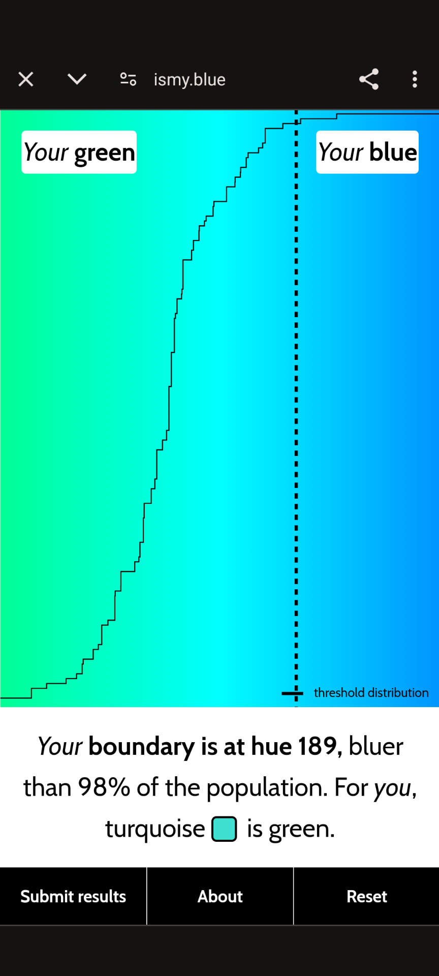
Your boundary is at hue 192, bluer than 98% of the population. For you, turquoise is green.
You all need to get your eyes checked
Says the blue dude
Yo, listen up, here is the story
dude you literally can’t see one of those colors
30 years on the internet, never seen so many people being wrong.
Perception isn’t a straightforward answer that is “right” or “wrong”
On the internet, your perception is always wrong.
My perception is right.
Did I win?
If you did we both did, I hold no opinion on this matter like a true neutral you’ll never know where I stand on this debate!
yo I got the same number!
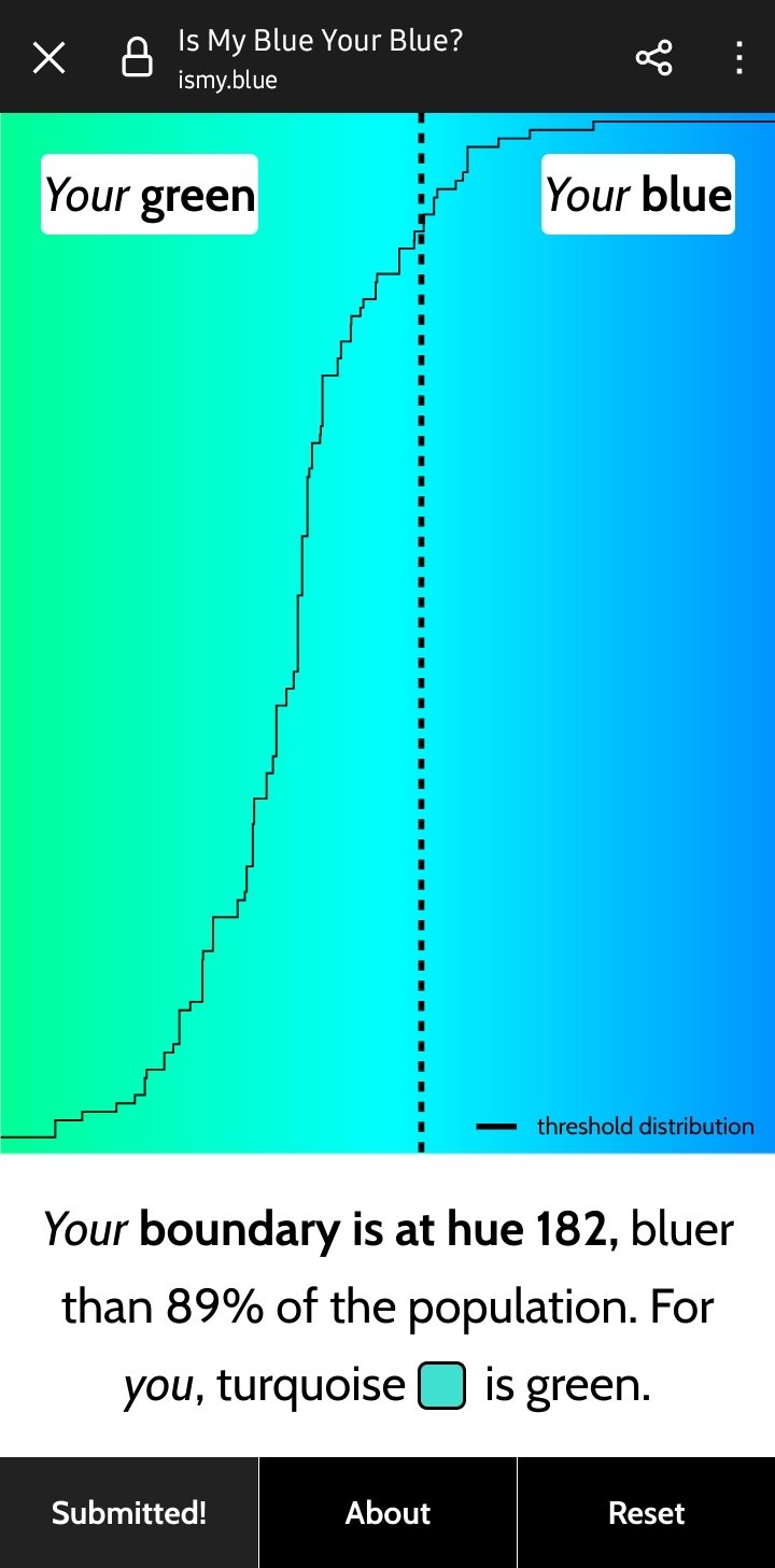
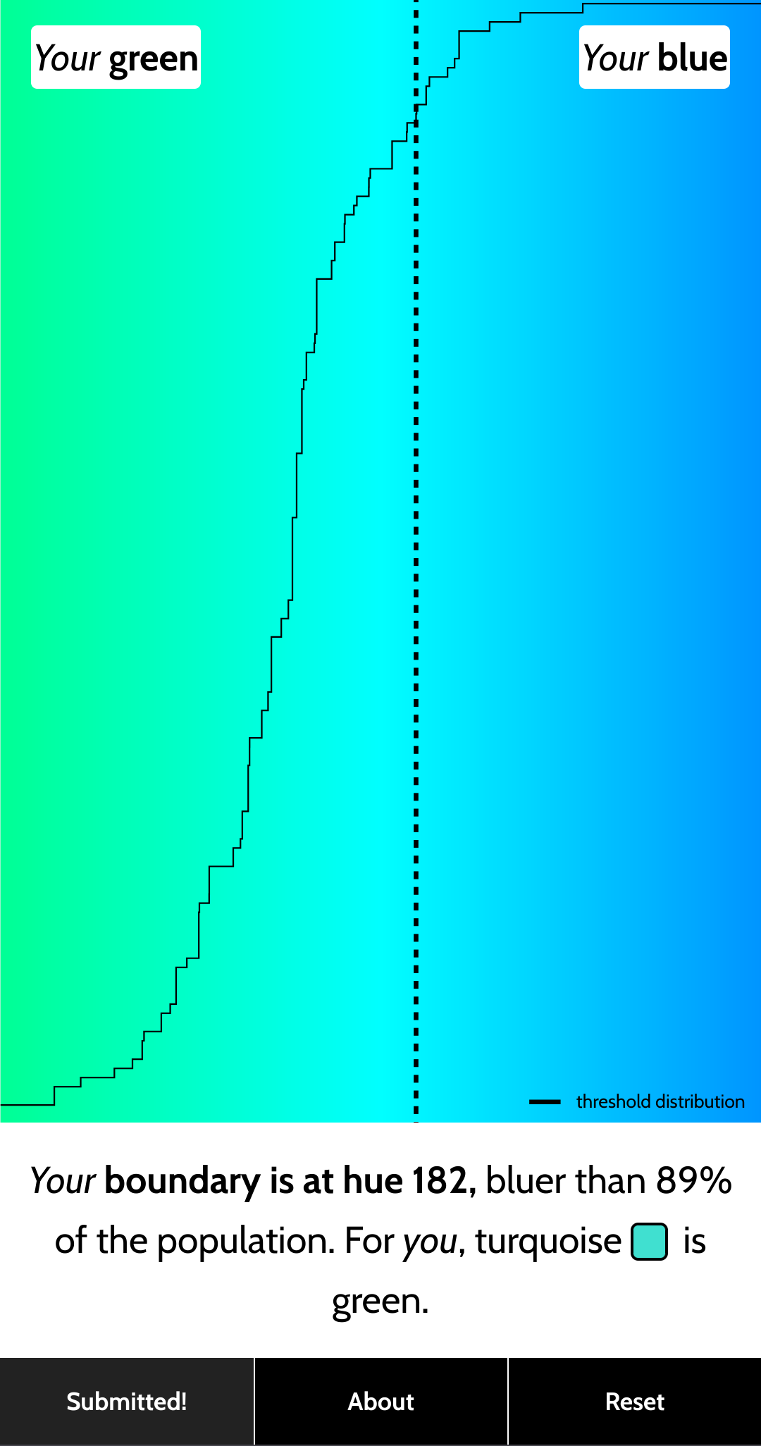
Hell yeah 182 gang rise up
 Gang gang
Yo

182 is the objectively correct answer.
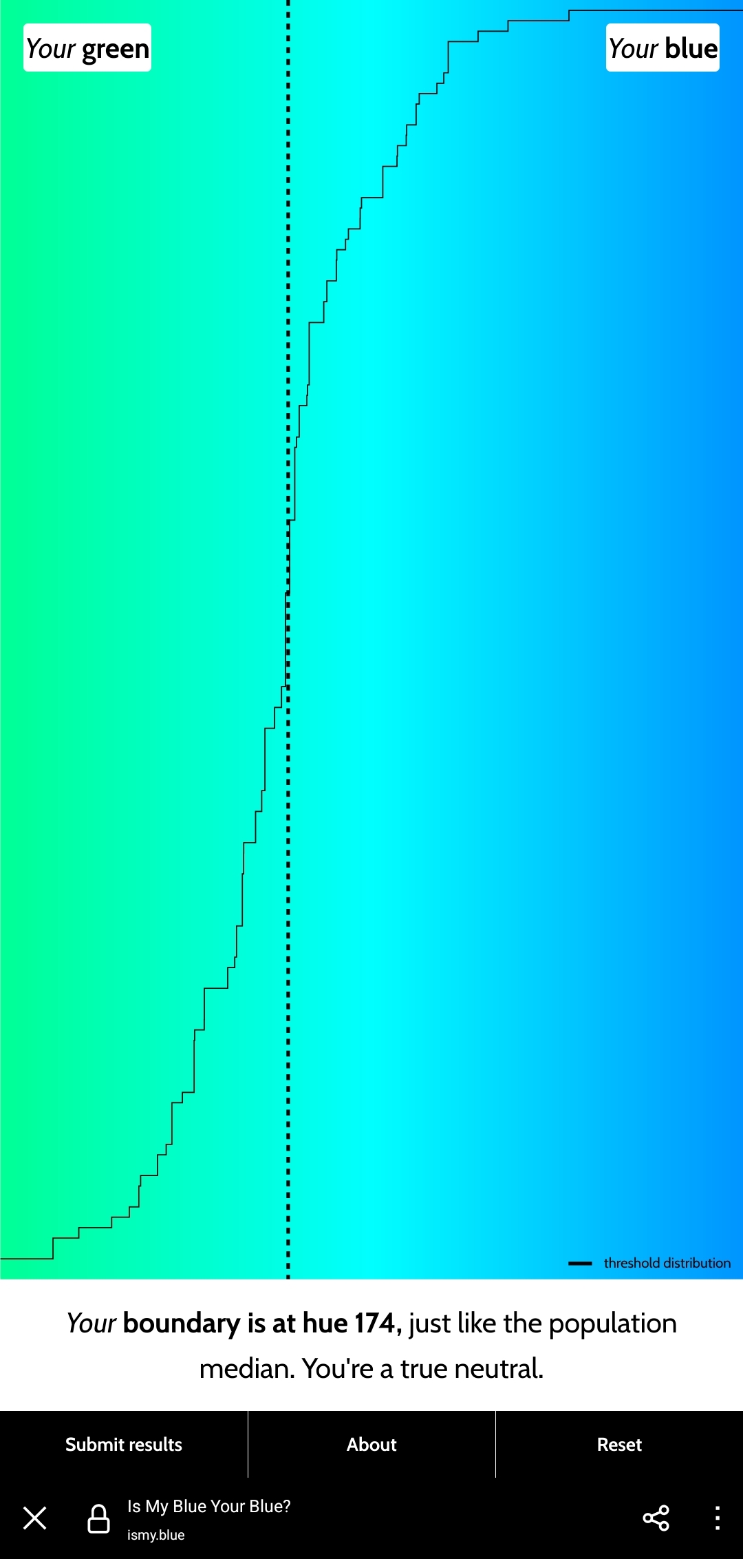
Hue 174 a true neutral was my description
174 for me as well.
Doesn’t the intensity of blue fade over the life of most OLED displays? Couldn’t that skew the results?
Monitor quality and calibration will always affect these sorts of things but your results are probably close enough to reality
182 for me. Apparently I am picky about my blues
Guess my eyes are a Lil off
“Your boundary is at hue 185, bluer than 97% of the population. For you, turquoise is green.”
Don’t worry; this is a completely pointless test if you didn’t have your monitor professionally calibrated beforehand.
Idk, 97% is pretty extreme
J’ai fait le test et je trouverais intéressant de le refaire en changeant la luminosité/clareté des tons. Pour les tons clairs, dans le doute je choisi bleu, mais c’est possible que je fasse pas pareil pour les tons foncés.
Ouais je pense que le calibrage de l’écran joue beaucoup aussi, sur mon pc les trois dernières couleurs étaient les mêmes à mes yeux, à cause de mon écran un peu nul
Tout le monde cite le calibrage, mais je suis bien plus interessé par la perception perso. Je sais même pas si ça se calibre un écran d’ordiphone.
Très bonne question, mais pour la perception je pense qu’il y a une part d’apprentissage culturel !
Much like Eiffel 65, I appear to be blue…
This is actually the opposite, as most of these hues appear green to you.
So you are blue, da ba di da ba die, but only in specific circumstances
Oh, then I guess only emotionally then. Thanks for the clarification.
So I found that I pretty reliably get 185ish if I don’t think about it and just click. Now what happens is the test gives you a blue blue or green green, then throws you color just a bit over the line opposite of your first then throws you colors the opposite but closer to that line back and forth about every time. Seems like my picks tend to be A, B, A, B, A, B pretty consistently, which lead to the same outcomes. Not intentional choices for me, but it feels like the shock of seeing a color variance compared to the last color makes it feel like it’s “more green” or “more blue” than the previous. I feel like they should have a sort of pallet (unintentional pun) cleanser in between each color to give a true test.
Absolutely. A quick gob of water in between the wines would be nice. I got 185 too


