
TIL this share symbol is android specific.
Edit: As other have mentioned, it’s not Android specific (I was referring to the post title). From Wikipedia:
WordPress developer Alex King created the original Share Icon in 2006.
Thx @[email protected] for the Wikipedia Link
It isn’t
The icon is two years older than Android.
Well I didn’t know that! Interesting,
As an iOS user the Android share icon makes no sense. How does that icon represent sharing? The iOS one is much clearer.
Icons generally dont have to make sense. The universal save icon being a floppy disk is a good example. It just needs to be recognizable.
Actually, I think that one at least has some history to it.
The disk drive was one of the first ways to store information between computer sessions as the first computers didn’t have built in storage. You would create a program, run it, and then when you shut the computer off it was gone. Since the disk drive was used to store programs for later, or “save” them, the icon was born from the physical object.
Sharing, conversely, doesn’t really have a real world example to base the icon on. Maybe two hands exchanging things? Perhaps two arrows to illustrate the ability for things to go both ways? Maybe a set of interconnected dots to show the connection between things? Any of them could work, so the iconography is less clear.
It’s actually not Android specific, but even then they all make about the same sense to me (which is not a tonne)
I think it’s meant to show how one becomes two. One person shares… something, and then that something has doubled. I’m just used to it by now. Never really had to give it thought.
As an Android user why does an arrow out of a square signify sharing something? (Also why is the apple share menu used for so much besides sharing things)
Three dots being connected makes sense though it isn’t intuitive.
The first time I saw the square with an arrow I thought it was to spit the screen vertically or to connect to a projector.
The iOS one looks like the standard “exit” symbol you see in airports around the world. It doesn’t suggest sharing anything to me.
It suggests something (the content) being sent outside your device.
As an Android user why does an arrow out of a square signify sharing something?
It’s sending something outside of your device (the box).
Like a phone call or a text?
The universal symbol for “input” on a TV remote is the opposite, a box with an arrow going in, simply because there can only be one source at a time
Two arrows makes more sense in the context of sharing
Two arrows makes more sense in the context of sharing
Why? Are you sending it to two people?
More frequently (percentage wise) than I use the Apple share button to get something to leave the device lol
Oh ok now I picture the ios one. I’ve grown up with both. I do prefer the android one more though. But I also dislike ios design elements.
Huh. The Apple one is new to me. It looks like an “upload” icon, which I guess makes sense.
The Android one looks like something being spread/copied from one point to two other points. Which also makes sense.
I see the Apple one as just showing that a menu will come up, it’s just visually showing what will happen when it’s pressed, and that happens to be the share menu.
I can see that. But that doesn’t help identify sharing! Haha
Like splitting from another cell? Or like splitting a bullet. Now 2 target can share the sweet relieve of death <3
/s
Almost as good as the car sharing sign in Germany
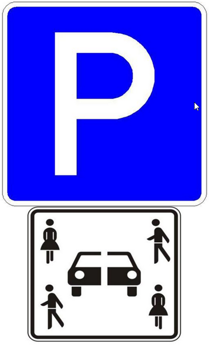
Explanation: “sharing” and “cutting in two pieces” can both be translated as “teilen”
Nobody? Nobody? Fine.
…
THAT’S A LOT OF DAMAGE!
That sign looks too much like the sign for the “verkehrsberuhigter Bereich” sign in in my opinion.
Nah, don’t think so. The verkehrsberuhigte Bereich is blue and a lot bigger, and this here is always below the parking P since it’s just an addendum. But it’s really not intuitive to understand
There should be a community for modern heiroglyphics
What’s the inscription next to it? “Donkey Repub…” ? 😁
It’s strange that sharing hasn’t really gotten a universal icon like most other things have.
But it has?

Wait, it doesn’t exist in Unicode. Why?
That’s the national flag of Donkey Republic! How dare you desecrate it by letting it touch the floor!!!
I always thought it was a downward view of someone balancing two plates on poles.

donkey


